

Not every big higher education story has an accompanying chart – but many of them do have an accompanying data release that allows us to dig into problems and hopefully help us identify solutions.
I’m lucky enough to have the chance to visualise some of these things for you all, and these are twelve (well, thirteen…) things that I have found interesting, informative, and useful over the past twelve months.
As always, if there are data-related questions please do get in touch – quite a few of the ideas for these charts came from my email inbox!
Money matters
This doesn’t even feel like a 2025 thing – it feels like an eternal complaint, but over the last couple of years things have intensified. We’ve (by “we” I mean all four devolved administrations) systematically and deliberately underfunded higher education for years, and acting surprised when universities have to stop doing valuable things – or doing them less well – is the inevitable result.
Financial issues have also led to the late publication of audited financial statements, as institutions have had to rework budgets to pass the “going concern” test. In December 2025 we finally got a near-complete set of financial data for 2023-24 (obviously not including the University of Dundee or Dartington Hall) and even a cursory look at the key financial indicators suggests that things are gradually (and then suddenly) getting worse. Striking for me is the growing number of very well known providers running a large deficit as a proportion of total income. You can do this for a few years (judiciously liquidising assets and drawing on reserves) but you cannot do it for much longer.
Saying goodbye
One of the ways in which these financial woes have manifested themselves is in difficult and painful provider-level decisions to stop employing many of our friends, colleagues, and inspirations across every area of university activity. Staff costs are, and remain, the biggest proportional cost in nearly every university and college – and years of austerity mean that every other cost has been cut to the bone).
Your campus unions have been working hard to blunt the impact of these cuts and negotiate alternative approaches that can keep the whole show on the road. If you have a good branch it is a fantastic thing, and even if the machinations of national union politics have turned you off please do continue to support the people performing this often thankless and often essential work. Everyone knows that nearly all universities are struggling – and it is only through working together (unions and managers) that we get through this while still being a university.
Here’s the change in academic staff numbers (we still don’t have a mandatory data collection in England for all of the other amazing staff that make universities work!), by cost centre, at your university (or anywhere else you want to look) between 2022-23 and 2023-24. Next year’s data – given the scope and scale of cuts announced – will look even worse.

The end of “high tariff providers”
Changes in recruitment strategies mean that all kinds of universities are making often surprising low tariff UCAS offers, with providers who traditionally cater for applicants with less evidence of academic prowess (or being middle-class) both struggling and wondering if the increasingly busy posh kids place up the road is actually set up to provide the support students need.
As is often the case with recruitment data we can’t really look at the issue directly – there’s some kind of an omerta about discussing this – but by looking at where providers are growing recruitment while getting less applications we can see some instances where a prime diagnosis may be a lowering of entry requirements.

To be clear, the elite end of the sector becoming less elite is not a bad thing in and of itself – but we need to be clear that providers more used to stellar A levels are able to provide the support that less advantaged students need, and we need also be a little more open about what the future is for the other providers who have historically done this work very well.
Mind you, posh kids who do really well at A level are less likely to go to university if they apply. What’s that about?
Subcontractual obligations
The last few years have been busy with attempts to spot and root out “low quality courses” – who remembers the PROCEED metric? – but these attempts seem to have landed on sub-contractual provision… particularly when this happens at high volumes at unregistered independent providers. There’s been steps taken to compel registration, and to reinforce the responsibility that lead partners have over the quality of the provision carried out in their name.
But to do all that took the release of previously unseen data on the size and shape of the subcontractual universe. It’s not perfect (in fact it is rather old data) but for the first time we have some understanding of who is (or was) working with who – and what the outcomes (B3) metrics look like.

[Full screen] (and there’s also a version allowing you search by lead provider)
Didn’t get the memo
Alas, nobody told shadow minister for policy renewal (the current opposition’s Temu David Willetts) Neil O’Brien who spent the spring playing with SLC data to determine which institutions had graduates who were not paying back loans. He did not do very well – in that he didn’t bother controlling for any of the things (including, mystifyingly, subject area) that we know affect earnings and thus graduate repayment.
Using LEO data and some assumptions (so in indicative terms only) I had a go at doing something similar – and it turns out that the biggest determining factor for low levels of repayment is the likelihood that someone attending a given provider has a disadvantaged background.

[Full screen] (and here’s a look by subject area which makes the point that that is very obviously a determinant of earnings too, so perhaps the lads at whichever think tank is helping Neil will spot that different providers teach different subjects in different proportions.)
Commuter line
Who is teaching the students who – for financial, work, caring obligations, or other reasons – want to study locally? There’s various data driven ways to answer that question, but all of them require that you accept someone else’s definition of living “locally” and none of them let you do things the other way around (which providers recruit in a given locality).
I had a go at this with one of my favourite HESA Student tables and a little bit of Tableau magic. It’s not entirely satisfying (I’m using the central point of each local authority area which… isn’t ideal) but it is fun.

Levy or not
A new tax is just the thing for a cash-strapped sector, and one on the one area of income where universities can actually meet the associated costs and run a profit was the Christmas gift all of us wanted. The money will stay – broadly – in the sector (with some of it going to grants for less well off students doing government priority subjects) but the big surprise was a shift from a proportional model (where the providers that charge the highest fees pay a bigger levy) to a flat rate, disproportionately hitting those who can’t or won’t charge a premium.
You can model the impact yourself here – and ponder the implications of a single sector tax that directly affects the ability to cross-subsidise public funded work.

It’s maybe my second favourite new data release. The favourite has to be the Standard Skills Classification from Skills England – because who doesn’t love a vocabulary that links together other vocabularies?
Spinning around
And who doesn’t love yet another new new data set? – this one is another belter. Universities often prove to be the launching pad for companies who are able to commercialise products, processes, or services developed from academic practice (research, teaching, capacity building). It’s still in experimental mode – we had two versions this year and this is a plot of the second one (which saved me the bother of manually linking it to Companies House data – thanks HESA friends!)

Premium content
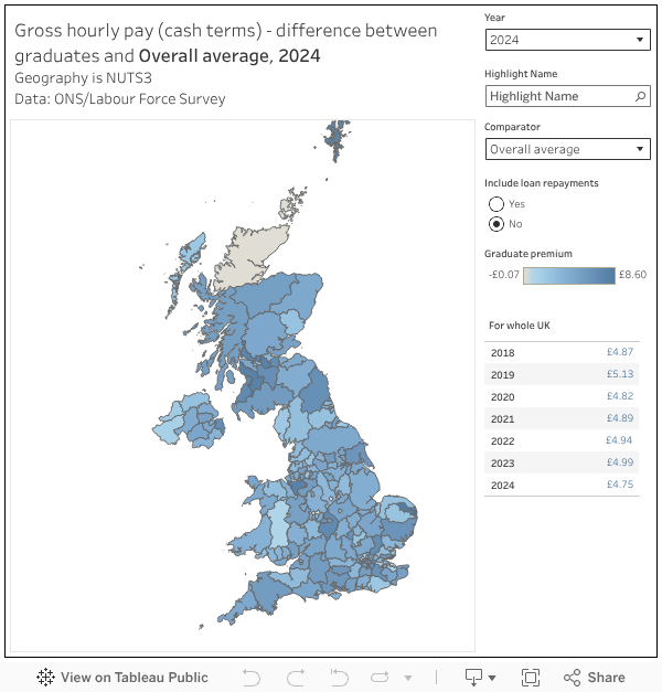
The idea of a graduate premium – that your newly minted degree holder will earn enough extra over their lifetime to cover the increasingly expensive loan repayments that are required from them – was everywhere this year, and those interested in getting an accurate rather than politically useful answer spent a lot of time hitting up on the limits of what available data can tell us. This is an area the Department for Education is actively working on – so expect some improvements in the future.
For me, the most compelling answer came from a data source that DfE has pledged to abandon – the venerable Graduate Labour Market Statistics (GLMS). Under cover of historic problems with the underlying Labour Force Statistics (LFS) this will be axed in favour of improvements to a data source that can’t even handle the concept of part time work – LEO.
I stumbled across a dataset showing hourly wages by highest qualification held within localities (NUTS3, UK deprecated international geographic identifier fans!), and the beleaguered Office for National Statistics were happy to fill in the gaps for me. In every area of the UK, graduates earn more for an hour’s work than people who haven’t attended higher education. And that has to count for something.
New information, supposed to fry your imagination
There were (thankfully) no changes to the National Student Survey this year – so just another data point in a timeseries that demonstrates that people leaving an undergraduate qualification do so with satisfaction rates that would turn any other service industry green with envy.

No plans
However, who gets to study is still very much a problematic question. If you read the wider education news you’ll know that the number of pupils with Education Health and Care Plans (EHCPs) has been steadily growing year on year – in 2024-25 it was above 600,000. But despite this growth, access to higher tariff (or prestigious I guess?) higher education providers for pupils with an EHCP is abysmal. In the 2023-24 recruitment cycle just 327 (that’s 1.5 per cent) of young people with an EHCP managed it – you could literally fit all of them in a lecture theatre.

Bonus: You’ll never believe this one weird chart
Yes, it’s the providers where more students get an undergraduate maintenance loan than an undergraduate fee loan. There are a few edge cases where this can happen, for an individual student what I’m looking for (call it a Christmas quiz) is an explanation that explains why these providers and why these volumes.
