An unexpected group of presenters–11th graders from Whitney M. Young Magnet High School in Chicago–made a splash at this year’s ACM Conference on Fairness, Accountability, and Transparency (FAccT). These students captivated seasoned researchers and professionals with their insights on how school environments shape students’ views of AI. “I wanted our project to serve as a window into the eyes of high school students,” said Autumn Moon, one of the student researchers.
What enabled these students to contribute meaningfully to a conference dominated by PhDs and industry veterans was their critical data literacy–the ability to understand, question, and evaluate the ethics of complex systems like AI using data. They developed these skills through their school’s Data is Powerprogram.
Launched last year, Data is Power is a collaboration among K-12 educators, AI ethics researchers, and the Young Data Scientists League. The program includes four pilot modules that are aligned to K-12 standards and cover underexplored but essential topics in AI ethics, including labor and environmental impacts. The goal is to teach AI ethics by focusing on community-relevant topics chosen by our educators with input from students, all while fostering critical data literacy. For example, Autumn’s class in Chicago used AI ethics as a lens to help students distinguish between evidence-based research and AI propaganda. Students in Phoenix explored how conversational AI affects different neighborhoods in their city.
Why does the Data is Power program focus on critical data literacy? In my former role leading a diverse AI team at Amazon, I saw that technical skills alone weren’t enough. We needed people who could navigate cultural nuance, question assumptions, and collaborate across disciplines. Some of the most technically proficient candidates struggled to apply their knowledge to real-world problems. In contrast, team members trained in critical data literacy–those who understood both the math and the societal context of the models–were better equipped to build responsible, practical tools. They also knew when not to build something.
As AI becomes more embedded in our lives, and many students feel anxious about AI supplanting their job prospects, critical data literacy is a skill that is not just future-proof–it is future-necessary. Students (and all of us) need the ability to grapple with and think critically about AI and data in their lives and careers, no matter what they choose to pursue. As Milton Johnson, a physics and engineering teacher at Bioscience High School in Phoenix, told me: “AI is going to be one of those things where, as a society, we have a responsibility to make sure everyone has access in multiple ways.”
Critical data literacy is as much about the humanities as it is about STEM. “AI is not just for computer scientists,” said Karren Boatner, who taught Autumn in her English literature class at Whitney M. Young Magnet High School. For Karren, who hadn’t considered herself a “math person” previously, one of the most surprising parts of the program was how much she and her students enjoyed a game-based module that used middle school math to explain how AI “learns.” Connecting math and literature to culturally relevant, real-world issues helps students see both subjects in a new light.
As AI continues to reshape our world, schools must rethink how to teach about it. Critical data literacy helps students see the relevance of what they’re learning, empowering them to ask better questions and make more informed decisions. It also helps educators connect classroom content to students’ lived experiences.
If education leaders want to prepare students for the future–not just as workers, but as informed citizens–they must invest in critical data literacy now. As Angela Nguyen, one of our undergraduate scholars from Stanford, said in her Data is Power talk: “Data is power–especially youth and data. All of us, whether qualitative or quantitative, can be great collectors of meaningful data that helps educate our own communities.”
Evan Shieh, Young Data Scientists League
Evan Shieh is the Executive Director of the Young Data Scientists League.
Latest posts by eSchool Media Contributors (see all)
Three weeks ago, the Organization for Economic Co-operation and Development (OECD) released its annual stat fest, Education at a Glance (see last week’s blog for more on this year’s higher education and financing data). The most interesting thing about this edition is that the OECD chose to release some new data from the recent Programme for International Assessment of Adult Competencies (PIAAC) relating to literacy and numeracy levels that were included in the PIAAC 2013 release (see also here), but not in the December 2024 release.
(If you need a refresher: PIAAC is kind of like the Programme for International Student Assessment (PISA) but for adults and is carried out once a decade so countries can see for themselves how skilled their workforces are in terms of literacy, numeracy, and problem-solving).
The specific details of interest that were missing in the earlier data release were on skill level by level of education (or more specifically, highest level of education achieved). OECD for some reason cuts the data into three – below upper secondary, upper secondary and post-secondary non-tertiary, and tertiary. Canada has a lot of post-secondary non-tertiary programming (a good chunk of community colleges are described this way) but for a variety of reasons lumps all college diplomas in with university degrees in with university degrees as “tertiary”, which makes analysis and comparison a bit difficult. But we can only work with the data the OECD gives us, so…
Figures 1, 2 and 3 show PIAAC results for a number of OECD countries, comparing averages for just the Upper Secondary/Post-Secondary Non-Tertiary (which I am inelegantly going to label “US/PSNT”) and Tertiary educational attainment. They largely tell similar stories. Japan and Finland tend to be ranked towards the top of the table on all measures, while Korea, Poland and Chile tend to be ranked towards the bottom. Canada tends to be ahead of the OECD average at both levels of education, but not by much. The gap between US/PSNT and Tertiary results are significantly smaller on the “problem-solving” measure than on the others (which is interesting and arguably does not say very nice things about the state of tertiary education, but that’s maybe for another day). Maybe the most spectacular single result is that Finns with only US/PSNT education have literacy scores higher than university graduates in all but four other countries, including Canada.
Figure 1: PIAAC Average Literacy Scores by Highest Level of Education Attained, Population Aged 25-64, Selected OECD Countries
Figure 2: PIAAC Average Numeracy Scores by Highest Level of Education Attained, Population Aged 25-64, Selected OECD Countries
Figure 3: PIAAC Average Problem Scores by Highest Level of Education Attained, Population Aged 25-64, Selected OECD Countries
Another thing that is consistent across all of these graphs is that the gap between US/PSNT and tertiary graduates is not at all the same. In some countries the gap is quite low (e.g. Sweden) and in other countries the gap is quite high (e.g. Chile, France, Germany). What’s going on here, and does it suggest something about the effectiveness of tertiary education systems in different countries (i.e. most effective where the gaps are high, least effective where they are low)?
Well, not necessarily. First, remember that the sample population is aged 25-64, and education systems undergo a lot of change in 40 years (for one thing, Poland, Chile and Korea were all dictatorships 40 years ago). Also, since we know scoring on these kinds of tests decline with age, demographic patterns matter too. Second, the relative size of systems matters. Imagine two secondary and tertiary systems had the same “quality”, but one tertiary system took in half of all high school graduates and the other only took in 10%. Chances are the latter would have better “results” at the tertiary level, but it would be entirely due to selection effects rather than to treatment effects.
Can we control for these things? A bit. We can certainly control for the wide age-range because OECD breaks down the data by age. Re-doing Figures 1-3, but restricting the age range to 25-34, would at least get rid of the “legacy” part of the problem. This I do below in Figures 4-6. Surprisingly little changes as a result. The absolute scores are all higher, but you’d expect that given what we know about skill loss over time. Across the board, Canada remains just slightly ahead of the OECD average. Korea does a bit better in general and Italy does a little bit worse, but other than the rank-order of results is pretty similar to what we saw for the general population (which I think is a pretty interesting finding when you think of how much effort countries put in to messing around with their education systems…does any of it matter?)
Figure 4: PIAAC Average Literacy Scores by Highest Level of Education Attained, Population Aged 25-34, Selected OECD Countries
Figure 5: PIAAC Average Numeracy Scores by Highest Level of Education Attained, Population Aged 25-34, Selected OECD Countries
Figure 6: PIAAC Average Problem Scores by Highest Level of Education Attained, Population Aged 25-34, Selected OECD Countries
Now, let’s turn to the question of whether or not we can control for selectivity. Back in 2013, I tried doing something like that, but it was only possible because OECD released PIAAC scores not just as averages but also in terms of quartile thresholds, and that isn’t the case this time. But what we can do is look a bit at the relationship between i) the size of the tertiary system relative to the size of the US/PSNT system (a measure of selectivity, basically) and ii) the degree to which results for tertiary students are higher than those for US/PSNT.
Which is what I do in Figure 7. The X-axis here is selectivity [tertiary attainment rate ÷ US/PSNT attainment rate rate] for 25-34 year olds on (the further right on the graph, the more open-access the system), and the Y-axis is PIAAC gaps Σ [tertiary score – US/PSNT score] across the literacy, numeracy and problem-solving measures (the higher the score, the bigger the gap between tertiary and US/PSNT scores). It shows that countries like Germany, Chile and Italy are both more highly selective and have greater score gaps than countries like Canada and Korea, which are the reverse. It therefore provides what I would call light support for the theory that the less open/more selective a system of tertiary education is, the bigger the gap tertiary between Tertiary and US/PSNT scores on literacy, numeracy and problem-solving scores. Meaning, basically, beware of interpreting these gaps as evidence of relative system quality: they may well be effects of selection rather than treatment.
Figure 7: Tertiary Attainment vs. PIAAC Score Gap, 25-34 year-olds
That’s enough PIAAC fun for one Monday. See you tomorrow.
The Organization for Economic Co-operation and Development (OECD) released its annual stat fest, Education at a Glance (EAG), two weeks ago and I completely forgot about it. But since not a single Canadian news outlet wrote anything about it (neither it nor the Council of Ministers of Education, Canada saw fit to put together a “Canada” briefing, apparently), this blog – two weeks later than usual – is still technically a scoop.
Next week, I will review some new data from the Programme for International Assessment of Adult Competencies (PIAAC) that was released in EAG and perhaps – if I have time – some data from EAG’s newly re-designed section on tertiary-secondary. Today, I am going to talk a bit about some of the data on higher education and financing, and specifically, how Canada has underperformed the rest of the developed world – by a lot – over the past few years.
Now, before I get too deep into the data, a caveat. I am going to be providing you with data on higher education financing as a percentage of Gross Domestic Product. And this is one of those places where OECD really doesn’t like it when people compare data across various issues of EAG. The reason, basically, is that OECD is reliant on member governments to provide data, and what they give is not consistent. On this specific indicator, for instance, the UK data on public financing of higher education are total gibberish, because the government keeps changing its mind on what constitutes “public funding” (this is what happens when you run all your funding through tuition fees and student loans and then can’t decide how to describe loan forgiveness in public statistics). South Korea also seems to have had a re-think about a decade ago with respect to how to count private higher education expenditure as I recounted back here.
There’s another reason to be at least a little bit skeptical about the OECD’s numbers, too: it’s not always clear what is and is not included in the numbers. For instance, if I compare what Statistics Canada sends to OECD every year with the data it publishes domestically based on university and college income and on its own GDP figures, I never come up with exactly the same number (specifically, the public spending numbers it provides to OECD are usually higher than what I can derive from what is presumably the same data). I suspect other countries may have some similar issues. So, what I would remind everyone is simply: take these numbers as being broadly indicative of the truth, but don’t take any single number as gospel.
Got that? OK, let’s look at the numbers.
Figure 1: Public and Private Expenditure on Tertiary Institutions as a Percentage of GDP, Select OECD Countries, 2022
Canada on this measure looks…OK. Public expenditure is a little bit below the OECD average, but thanks to high private expenditure, it’s still significantly above the average. (Note, this data is from before we lost billions of dollars to a loss of international student fees, so presumably the private number is down somewhat since then). We’re not Chile, we’re not the US or the UK, but we’re still better than the median.
Which is true, if all you’re looking at is the present. Let’s go look at the past. Figure 2, below, shows you two things. First, the amount of money a country spends on its post-secondary education system usually doesn’t change that much. In most countries, in most years, moving up or down one-tenth of a percentage point is a big deal, and odds are even over the course of a decade or so, your spending levels just don’t change that much.
Figure 2: Total Expenditure on Tertiary Institutions as a Percentage of GDP, Select OECD Countries, 2005-2022
Second, it shows you that in both Canada and the United States, spending on higher education, as a percentage of the economy, is plummeting. Now, to be fair, this seems like more of a denominator issue than a numerator issue. Actual expenditures aren’t decreasing (much) but the economy is growing, in part due to population growth, which isn’t really happening in the same way in Europe.
There is a difference between the US and Canada, though. And that is where the decline is coming from. In the US, it is coming (mostly) from lower private-sector contributions, the result of a decade or more of tuition restraint. In Canada, it is coming from much lower public spending. Figure 3 shows change in public spending as a percentage of GDP since 2005.
Figure 3: Change in Public Expenditure on Tertiary Institutions as a Percentage of GDP since 2005, Select OECD Countries, 2006-2022
As you can see here, few countries are very far from where they started in terms of spending as a percentage of GDP per capita. Australia and Sweden are both down a couple of tenths of a percentage point. Lucky Netherlands is up a couple of tenths of a percentage point (although note this is before the very large cutbacks imposed by the coalition government last year). But Canada? Canada is in a class all of its own, down 0.6% of GDP since just 2011. (Again, don’t take these numbers as gospel: on my own calculations I make the cut in public funding a little bit less than that – but still at least twice as big a fall as the next-worst country).
In sum: Canada’s levels of investment in higher education are going the wrong way, because governments of all stripes at both the federal and provincial level have thought that higher education is easily ignorable or not worth investing in. As a result, even though our population and economy are growing, universities and colleges are being told to keep operating like it’s 2011. The good news is that we have a cushion: we were starting from a pretty high base, and for many years we had international student dollars to keep us afloat. As a result, even after fifteen years of this nonsense, Canada’s levels of higher education investment still look pretty good in comparison to most countries. The bad news: now that the flow of international student dollars has been reduced, the ground is rising up awfully fast.
Global student satisfaction has remained steady in 2025, but pressures on inclusivity, affordability and the quality of student life are beginning to show, according to the Global Student Satisfaction Awards: Summary Report 2025.
Studyportals’ 2025 Student Satisfaction survey tracked responses from over 102,000 students around the world, with the US, Belgium and Austria leading the charge in overall satisfaction, ranked at 4.32, 4.29 and 4.28 stars out of five respectively.
The biannual survey looked at reviews from students of 180 nationalities studying at institutions in 124 countries, recording an average satisfaction score of 4.18 out of 5. While stable compared to 2023 (when the last survey was published), this represents a slight dip of 0.71%.
Meanwhile Pakistan, France, Ireland and Türkiye saw some of the steepest declines in satisfaction. The UK and India bucked the trend with improved scores, both climbing above the global average.
Pakistan recorded the most significant drop since 2023’s survey (-11.3%), moving significantly further below the global benchmark. France also fell by -3.2%, Ireland by -2.4%, and Türkiye by -1.2%.
By contrast, Finland (+3.3%) and the Netherlands (+0.2%) registered modest improvements, though both remain below the global average. The report warns that unless these downward trends are addressed, strong challengers like India and the UK could capture greater student interest.
Students are more confident about career prospects, but increasingly concerned about diversity and their quality of life Edwin van Rest, Studyportals
The report also tracked other factors such as admissions processes, career development, student diversity and student life.
Key indicators revealed a mixed picture. Student diversity (-5.03%) and student life (-4.39%) suffered the largest declines, reflecting growing concerns around integration, housing shortages and rising costs in popular destinations. Admissions processes also weakened (-3.85%), with students calling for clearer communication, smoother transitions and more user-friendly digital systems.
On the positive side, career development (+1.23%) recorded notable gains, with the US, India and Switzerland leading thanks to stronger links with employers, internships and industry engagement. Online classroom experience, long the weakest category, also improved modestly (+1.30%), particularly in the US, India and South Africa.
Studyportals said the findings underline shifting student priorities. Employability outcomes and structured cross-cultural experiences are increasingly valued, while inclusivity and transparency remain pressing challenges.
“These results show where universities are winning student trust, and where they risk losing it,” noted Edwin van Rest, CEO & co-founder of Studyportals. “Students are more confident about career prospects, but increasingly concerned about diversity and their quality of life.”
International students are placing getting a quality education over policy developments – with the UK keeping its spot as the preferred desitnation for 80% of nearly 1,000 pathway students surveyed by NCUK.
A new report covering the survey’s findings analyses data from 921 students across 88 countries studying an international foundation year or Master’s preparatino programs, looking at their motivations for studying in top destinations, as well as other preferences.
It found that Australia was the second most popular choice, with 4% of students surveyed marking it as their preference, followed by Canada, the US, New Zealand and Ireland at 3%. Meanwhile, the most coveted programs are business and computer science, as the preferred subjects for just under a third (31%) of respondents.
Students’ continued preference for the UK comes in spite of a slew of policy changes affecting international students. In May, the government unveiled its long-awaited immigration white paper, setting out the way Keir Starmer’s Labour party intends to tackle migration over the coming years.
It included plans to reduce the Graduate Route by six months to a total of 18 months, as well as new compliance metrics that higher education institutions must in order to continue recrutiing international students. Tougher Basic Compliance Assessment (BCA) requirements are set to take effect this month, meaning that universities will face penalties if more than 5% of their students’ visas are rejected, down from 10%.
And last September, the UK increased international student maintenance requirements for the first time since 2020. Under the new rules, students coming to London must show evidence of having £1,483 per month, while studying outside of London need proof that they have at least £1,136 per month.
But NCUK’s chief marketing officer Andy Howells pointed out that students are looking beyond arbitrary political decision when choosing their preferred study destination, thinking instead about their long-term prospects.
“This research demonstrates that international students are sophisticated decision-makers who look beyond political headlines to focus on educational quality and career outcomes,” he said. “While policy changes generate significant discussion in our sector, students are primarily motivated by the academic excellence and opportunities that institutions can provide.”
The survey found that, of a sample size of 646 students, just 12% who said they were considering studying in the UK said that financial requiremwnr increases would stop them from applying to UK instiutuons.
However, the popularity of other major study destinations were ore impacted by political headwinds, the survey found.
Over a third (36%) interested in applying the Australian institutions said that proposed international enrolment caps would affect their decision, while 26% of those looking to study in Canada said they would no longer apply to Canadian institutions over policy changes – particularly changes to the country’s postgraduate work permit scheme.
And almost four in 10 (38%) considering the US said Donald Trump’s second presidency would negatively impact their choice to study in America.
For the majority of students surveyed (69.9%), education quality is the primary driver leading them to seek study abroad opportunities, closely followed by enhanced career development opportunities (56.4%) and gaining new knowledge (55.2%).
The survey also shone a light on students’ post-graduation plans. Half of respondents said they wanted to stay in their study destination, with 31% planning to work and 19% looking at further studies.
This research demonstrates that international students are sophisticated decision-makers who look beyond political headlines to focus on educational quality and career outcomes Andy Howells, NCUK
But a growing number of students plan to return to their hoe country immediately after graduating, with 23% saying they want to do this – up from 18% in last year’s survey.
Immigration has continued to be a hot topic in the UK as the anti-immigration Reform party grows in popularity.
Just earlier this week, Home Secretary Yvette Cooper drew ire from the international education sector after announcing that the government will be tougher on overseas students who make asylum claims that “lack merit” as a means to stay in the country after their visa expires.
Some 10,000 students have already been texted and emailed warning them that they will not be allowed to stay in the UK if they have no legal right to remain and explicitly warning them against making bogus asylum claims.
September marks the start of the next round of Graduate Outcomes data collection.
For universities, that means weeks of phone calls, follow-up emails, and dashboards that will soon be populated with the data that underpins OfS regulation and league tables.
For graduates, it means answering questions about where they are, what they’re doing, and how they see their work and study 15 months on.
A snapshot
Graduate Outcomes matters. It gives the sector a consistent data set, helps us understand broad labour market trends, and (whether we like it or not) has become one of the defining measures of “quality” in higher education. But it also risks narrowing our view of graduate success to a single snapshot. And by the time universities receive the data, it is closer to two years after a student graduates.
In a sector that can feel slow to change, two years is still a long time. Whole programmes can be redesigned, new employability initiatives launched, employer engagement structures reshaped. Judging a university on what its graduates were doing two years ago is like judging a family on how it treated the eldest sibling – the rules may well have changed by the time the younger one comes along. Applicants are, in effect, applying to a university in the past, not to the one they will actually experience.
The problem with 15 months
The design of Graduate Outcomes reflects a balance between timeliness and comparability. Fifteen months was chosen to give graduates time to settle into work or further study, but not so long that recall bias takes over. The problem is that 15 months is still very early in most careers, and by the time results are published, almost two years have passed.
For some graduates, that means they are captured at their most precarious: still interning, trying out different sectors, or working in roles that are a stepping stone rather than a destination. For others, it means they are invisible altogether, portfolio workers, freelancers, or those in international labour markets where the survey struggles to track them.
And then there is the simple reality that universities cannot fully control the labour market. If vacancies are not there because of a recession, hiring freezes, or sector-specific shocks, outcomes data inevitably dips, no matter how much careers support is offered. To read Graduate Outcomes as a pure reflection of provider performance is to miss the economic context it sits within.
The invisible graduates
Graduate Outcomes also tells us little about some of the fastest-growing areas of provision. Apprentices, CPD learners, and in future those engaging through the Lifelong Learning Entitlement (LLE), all sit outside its remit. These learners are central to the way government imagines the future of higher education (and in many cases to how universities diversify their own provision) yet their outcomes are largely invisible in official datasets.
At the same time, Graduate Outcomes remains prominent in league tables, where it can have reputational consequences far beyond its actual coverage. The risk is that universities are judged on an increasingly narrow slice of their student population while other important work goes unrecognised.
Looking beyond the survey
The good news is that we are not short of other measures.
Longitudinal Education Outcomes (LEO) data shows long-term earnings trajectories, reminding us that graduates often see their biggest salary uplift years into their careers, not at the start. An Institute for Fiscal Studies report highlighted how the biggest benefits of a degree are realised well beyond the first few years.
The Resolution Foundation’s Class of 2020 study argued that short-term measures risk masking the lifetime value of higher education.
Alumni engagement gives a richer picture of where graduates go, especially internationally. Universities that invest in tracer studies or ongoing alumni networks often uncover more diverse and positive stories than the survey can capture.
Skills data (whether through Careers Registration or employer feedback) highlights what students can do and how they can articulate it. That matters as much as a job title, particularly in a labour market where roles evolve quickly.
Case studies, student voice, and narratives of career confidence help us understand outcomes in ways metrics cannot.
Together, these provide a more balanced picture: not to replace Graduate Outcomes, but to sit alongside it.
Why it matters
For universities, an over-reliance on Graduate Outcomes risks skewing resources. So much energy goes into chasing responses and optimising for a compliance metric, rather than supporting long-term student success.
For policymakers, it risks reinforcing a short-term view of higher education. If the measure of quality is fixed at 15 months, providers will inevitably be incentivised to produce quick wins rather than lifelong skills.
For applicants, it risks misrepresenting the real offer of a university. They make choices on a picture that is not just partial, but out of date.
Graduate Outcomes is not the enemy. It provides valuable insights, especially at sector level. But it needs to be placed in an ecosystem of measures that includes long-term earnings (LEO), alumni networks, labour market intelligence, skills data, and qualitative student voice.
That would allow universities to demonstrate their value across the full diversity of provision, from undergraduates to apprentices to CPD learners. It would also allow policymakers and applicants to see beyond a two-year-old snapshot of a 15-month window.
Until we find ways to measure what success looks like five, ten or twenty years on, Graduate Outcomes risks telling us more about the past than the future of higher education.
Hi all. Today, HESA is releasing the eighth edition of The State of Postsecondary Education in Canada, co-authored by myself and HESA’s Jiwoo Jeon and Janet Balfour. Many thanks to our partners – Pearson, Studiosity, Duolingo, Capio, Element451 and Riipen – for supporting this year’s edition.
You probably don’t need to actually read this year’s edition to know that the state of postsecondary education in Canada is a bit perilous. And the reason for this, quite simply, is that public funding for higher education has been stagnant for well over a decade now.
At one level, of course, it is possible to look at public funding in Canada and proclaim that nothing is wrong. As Figure 1 shows, public spending on higher education has stayed relatively constant over the past fifteen years in inflation-adjusted dollars. Individual provinces may have seen swings up or down in their spending, but collectively the ten provinces have spent a collective $20 billion/year or so on higher education since about 2011-12 (excluding transfer payments from the federal government), and the federal government has spent about $10 billion/year.
Figure 1: Federal and Provincial Own-Source Expenditures in Respect of PSE Institutions, Canada, in $2023, 2007-08 to 2023-24, in Billions
So, at one level it is possible to shrug off the problem. But that requires eliminating a lot of context. Let’s see how Canadian funding looks when we put it into various types of contexts.
If we describe public funding in per-student terms, as in Figure 2, what you see is a mixed picture. Total public funding per full-time equivalent domestic student has dropped by about 6% since 2009, and for university students by about 15%. Complicating this figure is the fact that per-student funding for college students has risen somewhat, however, this is due not to extra funding but rather to a very significant drop in the number of domestic students enrolled in colleges. Whether this is due to a reduction of interest in college programs among Canadians, or a deliberate move away from Canadian to international students on the part of colleges is difficult to answer, but in either event, the rise in funding per college student is a function of fewer students rather than more funding.
Figure 2: Per-student Spending by Sector, Canada, in $2023, 2007-08 to 2023-24
If we describe public funding as a percentage of the country’s economy, the picture looks significantly worse. Prior to the recession of 2008-09, public funding on postsecondary education was about 1.3% of GDP, which was substantially above the level seen across other industrialized countries (about 1.0%, according to the OECD). Briefly, that number popped up during the Great Recession, partly because spending increased but also partly because GDP stagnated. Since then, however, spending has stayed constant while GDP has grown. The result is that public spending on postsecondary has fallen to the OECD average of 1% – and the financial advantage our system once held over competitor nations has largely disappeared.
Figure 3: Public Spending on Postsecondary Education as a Percentage of GDP, in $2023, 2007-08 to 2023-24
We can also look at these figures in per-inhabitant terms. There was a point in the late 00s where Canada had about 33 million inhabitants and public sources spent $30 billion per year on postsecondary education. Fifteen years and seven million new inhabitants later, we’re still spending $30 billion per year. That results in a 21% reduction in spending on universities and colleges per inhabitant from public sources, as shown in Figure 4. In Figure 5, we look at postsecondary spending as a percentage of government budgets. Again, we see a case of spending on postsecondary institutions falling consistently because overall government expenditure is rising quickly. In the past fifteen years, aggregate provincial spending on postsecondary has fallen as a percentage of total provincial expenditures from 5.4% to just 3.3%; for federal spending it has fallen from 1.6% to just 1%.
Figure 4: Public Spending on Post-Secondary Education Institutions Per Inhabitant, in $2023, 2007-08 to 2023-24
Figure 5: Public Spending on Postsecondary Education Institutions as a Percentage of Total Government Spending, Federal and Provincial Governments, in $2023, 2007-08 to 2023-24
In other words: we have been able – just — to keep our public investments in higher education level with inflation. But we have only been able to do so because our population is larger, and our economy has grown over the last fifteen years, and we can do so with less relative effort. Had we kept up funding on a domestic per-student level with where it was in the immediate aftermath of the Great Financial crisis, post-secondary education system would have an extra $2.1 billion. If we had kept funding on postsecondary education level with overall population growth we would have invested another $7.3 billion. If we’d had funding for postsecondary institutions level with GDP growth we would have invested another $13.6 billion. And if we had kept it level with the overall growth in program spending, we would have invested another $19.1 billion. So, depending on the measure chosen, we are anywhere from $2-20 billion short of where we would be had we kept our spending levels of the late 00s/early 10s.
But, you say, isn’t this true everywhere? And aren’t we at least better than the United States?
It is certainly true that Canada is in a pattern that would seem familiar both to residents of Australia and the United Kingdom. These three countries have all followed roughly the same path over the past decade and a half, combining stagnant public funding with slightly growing domestic numbers, paid for by an absolute free-for-all with respect to international students paying market tuition rates. All three countries looked like they had made a good deal at least for as long as the international student boom lasted.
But take a look at our biggest competitor, the United States. During the financial crisis of 2008-9, funding for postsecondary institutions tumbled by over 10%. But then, in just the eight years between 2012 and 2020, funding for higher education grew by a third – from about $150B (US) per year to over $200B/year. In fact, for all we hear about cuts to funding under Trump (not all of which may come true, as at the time of writing the Senate seems quite intent at least on reversing the billions of proposed cuts to the National Institutes of Health), even if all the proposed cuts were to come through, total US spending on higher education would be roughly 20% higher than it was in 2008-09, while Canada’s would be more or less unchanged. And of course, in the United States domestic enrolments are falling, meaning that in per- student terms, the gap is even more substantial.
Figure 6: Indexed Real Public Spending on Postsecondary Institutions, Canada vs. US, 2011-12 to 2023-24 (2011-12 = 100)
In sum: Canada is not alone in seeing significant falls in higher education spending, but few countries have seen declines in quite as an across-the-board fashion, for quite as long, as we have. Canada began the 2010s with one of the best-funded tertiary education systems in the world, but, quite simply, governments of every stripe at both the federal and provincial levels have been systematically squandering that advantage for the past 15 years. We had a genuine lead in something, an advantage over the rest of the world. But now it is gone.
So much for the past: what about the future? Well, it depends a bit on where you stand. The federal Liberals came back to power on a platform which was the least science-friendly since 1988. They promised money for postsecondary education, but most of it was either for apprenticeship grant programs which they themselves had deemed poor value for money just last year, or for programs to switch apprenticeship training from public colleges to union-led training centres – as crass a piece of cash-for-union endorsements as one can imagine. (The only saving grace? The losing Conservatives promised the unions even larger bribes). What they promised for science, for direct transfers to public universities and colleges, was a pittance in comparison.
Moreover, following the election, in the face of a set of tariff threats from the Trump Administration, the federal and provincial governments united in a program of “nation-building” which revolved entirely around the notion that national salvation was to be found in programs which “produced more goods” and “gets them to markets” (i.e. non-US markets, meaning ports) more quickly. The idea that the country might pivot to services, to a more knowledge-intensive economy in which university and college research efforts might be seen as useful, was apparently not even considered. Rather, the country rushed head-first into the familiar – but in the long-term disastrous – role being hewers of wood and drawers of water.
Now, hewing wood and drawing water has traditionally been Canada’s lot, and one could argue that historically have not fared so very badly by focusing on this core competence. But it is worth remembering the Biblical origin of this phrase, in the book of Joshua. A group of Canaanites known as the Gibeonites had not been entirely truthful when signing a treaty with the returning Israelites; claiming to be a nomadic people rather than a settled one (which would have led to them being exterminated). When the Israelites discovered the deception, many wanted the Gibeonites killed; instead, Joshua decided that they should hew wood and draw water for the Israelites instead. That is to say, they fell into bondage. The political analogies in today’s Trumpian world should be obvious.
To return to higher education: things look pretty bleak. Investment is falling. Governments are unwilling either to spend more on higher education, or to permit institutions to generate money on their own through tuition fees. Their idea of economic growth is, at best, out of the 1960s: sell more natural resources to foreigners. The idea of making our way in the world as a knowledge or science powerhouse, a spirit that infused policymaking at both the federal and provincial level in the early 2000s, has simply disappeared. Colleges might see some boosts in funding over the coming years for vocational programming, although it’s likely that they will need to scrap with private-sector unions for the money; the likelihood is that universities will see real decreases in funding. The fate of the promised increase in research spending in the 2024 budget seems especially at-risk.
The path to a better Canada does not lie in becoming better hewers of wood and drawers of water. It lies in developing new industries based on cutting-edge knowledge and science. Spending on postsecondary students, on its own, does not guarantee that these new industries will come into existence. But the absence of spending on postsecondary education certainly guarantees that they will not.
The country has a choice to make. And right now, we seem to be choosing poorly.
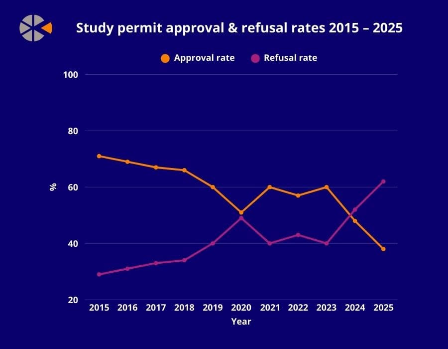
Government figures obtained by The PIE show 62% of applicants were refused a study permit from January to July this year, with record-high volumes “raising urgent questions about transparency and application readiness,” said ApplyBoard.
Despite a decade of relatively stable approval ratings hovering around 60%, rates have plummeted to 38% so far this year, down from 48% in 2024 following the implementation of Canada’s study permit caps.
“It’s clear that Immigration, Refugees and Citizenship Canada (IRCC) is applying far greater scrutiny to new applications,” Jonathan Sherman, vice president of sales & partnership at BorderPass told The PIE, pointing to a “fundamental shift” in government processing.
Data: IRCC
Indian students – who comprise 40% of Canada’s international student population – have been hardest hit by soaring refusals, with four out of five Indian students receiving rejections in Q2 2025, according to BorderPass.
Stakeholders have pointed to a glimmer of hope in overall approval ratings rising modestly this spring, though without a “dramatic shift,” Canada will only reach one fifth of the government’s international student target for the year, Sherman warned.
With institutions bracing for severe declines, ApplyBoard analysis has found the most common reason for reason for rejection in 2024 was the perception by IRCC officers that students wouldn’t leave Canada after their studies, cited in over 75% of cases.
“While reviewers at IRCC understand that some future students hope to gain work experience in Canada after graduation… the extensive use of this reason last year suggests that many are perceived as having permanent residency as their primary purpose, instead of study,” stated the report.
Financial concerns drove three of the top five refusal reasons, after Canada more than doubled its proof-of-funds requirements from $10,000 in 2023 to $20,635 in 2024.
Specifically, in 53% of cases, IRCC officers said they were unconvinced that applicants would leave Canada based on financial assets, alongside doubts about insufficient resources for tuition and living expenses.
“While new policy caps played a role, our full-year data points to recurring applicant challenges, particularly around financial readiness and immigration intent that are preventable with the right guidance and documentation,” said ApplyBoard.
The report highlighted the continuing decline of unspecified reasons for refusal, following IRCC adding officer decision notes to visa refusal letters last month, which was welcomed as a much-needed step in improving transparency.
Other reasons for refusal include the purpose of visit being inconsistent with a temporary stay and having no significant family ties outside Canada.
The data comes amid a major immigration crackdown in Canada, with temporary resident targets included in the latest Immigration Levels Plan for the first time, which aims to reduce temporary resident volumes to 5% of the population by the end of 2027 – a year later than the previous government’s target.
Many are perceived as having permanent residency as their primary purpose, instead of study
ApplyBoard
Approval rates are also below average for other temporary resident categories, but none so drastically as study permits, with just under half of all visitor visas approved so far this year, compared to a ten-year average of 64%.
After more than 18 months of federal policy turbulence, changing eligibility rules have likely contributed to the rise in study permit rejection rates.
Pressure to reduce IRCC backlogs and reach ambitious government targets could also be playing a role, according to immigration lawyers speaking to the Toronto Star.
As of July 31, over 40% of Canada’s immigration inventory was in backlog, including 56% of visitor visas, 46% of work visas and 23% of study visas, according to official data.
Following a swathe of new IRCC officer hires, Sherman said he expected to see improvements in consistency, though “processing backlogs may get worse before they get better,” he warned.
Amid the challenges, educators and advisers are doubling down on what applicants and institutions can do to ensure the best chance of success, with ApplyBoard warning that any incomplete or ineligible documentation can be grounds for refusal.
I was conferencing with a group of students when I heard the excitement building across my third grade classroom. A boy at the back table had been working on his catapult project for over an hour through our science lesson, into recess, and now during personalized learning time. I watched him adjust the wooden arm for what felt like the 20th time, measure another launch distance, and scribble numbers on his increasingly messy data sheet.
“The longer arm launches farther!” he announced to no one in particular, his voice carrying the matter-of-fact tone of someone who had just uncovered a truth about the universe. I felt that familiar teacher thrill, not because I had successfully delivered a physics lesson, but because I hadn’t taught him anything at all.
Last year, all of my students chose a topic they wanted to explore and pursued a personal learning project about it. This particular student had discovered the relationship between lever arm length and projectile distance entirely through his own experiments, which involved mathematics, physics, history, and data visualization.
Other students drifted over to try his longer-armed design, and soon, a cluster of 8-year-olds were debating trajectory angles and comparing medieval siege engines to ancient Chinese catapults.
They were doing exactly what I dream of as an educator: learning because they wanted to know, not because they had to perform.
Then, just recently, I read about the American Federation of Teachers’ new $23 million partnership with Microsoft, OpenAI, and Anthropic to train educators how to use AI “wisely, safely and ethically.” The training sessions would teach them how to generate lesson plans and “microwave” routine communications with artificial intelligence.
My heart sank.
As an elementary teacher who also conducts independent research on the intersection of AI and education, and writes the ‘Algorithmic Mind’ column about it for Psychology Today, I live in the uncomfortable space between what technology promises and what children actually need. Yes, I use AI, but only for administrative work like drafting parent newsletters, organizing student data, and filling out required curriculum planning documents. It saves me hours on repetitive tasks that have nothing to do with teaching.
I’m all for showing educators how to use AI to cut down on rote work. But I fear the AFT’s $23 million initiative isn’t about administrative efficiency. According to their press release, they’re training teachers to use AI for “instructional planning” and as a “thought partner” for teaching decisions. One featured teacher describes using AI tools to help her communicate “in the right voice” when she’s burned out. Another says AI can assist with “late-night lesson planning.”
That sounds more like outsourcing the foundational work of teaching.
Watching my student discover physics principles through intrinsic curiosity reminded me why this matters so much. When we start relying on AI to plan our lessons and find our teaching voice, we’re replacing human judgment with algorithmic thinking at the very moment students need us most. We’re prioritizing the product of teaching over the process of learning.
Most teachers I talk to share similar concerns about AI. They focus on cheating and plagiarism. They worry about students outsourcing their thinking and how to assess learning when they can’t tell if students actually understand anything. The uncomfortable truth is that students have always found ways to avoid genuine thinking when we value products over process. I used SparkNotes. Others used Google. Now, students use ChatGPT.
The problem is not technology; it’s that we continue prioritizing finished products over messy learning processes. And as long as education rewards predetermined answers over curiosity, students will find shortcuts.
That’s why teachers need professional development that moves in the opposite direction. They need PD that helps them facilitate genuine inquiry and human connection; foster classrooms where confusion is valued as a precursor to understanding; and develop in students an intrinsic motivation.
When I think about that boy measuring launch distances with handmade tools, I realize he was demonstrating the distinctly human capacity to ask questions that only he wanted to address. He didn’t need me to structure his investigation or discovery. He needed the freedom to explore, materials to experiment with, and time to pursue his curiosity wherever it led.
The learning happened not because I efficiently delivered content, but because I stepped back and trusted his natural drive to understand.
Children don’t need teachers who can generate lesson plans faster or give AI-generated feedback, but educators who can inspire questions, model intellectual courage, and create communities where wonder thrives and real-world problems are solved.
The future belongs to those who can combine computational tools with human wisdom, ethics, and creativity. But this requires us to maintain the cognitive independence to guide AI systems rather than becoming dependent on them.
Every time I watch my students make unexpected connections, I’m reminded that the most important learning happens in the spaces between subjects, in the questions that emerge from genuine curiosity, in the collaborative thinking that builds knowledge through relationships. We can’t microwave that. And we shouldn’t try.
Chalkbeat is a nonprofit news site covering educational change in public schools.
For more news on AI in education, visit eSN’s Digital Learning hub.
Timothy Cook, Chalkbeat
Timothy Cook, M.Ed., teaches third grade and researches AI’s impact on education. He writes about cognitive development and technology at Psychology Today.
Latest posts by eSchool Media Contributors (see all)
After months of high study permit refusal rates, stakeholders welcome a more successful second quarter of 2025.
But concerns remain about the overall volume of approvals – especially as students from key market India continue to struggle to secure study permits.
Meanwhile, approvals from Ghana surge over 200% compared to Q1 of 2025.
The IRCC data, compiled by BorderPass, showed that while Canadian study permit applications dipped in Q2 2025, the number of approvals increased by 4,450 – leading to a 10% increase in the overall approval rating.
“The encouraging sign is that June saw the highest approval rate of the year at 39%, which could point to a modest improvement in the second half of the year,” Jonathan Sherman, vice-president of sales & partnerships at BorderPass told The PIE News.
After record low approval ratings in Q1, stakeholders have welcomed the rise in approvals, though serious concerns remain about overall volumes.
“Just 31,580 permits were approved in the first half of 2025. IRCC’s published target for the year is about 300,000, which means at the current pace we will only reach around 20% of the goal unless there is a dramatic shift,” warned Sherman.
After Canada’s implementation of the study permit cap in 2024, the approval rate dropped from 67% in 2023 to 45% in 2024. So far in 2025, approvals for new study permits (excluding extensions) are tracking at 31%.
One of the most striking trends is India’s continued decline, with data showing study permit approvals falling another 7% in Q2 to just 20%, reflecting a “fundamental shift in how IRCC is assessing these applications”, said Sherman.
This stands in sharp contrast to the more than 80% approval rates for Indian students just a few years ago, “reflecting a fundamental shift in how IRCC is assessing these applications”, said Sherman.
The widening gap between universities and colleges also stood out in the data, a difference that Sherman said was “reshaping the international education market in Canada”.
Among the top 20 institutions by volume, university approvals have dropped from 63% in 2024 to 53% so far in 2025, but colleges have seen a steeper fall from 60% to 28%.
Colleges have felt the heaviest impact of federal policy changes, including the study permit cap and the new field of study restrictions for post-graduation work permits.
Despite a major win for the college sector in March this year when PGWP eligibility was expanded for degree students at colleges, these institutions have still been the hardest hit by the changes, with many of their programs no longer eligible for a work permit.
“That said, colleges that are focusing on programs with clear labour market outcomes such as health, technology, and skilled trades are showing better results,” noted Sherman.
“The institutions that carefully vet applicants for immigration quality and program alignment are also proving more resilient,” he advised.
At the current pace we will only reach around 20% of IRCC’s published target unless there is a dramatic shift
Jonathan Sherman, BorderPass
Alongside students from India, Iranian students also experienced volatility, with the country’s approval rating falling by more than 50% from Q1. In contrast, Ghana saw its approval rating surge by 225% on the previous quarter.
The approval rating for Chinese students – who make up Canada’s second largest international student cohort – saw stable growth, surpassing 65% approval, and South Korea remained a consistent top performer with approvals at more than 85%.
“Smaller markets like Vietnam, Nepal and Nigeria are also moving – some positively, some unpredictably – creating both new opportunities and risk. For many DLIs, this means rethinking region-based strategies in real time,” advised the BorderPass report.
As well as seeing variations across institution type and source market, a large number of IRCC officers were hired and trained in the first half of 2025, which Sherman said had “introduced some inconsistency in decision making as new processing are applied”.
“On this note, we are hearing that processing backlogs may get worse before they get better,” he warned.
Overall: “It is clear that IRCC is applying far greater scrutiny to new applications,” said Sherman, with the gap between high- and low-performing institutions becoming ever wider.
Specifically, by investing in application intelligence, thoroughly reviewing documents, confirming travel readiness and working with legally backed partners, some institutions have seen approval rates more than double the national average, according to Sherman.


