Sometimes you walk through a city and the city changes around you.
There’s a subtle modulation in feel – the style and tenor of the place is renewed, the rhythm of green spaces shifts, the architectural language expands. Statements made in concrete, brick, limestone, and plate glass are more assertive.
And a new form of power and control begins to be felt. You see what look like guard posts, staffed by a private police force. Gates and passes dictate where you can and cannot go. Parking a car holds a byzantine mystery of its own. Signs are branded, sometimes incomprehensibly, for the attention of an elite you suddenly feel you are not part of.
And who runs these places? Well, you don’t get to choose. What do they do? You don’t get a say. This part of your city is not your city.
It’s a university estate.
Special economic zones
If you like, a university is a freeport – where the goods coming in and out are ideas. It is, to be clear, absolutely a part of a nation state – but it is a separate polity – designed and separated for a purpose. Individually these areas are tiny, but when you start adding things together it gets interesting.
The total population (the FTE of every staff member and student that could be counted as a “citizen” of our higher education zones) is 2.4 million – that’s around the size of Slovenia or Latvia. Staff FTE is closer to 396,000 – larger than the population of Iceland.
University sites extend across 12,887 hectares of land in the UK – that’s more space than Bristol (the unitary authority area), and larger than Jersey. But for the number of people involved that isn’t a lot of space: the population density (again, using FTE here) is 0.02 FTE/m2 (behind only Macau and Monaco in global terms).
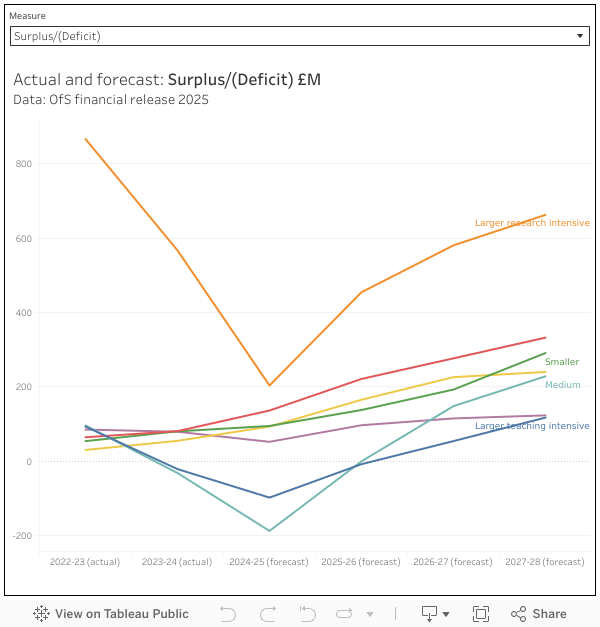
Financially, we are looking at £48bn in income and £39bn in expenditure (these as reported in the Estates dataset, not the Finances dataset, giving us a positive (if weak) balance of trade. Gross national income per FTE (if we use staff only) is £12,192 (that’s 16,518 USD at current prices, a higher equivalent GNI per capita than Russia!)
Land management
According to the Association of University Directors of Estates (AUDE, using last year’s data) our hypothetical micronation spends around £200m on defence (or security if you’d rather) each year. If you include maintenance and repair – another essential way to protect the value of your estates assets, we’re pushing our total up beyond £1bn. And if you factor in all spending on premises (cost centre 205, which includes things like taxes, rental payments, energy, and insurance) – we are talking in the region of £6bn.
This spending covers a lot of work. Higher education involves the use of just under 16,000 buildings – everything from student accommodation and office blocks, from nuclear reactors to wind tunnels, from listed buildings to literal pigsties. It isn’t published in the open data, but last year AUDE tells us the proportion of buildings rated as being in condition C (operational but major repair or replacement needed in the short to medium-term) and D (inoperable or serious risk of major failure or breakdown) was 23.8 per cent – the building stock is deteriorating, year on year, as repair and maintenance backlogs grow.
What we do see in published data is display energy certificates (DEC) and and energy performance (EPC) certificates, two broadly comparable ways of rating the environmental performance of buildings. It’s not a direct line that can be drawn, but a well maintained estate (or an estate where old buildings are replaced with new) is likely to become more energy efficient over time and a poorly maintained estate will tend to lose efficiency. This year 28.21 per cent of sector non-residential estates were in categories E, F, or G – broadly the same as last year, for a larger estate that still includes a number of older buildings that are never going to reach modern efficiency standards, but still a concern.
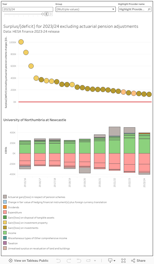
Though higher education involves the creation of intangible assets (everything from intellectual property to the future value of graduates in wider society), the estate represents the sector’s tangible assets. Should we lose a provider to the financial storms the sector faces, it is to the estate that creditors (or potential buyers) might look to release funds.
Zero and below
The UK’s COP29 pledges – in the service of a global “net zero” carbon in 2050 – have become increasingly politically controversial as the costs of doing pretty much anything have risen (due to a range of geopolitical factors far too well-known and tedious to go into here having an impact on supply chains and labour availability).
In our hypothetical UK higher education micronation – given what is popularly imagined to be a progressive, science-informed, population – you would expect an element of leadership in sustainability and decarbonisation. And indeed, this has been the case. But this stuff comes at a cost.
OfS’s review of the financial stability of providers in England in 2024 suggested that a key driver of continued financial challenge was:
The affordability of necessary estate maintenance and development and the significant cost of investment needed to reduce carbon emissions as part of providers’ commitments to achieve net zero.
A year later, the mention of net zero had been scrubbed entirely:
the significant cost of investment needed to reduce carbon emissions as part of a commitment to tackling environmental sustainability
Despite governments having an interest in the improving the sustainability of, and reducing emission from campuses (for example the education system sustainability and climate change strategy, first published by DfE in 2021 under the auspices of noted doyenne of woke activism Nadhim Zahawi) there is no statutory energy and carbon reporting route in English higher education(as there is for FE colleges and schools). The closest OfS gets is to gently ask those bidding for historically tiny amounts of capital to offer “assurance that providers have considered practical solutions towards achieving environmental sustainability as part of their bid”.
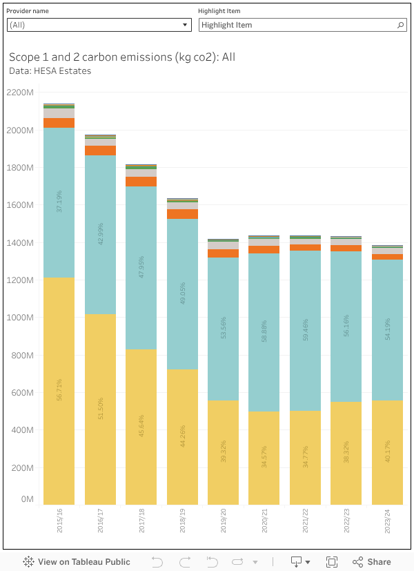
Our UK HE micronation, as well as being a good global citizen, also has an interest in driving down long-term costs. Fossil fuels are only going to get more expensive in the long run, switching to alternatives and moving to greater efficiency makes business sense even if there are initial costs. There has been some progress with scope 1 and 2 emissions (another fall last year), though this is limited compared to what could be achieved last decade: much of the “easy” work has already been done. That said, we’re still talking about 1.4m tonnes of carbon a year, equivalent to a small African country (Eswatini, formerly Swaziland, is a decent comparator) – and this is only scope 1 and 2 (direct) emissions, factoring in the supply chains and travel within scope 3 is another matter.
Zones of proximal development
So, while it is undeniably fun to see UK higher education at the scale of a small country, it still remains firmly rooted in the four home nations. But the exercise prompted me to think – are there other zones within the UK that have been designed to optimise specific benefits for the areas and nations around them?
These days its all industrial strategy zones, but in terms people may recognise we might think about enterprise zones designed to stimulate economic growth by offering incentives to business – there are 48 in England. We have the internationally focused freeports, of course – 12 of them in the UK, and 7 investment zones (to date) that aim to unlock opportunities for business. In each of these examples the actual zones are quite small (almost like campuses, in fact) but the focus is on the impact on a wider local area (where workers may commute from, for example).
Zones like this reflect a global trend towards special economic zones (SEZs) which disapply national rules (around tax, customs, state aid, planning and so on – in some international examples we get as far as labour laws and immigration rules) in the interests of commercial activity. The wilder fringes of policies like this are pretty terrifying, but the UK does appear to be open to paddling in the shallower waters.
Which prompts the question – if universities are like freeports (better than freeports, in fact, as they have a proven track record of providing local benefits) why not offer the relaxation of some national regulations to encourage them to expand and develop in the areas that we want them to? Perhaps it should be easier for UK higher education to recruit international staff – perhaps there should be reductions of employer national contributions with respect to UK staff. Perhaps planning could be easier around established campuses? Perhaps it should be easier to unlock state investment to improve estates without triggering the rules that would drag us into the public sector? Perhaps we could unlock investment and incentives for clean electricity generation and area heating systems?
In the absence of an increase in tuition fees or income from OfS, a special economic zone (or zones) for higher education might be a way forward. The ideas of universities as largely self-administrating state-like entities within a country is an old one (the early days of Oxford featured a parallel judicial system, that ended up provoking riots and the foundation of Cambridge!) and perhaps worth revisiting.