
Check-in on Administrative Bloat, 2025 Edition
It’s been a little over five years since I took a serious dive into the question of “administrative bloat,” which apparently exists everywhere but in the statistics. Still, always good to check assumptions every once in a while, and I thought five years was long enough to make a new look at the data worthwhile. So here goes:
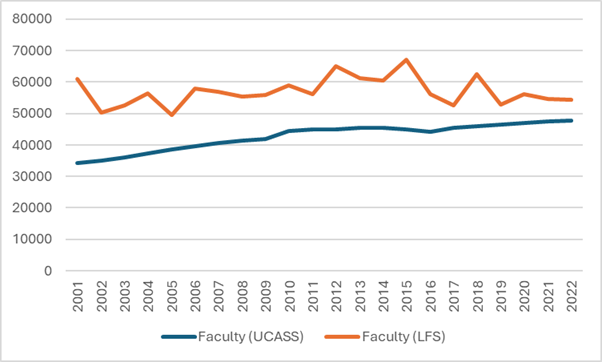
Let’s start by reviewing what we can and cannot know about staffing at Canadian universities. StatsCan tracks the number of permanent ranked faculty pretty accurately through its University and College Academic Staff Survey (UCASS), and in a loosey-goosier fashion through the Labour Force Survey. The latter gives much higher numbers than the former, as shown below in Figure 1, which compares the number of “ranked” academics from UCASS with the number of permanent, full-time academics from the LFS.
Figure 1 – Full-time Academic Staff Numbers According to LFS and UCASS
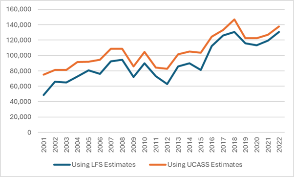
StatsCan also tracks the total number of employees—both salaried and hourly—in the university sector using the Survey of Employment, Payroll and Hours (SEPH). However, in theory, if you subtract the number of FT academic staff from the number of total staff, you should be able to get the total number of non-academic staff, right? Well, unfortunately, this is where the discrepancy between UCASS and LFS runs into some problems. In Figure 2, I show the implied number of non-academics using both methods. The growth rates are different because of the difference in observations in the early period, but the two estimates do both converge on the observation that there are about 130,000 non-academic staff at Canadian universities, or about two and a half times the complement of academic staff.
Figure 2 – Implied Non-Academic Staff Numbers using SEPH, LFS and UCASS
So, that’s evidence of bloat, right? Well, maybe. Personally, what I take from Figure 2 is that either (or both) the LFS numbers and the SEPH numbers are probably flaming hot garbage. There’s simply no way that the number of non-academic staff has increased by 170% in the past twenty years, as a combination of the SEPH and LFS data suggests. For reasons that will become apparent shortly, I also have serious doubts that it’s increased by 85% either, as the combination of SPEH and UCASS suggests. Because there is a second set of data available to look at this question, one that shows expenditure on salaries, and it shows a much different picture.
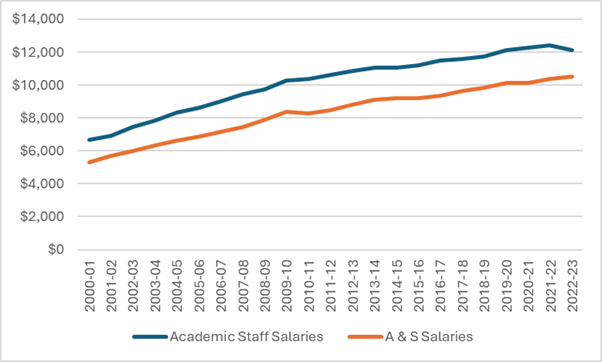
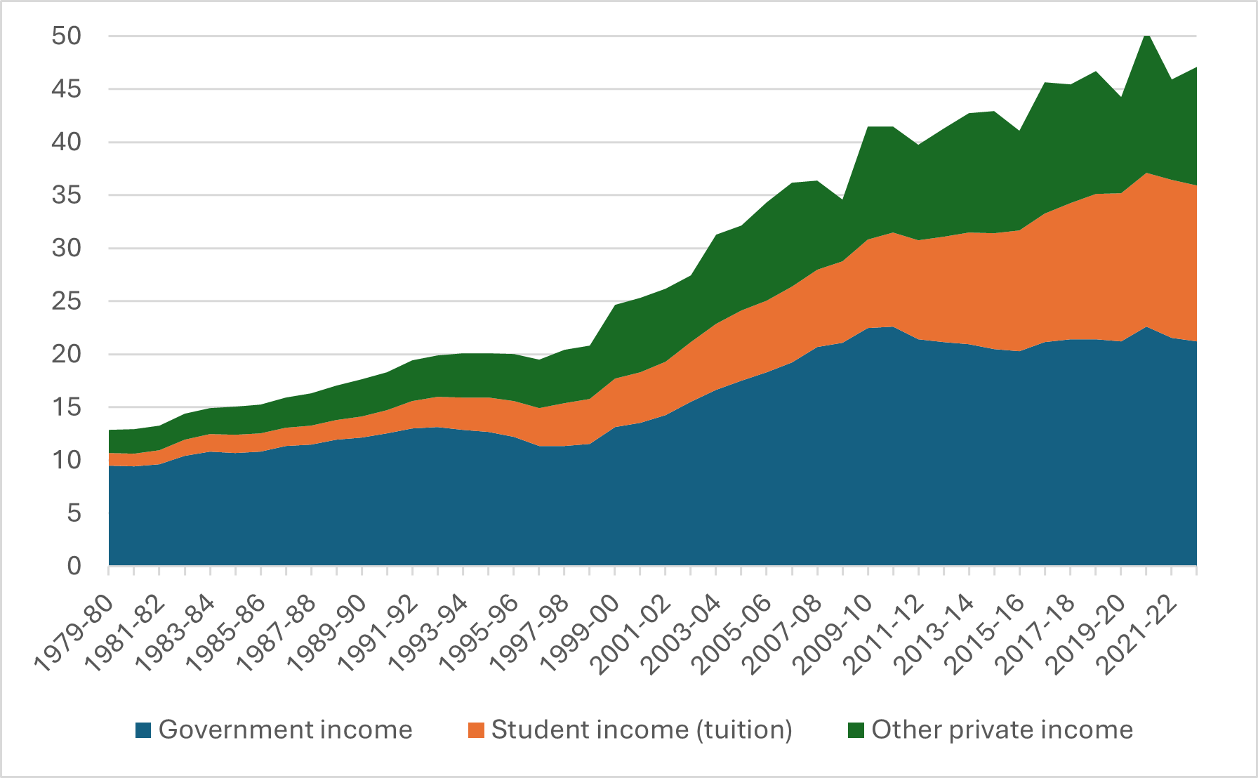
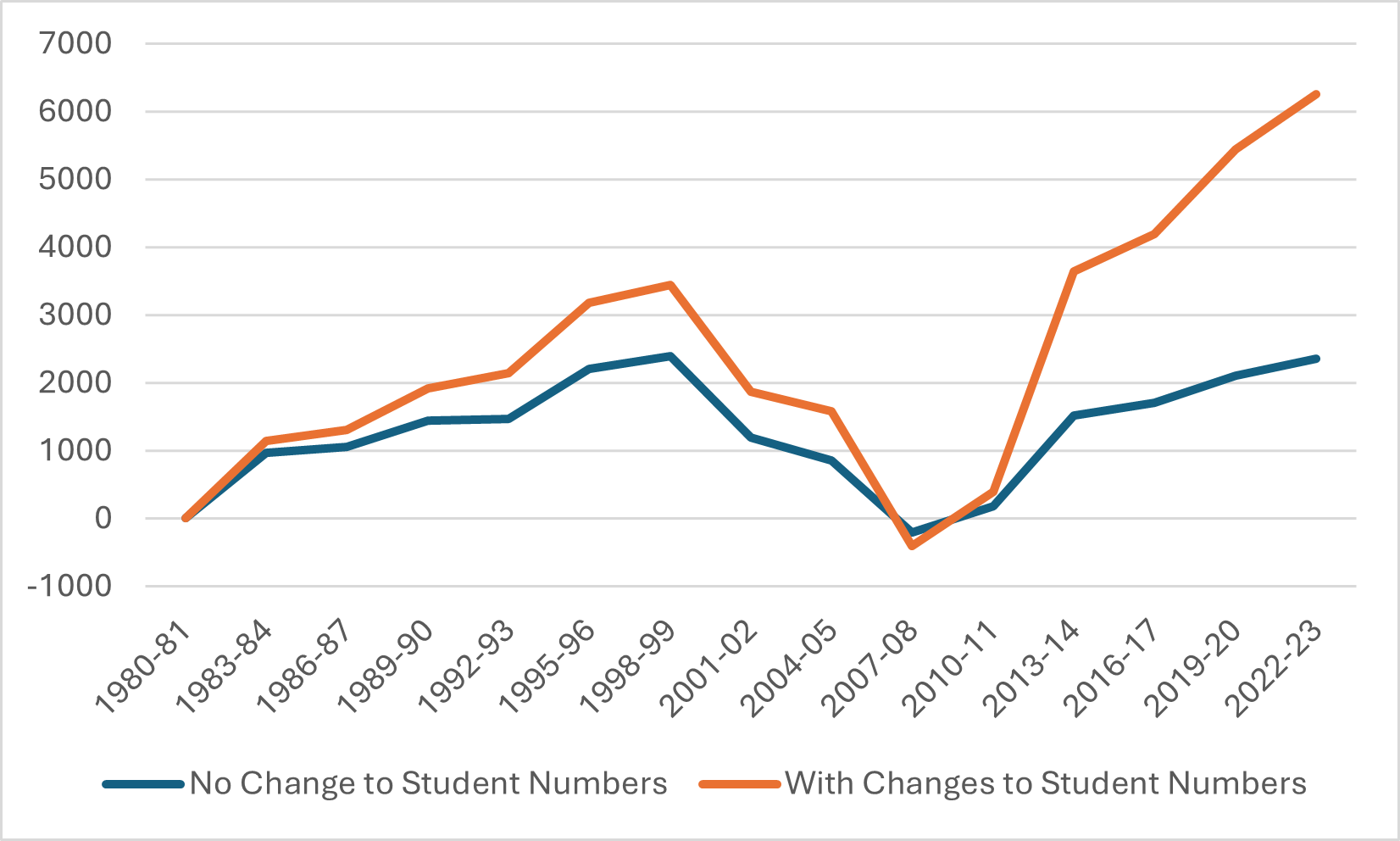
The annual FIUC survey shows how much money is spent on wages for ranked academics as well as how much is spent on non-academics (it also shows wages for instructional staff without academic rank,” but I exclude this here for ease of analysis). Over the past three years, it is true that non-academic salary mass has risen, and academic ones have not (score for the bloat theory!), but looked at with a 25-year lens, Figure 3 shows that the rate of increase is about the same (score one against).
Figure 3 – Total Expenditures on Salaries by Employee Group, in millions of $2023
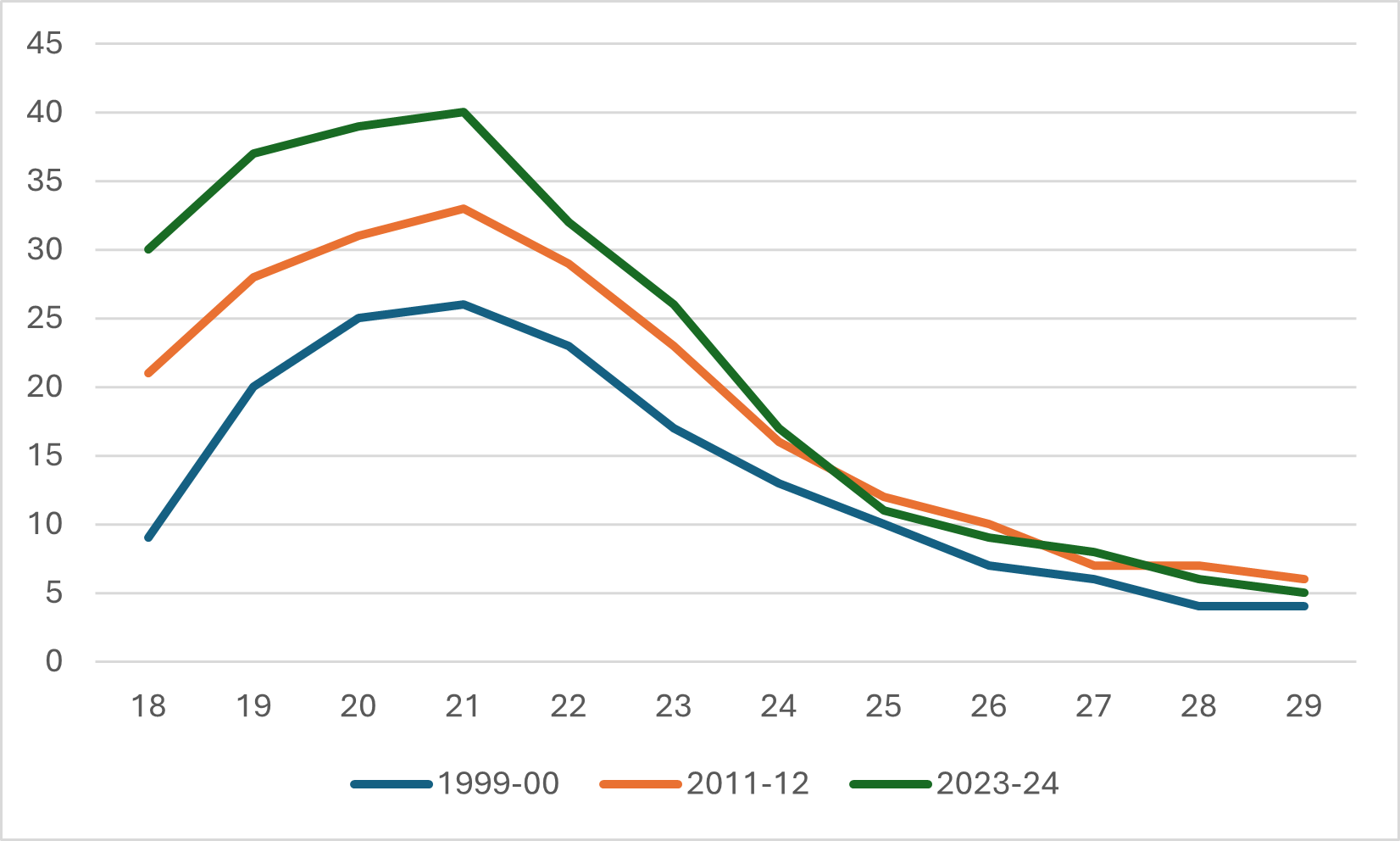
Basically, the salary data in Figure 3 tells a completely different story than the SEPH/LFS/UCASS data in Figure 2. All you do is divide the spending data by the implied headcounts to see what I mean (which I do below). Figure 4 shows the implied change in average academic pay and average A&S pay, dividing total FIUC pay by the UCASS academic staff numbers and the A&S staff numbers implied by subtracting the UCASS numbers from the SEPH numbers, i.e., the orange line from Figure 2. To believe both sets of data, you have to believe that average academic salaries have increased substantially while average salaries for non-academics have declined substantially.
Figure 4 – Change in Implied Average Pay, Academic Staff vs. A&S Staff, 2001-02 = 100
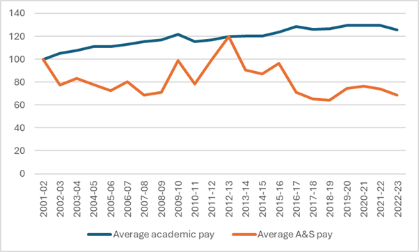
In Figure 4, the blue line representing academic salaries is more or less consistent with the long-term trend in salaries we have seen by looking at salary survey data (which I last did back here): significant growth in the 00s and much slower growth thereafter. There are no staff salary surveys to use for comparison, but let’s put it this way: when people talk about “bloat” in non-academic staff positions, they normally mean it in the sense that the bloat is coming from expensive A&S staff, overpaid A&S staff, etc. For Figure 4 to be true, the growth in staff numbers would need to come almost entirely from more junior, less well-paid staff. It’s not impossible that this is true, but it’s not consistent with the general vibe about bloat, either
So who knows, really? There’s a lot of contradictory data here, some of which argues strongly in favour of the bloat argument, but quite a bit of which points in the other direction. Better data is needed to answer this question probably isn’t forthcoming.
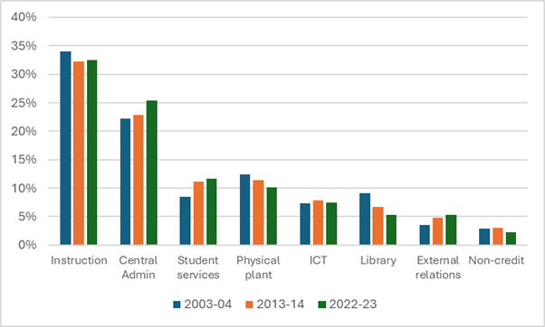
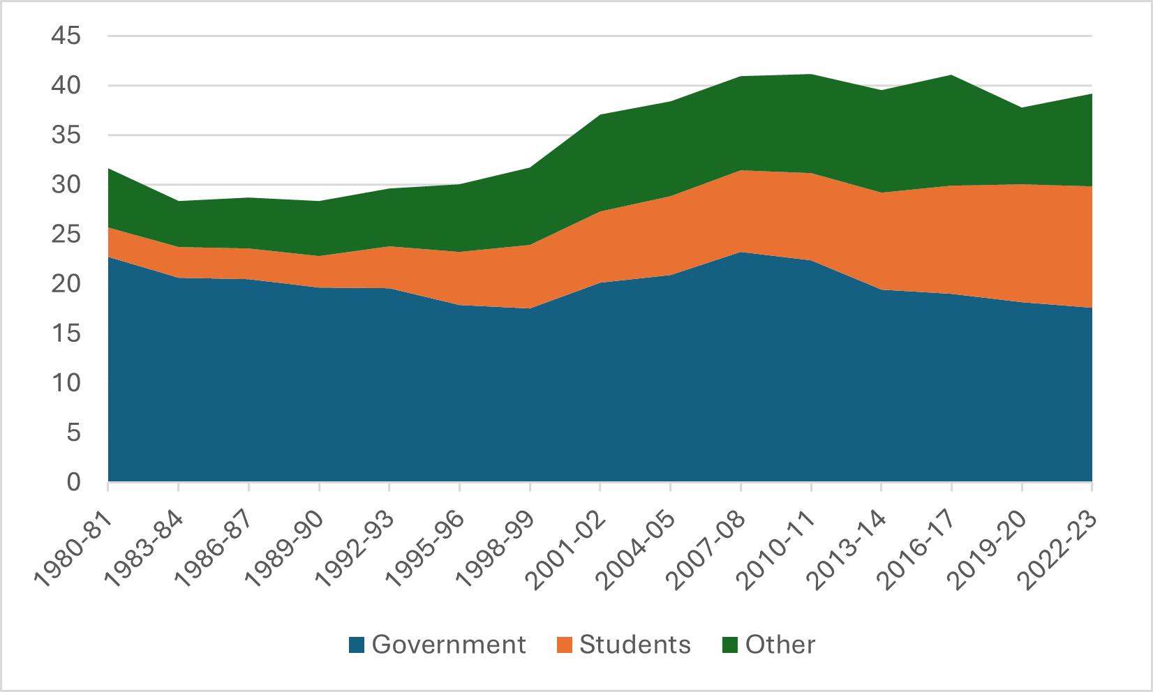
Meanwhile, we can take one last look at A&S expenditure data. We can check to see if the pattern of A&S salary expenditures across university operating functions has changed over time. As Figure 5 shows, the answer is “a little bit.” Central Administration now takes up 25% of total A&S salary expenditures, up from 22% 20 years ago. Student services and external relations are up much more sharply in proportional terms, but since they were both starting from a low base, they don’t impact the overall numbers that much. Libraries, physical plant, and non-credit instruction are the categories losing share.
Figure 5: Share of Total A&S Salary Mass by Function, Canadian University Operating Grants, Select Years
And there you have it: more data than you probably needed on administrative bloat. See you back here again in 2030.

