Category: student outcomes

  • Alterni-TEF, 2026 | Wonkhe

    Alterni-TEF, 2026 | Wonkhe

    The proposal that the Office for Students put out for consultation was that the teaching excellence framework (TEF) will become a rolling, annual, event.

    Every year would see an arbitrary number of providers undergo the rigours (and hefty administration load) of a teaching excellence framework submission – with results released to general joy/despair at some point in the autumn.

    The bad news for fans of medal-based higher education provider assessments is that – pending the outcome of the recent ask-the-sector exercise and another one coming in the summer – we won’t get the first crop of awards until 2028. And even then it’ll just be England.

    No need to wait

    Happily, a little-noticed release of data just before Christmas means that I can run my own UK Alterni-TEF. Despite the absence of TEF for the next two years, OfS still releases the underlying data each year – ostensibly to facilitate the update of the inevitable dashboard (though this year, the revised dashboard is still to come).

    To be clear, this exercise is only tangentially related to what will emerge from the Office for Student’s latest consultation. I’ve very much drawn from the full history of TEF, along similar lines to my previous releases.

    This version of the TEF is (of course) purely data driven. Here’s how it works.

    • I stole the “flags” concept from the original TEF – one standard deviation above the benchmark on each indicator is a single flag[+], two would be a double flag[++] (below the benchmark gives me a single[-] or double[- -] negative flag). I turned these into flag scores for each sub award: [++] is 2, [- -] is minus 2 and so on. This part of the process was made much more enjoyable by the OfS decision to stop publishing standard deviations – I had to calculate them myself from the supplied (at 95%) confidence intervals.
    • If there’s no data for a split metric at a provider, even for just one flag, I threw it out of that competition. If you can’t find your subject at your provider, this is why.
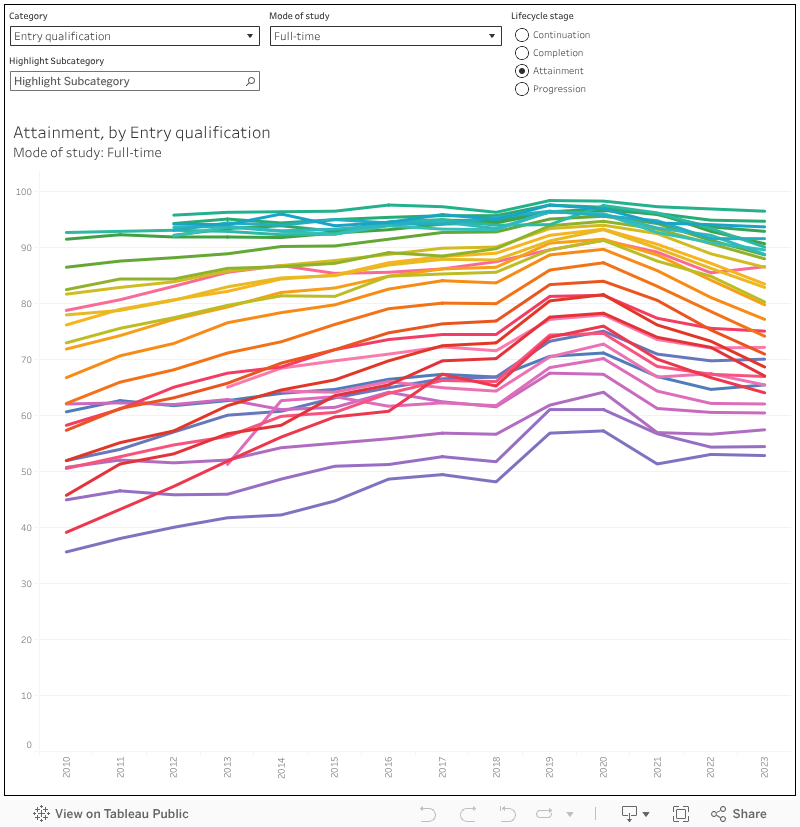
    • For the Student Outcomes sub-award (covering continuation, completion, and progression) three or more positive flags ( or the flag score equivalent of [+++] or above) gives you a gold, three or more negative flags or equivalent gives you a bronze. Otherwise you’re on silver (there’s no “Needs Improvement” in this game, and a happy absence of regulatory consequences)
    • For the Student Experience sub-award, the flag score equivalent of seven or more positive flags lands you a gold, seven or more negative gets you a bronze.
    • Overall, if you get at least one gold (for either Outcomes of Experience) you are gold overall, but if you get at least one bronze you are bronze overall. Otherwise (or if you get one bronze and one gold) you get a silver.
    • There’s different awards for full-time, part-time, and apprenticeship provision. In the old days you’d get your “dominant mode”, here you get a choice (though as above, if there’s no data on even one indicator, you don’t get an award).

    There are multiple overall awards, one for each split metric. To be frank, though I have included overall awards to put in your prospectus (please do not put these awards into your prospectus) the split metrics awards are much more useful given the way in which people in providers actually use TEF to drive internal quality enhancement.

    Because that’s kind of the point of doing this. I’ve said this before, but every time I’ve shown plots like this to people in a higher education provider the response is something along the lines of “ah, I know why that is”. There’s always a story of a particular cohort or group that had a bad time, and this is followed by an explanation as to how things are being (or most often, have been) put right.

    Doing the splits

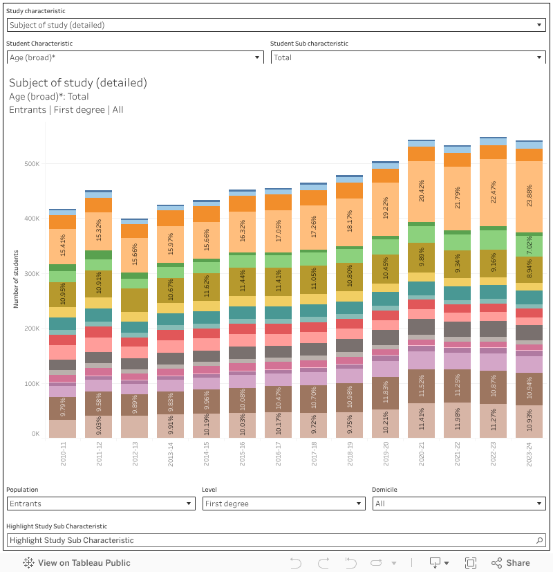
    In previous years I’ve just done subject TEF, but there’s no reason not to expand what is available to cover the full range of split metrics that turn up in the data. Coverage includes:

    • Overall
    • Subject area (a variant on CAH level 2)
    • ABCs quintile (the association between characteristics OfS dataset)
    • Deprivation quintile (using the relevant variant of IMD)
    • Sex
    • Ethnicity
    • Disability indicator
    • Age on course commencement (in three buckets)
    • Graduate outcomes quintile
    • Level of study (first degree, other undergraduate, UG with PG components)
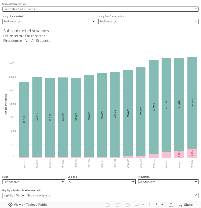
    • Partnership type (taught in house, or subcontracted out)

    The data as released also purports to contain data on domicile (I couldn’t get this working with my rules above) and “year” which refers to a year of data in each metric. To avoid confusion I haven’t shown these.

    In each case there is different data (and thus different awards) for full time, part time, and apprenticeship provision. It’s worth noting that where there is no data, even for a single indicator, I have not shown that institution as having provision referring to that split. So if you are standing in your department of mathematics wondering why I am suggesting it doesn’t exist the answer is more than likely that there is missing data for one of your indicators.

    Here, then, is a version that lets you compare groups of students within a single institution.

    [Full screen]

    And a version that lets you look at a particular student subgroup for all providers.

    [Full screen]

    For each, if you mouse over an entry in the list at the top, it shows a breakdown by indicator (continuation, completion, progression for student outcomes; six cuts of National Student Survey question group data for student experience) at the bottom. This allows you both to see how the indicator compares against the benchmark, view flag scores (the colours) by indicator, and see how many data points are used in each indicator (the grey bar, showing the denominator).

    More detail

    The Office for Students did briefly consider the idea of a “quality risk register” before it was scrapped in the latest round of changes. In essence, it would have pointed out particular groups of students where an indicator was lower than what was considered normal. To be honest, I didn’t think it would work at a sector level as well as at the level of the individual institution – and I liked the idea of including NSS-derived measures alongside the outcomes (B3) indicators.

    So here’s an alternative view of the same data that allows you to view the underlying TEF indicators for every group (split) we get data for. There’s a filter for split type if you are interested in the differing experience of students across different deprivation quintiles, ethnicities, subjects, or whatever else – but the default view lets you view all sub-groups: a quality risk register of your very own.

    [Full screen]

    Here the size of the blobs show the number of students whose data is included in each group, while the colour shows the TEF flag as a quick way for you to grasp the significance and direction of each finding.

    Understanding the student experience in 2026

    Data like this is the starting point for a series of difficult institutional conversations, made all the harder by two kinds of financial pressure: that faced by students themselves (and affecting the way they are able to engage with higher education) and that faced by providers (a lack of resources, and often staff, to provide supportive interventions).

    There’s no easy way of squaring this circle – if there was, everyone would be doing it. The answers (if there are answers) are likely to be very localised and very individual, so the wide range of splits from institutional data available here will help focus efforts where they are most needed. Larger providers will likely be able to supplement this data with near-realtime learner analytics – for smaller and less established providers releases like this may well be the best available tool for the job.

    More than ever, the sector needs to be supplementing this evidence with ideas and innovations developed by peers. While a great deal of public funding has historically been put into efforts to support the sharing of practice, in recent years (and with a renewed emphasis on competition under the Office for Students in England) the networks and collaborations that used to facilitate this have begun to atrophy.

    Given that this is 2026, there will be a lot of interest in using large language models and similar AI-related technologies to support learning – and it is possible that there are areas of practice where interventions like this might be at use. As with any new technology the hype can often run ahead of the evidence – I’d suggest that Wonkhe’s own Secret Life of Students event (17 March, London) would be a great place to learn from peers and explore what is becoming the state of the art, in ways that do not endanger the benefits of learning and living at a human scale.

    Meanwhile it is ironic that an approach developed as an inarguable data-driven way of spotting “poor quality provision” has data outputs that are so useful in driving enhancement but are completely inadequate for their stated purpose. Whatever comes out of this latest round of changes to the regulation of quality in England we have to hope that data like this continues to be made available to support the reflection that all providers need to be doing.

    Source link

  • OfS characteristics dashboards, 2025 release

    OfS characteristics dashboards, 2025 release

    The Office for Students releases a surprisingly large amount of data for a regulator that is supported by a separate “designated data body”.

    Some of it is painfully regulatory in nature – the stuff of nightmares for registrars and planning teams that are not diligently pre-preparing versions of the OfS’ bespoke splits in real time (which feels like kind of a burden thing, but never mind).

    Other parts of it feel like they might be regulatory, but are actually descriptive. No matter how bad your provider looks on any of the characteristics, or access and participation, indicators it is not these that spark the letter or the knock on the door. But they still speak eloquently about the wider state of the sector, and of particular providers within it.

    Despite appearances, it is this descriptive data that is likely to preoccupy ministers and policymakers. It tells us about the changing size and shape of the sector, and of the improvement to life chances it does and does not offer particular groups of students.

    Outcomes characteristics

    How well do particular groups of students perform against the three standard OfS outcomes measures (continuation, completion, progression) plus another (attainment) that is very much in direct control of individual providers?

    It’s a very pertinent question given the government’s HE Reform agenda language on access and participation – and the very best way to answer it is via an OfS data release. Rather than just the traditional student characteristics – age, ethnicity, the various area based measures – we get a range of rarities: household residual income, socioeconomic status, parental higher education experience. And these come alongside greatly expanded data on ethnicity (15 categories) and detail on age.

    Even better, as well as comparing full time and part-time students, we can look at the performance of students by detailed (or indeed broad) subject areas – and at a range of levels of study.

    We learn that students from better off (residual income at £42,601 or greater) are more likely to progress to a positive outcome – but so are students of nursing. Neither of these at the level of medical students, or distance learning students – but very slightly above Jewish students. The lowest scoring group on progression is currently students taught via subcontractual arrangements – but there are also detriments for students with communication-related disabilities, students from Bangladeshi backgrounds, and students with “other” sexual orientations.

    In some cases there are likely explanatory factors and probably intersections – in others it is anyone’s guess. Again and again, we see a positive relationship between parental income or status and doing well at higher education: but it is also very likely that progression across the whole of society would show a similar pattern.

    On this chart you can select your lifecycle stage on the top left-hand side, and use the study characteristics drop down to drill into modes of study or subject – there’s also an ability to exclude sub-contractual provision outside of registered provider via the population filter. At the bottom you can set domicile (note that most characteristics are available only for UK students) and level of study (again note that some measures are limited to undergraduates). The characteristics themselves are seen as the individual blobs for each year: mouse over to find similar blobs in other years or use the student characteristic filter or sub-characteristic highlighter to find ones that you want.

    [Full screen]

    The “attainment” life cycle stage refers to the proportion of undergraduate qualifiers that achieve a first or upper second for their first degree. It’s not something we tend to see outside of the “unexplained first” lens, and it is very interesting to apply the detailed student characteristics to what amounts to awarding rates.

    It remains strikingly difficult to achieve a first or upper second while being Black. Only 60 per cent of UK full time first degree students managed this in 2023-24 which compares well to nearer 50 per cent a decade ago, but not so well with the 80 per cent of their white peers. The awarding gap remains stark and persistent.

    Deprivation appears to be having a growing impact on continuation – again for UK full time first degree students, the gap between the most (IMD Q1, 83.3 per cent) and least (Q5 93.1 per cent) deprived backgrounds has grown in recent years. And the subject filters add another level of variation – in medicine the different is tiny, but in natural sciences it is very large.

    Population characteristics

    There are numerators (number of students where data is included) and denominators (number of students with those characteristics) within the outcomes dashboard, but sometimes we just need to get a sense of the makeup of the entire sector – focusing on entrants, qualifiers, or all students.

    We learn that nearly 10 per cent of UK first degree students are taught within a subcontractual arrangement – rising to more than 36 per cent in business subjects. Counter-intuitively, the proportion of UK students studying other undergraduate courses (your level 4 and 5 provision) has fallen in previous years – 18 per cent of these students were taught via sub contractual arrangements in 2010, and just 13 per cent (of a far lower total) now. Again, the only rise is in business provision – sub-contractual teaching is offered to nearly a quarter of non-degree undergraduates from UK domiciles there.

    More than a third (33.14 per cent) of UK medicine or dentistry undergraduates are from managerial or professional backgrounds, a higher proportion than any other subject area, even though this has declined slightly in recent years.

    Two visualisations here – the first shows student characteristics as colours on the bars (use the filter at the top) and allows you to filter what you see by mode or subject area using the filters on the second row. At the bottom you can further filter by level of study, domicile, or population (all, entrants, or qualifiers). The percentages include students where the characteristic is “not applicable” or where there is “no response” – this is different from (but I think clearer than) the OfS presentation.

    [by student characteristic]

    The second chance puts subject or mode as the colours, and allows you to look at the make up of particular student characteristic groups on this basis. This is a little bit of a hack, so you need to set the sub characteristic as “total” in order to alter the main characteristic group.

    [by study characteristic]

    Entry qualification and subject

    Overall, UK undergraduate business students are less likely to continue, complete, attain a good degree, or a positive progression outcome than their peers in any other subject area – and this gap has widened over time. There is now a 1.5 percentage point progression gap between business students and creative or performing arts students: on average a creative degree is more likely to get you into a job or further study than one in business, and this has been the case since 2018.

    And there is still a link between level 3 qualifications and positive performance at every point of the higher education life cycle. The data here isn’t perfect – there’s no way to control for the well documented link between better level 3 performance (more As and A*s, less Cs, Ds and BTECs) and socioeconomic status or disadvantage. Seventy two per cent of the best performing BTEC students were awarded a first or upper second, 96 per cent of the best performing A level students.

    This is all taken from a specific plot of characteristics (entry qualification and subject) data – unfortunately for us it contains information on those two topic only, and you can’t even cross plot them.

    [Full screen]

    What OfS makes of all this

    Two key findings documents published alongside this release detail the regulatory observations. The across-the-board decline in continuation appears to have been halted, with an improvement in 2022-23 – but mature entrants are still around 9 percentage points less likely to continue.

    We get recognition of the persistent gap in performance at all levels other than progression between women (who tend to do better) and men (who tend to do worse). And of the counterintuitive continuation benefits experienced by disabled students. And we do get a note on the Black attainment gap I noted above.

    Again, this isn’t the regulatory action end of OfS’ data operations – so we are unlikely to see investigations or fines related to particularly poor performance on some of these characteristics within individual providers. Findings like these at a sector level suggest problems at a structural rather than institutional level, and as is increasingly being made plain we are not really set up to deal with structural higher education issues in England – indeed, these two reports and millions of rows of data do not even merit a press release.

    We do get data on some of these issues at provider level via the access and participation dashboards, and we’ll dive into those elsewhere.

    Source link

  • How About Grade 13? | HESA

    How About Grade 13? | HESA

    Hey everyone, quick bit of exciting Re: University news before we get started. Our speakers are beginning to go live on the site here. We’ll be shouting them out on the blog over the next few weeks, so watch this space. Also, a huge thanks to our many dynamic partners and sponsors for making it all happen, check them out here. And of course, thank you to everyone who has already grabbed a ticket, we are already 75% sold out and we are looking forward to having some very interesting conversations with you in January. Anyway, on with the blog…


    Question:  What policy would increase student preparation for post-secondary education, thus lowering dropouts and average time-to-completion while at the same time lowering per-student delivery costs?

    Answer: Introducing (or re-introducing) Grade 13 and move (or return) to make 3-year degrees the norm.

    It’s a policy that has so many benefits it’s hard to count them all. 

    Let’s start with the basic point that older students on the whole are better-prepared students. In North America, we ask students to grow up and make decisions about academics and careers awfully early. In some parts of the world, they deal with this by having students take “gap years” to sort themselves out. In North America we are very Calvinist (not the good kind) about work and study, and think of tie off just to mature and think as “wasteful”, so we drive them from secondary school to university/college as fast as possible. 

    But there’s no reason that the line between secondary and post-secondary education needs to be where it is today. In antebellum America, the line was in people’s early teens; and age 18 wasn’t an obvious line until after World War II (Martin Luther King Jr. started at Morehead College age 15 because it decided to start taking high school juniors). The Philippines drew the line after 10 years of schooling until about six years ago. Ontario’s elimination of grade 13 was one of the very few examples anywhere in the world of a jurisdiction deciding to roll the age of transition backwards.

    But it’s not clear in Ontario – which has now run this experiment for nearly 25 years – that the system is better off if you make students go to post-secondary education at 18 rather than 19. If you give students an extra year to mature, they probably have a better sense of what specific academic subjects actually consist of and how they lead to various careers. Because they have a better sense of what they want to do with their lives, they study with more purpose. They are more engaged. And almost everything we know about students suggests that more engaged students are easier to teach, switch programs less often, and drop out less frequently. 

    These all seem like good outcomes that we threw away for possibly no good reason.

    Students would spend another year at home. Not all of them would enjoy that, but their parents’ pocket-books sure would. They’d also spend one more year in classes of approximately thirty instead of classes of approximately three hundred. Again, this seems like a good thing.

    And as for cost, well, the per-student cost of secondary education is significantly lower than that of the per-student cost of post-secondary education. I don’t just mean for families, for whom the cost of secondary school is zero. I also mean for governments who are footing the bill for the post-secondary part of the equation, too (at least this is the case everywhere outside Ontario, which has abysmal levels of per-student spending on public post-secondary education). 

    There really is only one problem with moving from a 6+6+4 system of education to a 6+7+3 system.  It’s not that a three-year degree is inherently bad or inadequate. Quebec has a 6+5+2+3 system and as far as I know no one complains. Hell, most of Europe, and to some extent Manitoba, are on a 6+6+3 system and no one blinks. 

    No, the problem is space. Add another year of secondary school and you need bigger secondary schools. And no one is likely to want to get into that, particularly when the system is already bursting – in most of the country, particularly in western Canada – from a wave of domestic enrolments. It is possible that some universities and colleges could convert some of their space to house high schools (the University of Winnipeg has quite a nice one in Wesley Hall), but that wouldn’t be a universal solution. Architecture and infrastructure in this case act as a limiting factor on policy change. However, by the early-to-mid 2030s when secondary student and then post-secondary numbers level off or even start to decline again, that excuse will be gone. Why wouldn’t we consider this?

    (Technically another potential solution here of is to adopt something like a CEGEP, since these which arguably bridge the gap between secondary and university better that grade 13 did. But the real estate/infrastructure demands of creating a new class of institutions probably make that a non-starter).

    Anyways, this is just idle talk. This might be a complete waste of time and money, of course. My suggestions about possible benefits could be totally off. Interestingly, as far as I know, Ontario never did a post-policy implementation review about eliminating grade 13/Ontario Academic Credits. Did we gain or lose as a society? What were the cost implications? Seems like the kind of questions to which you’d want to know the answers (well, I wish I lived in a country that thought these were questions worth answering, anyway). And even if we thought there were benefits to keeping students out of post-secondary for one more year, architectural realities would almost certainly get in the way. 

    But if we’re genuinely interested in thinking about re-making systems of education, these are the sorts of questions we should be asking. Take nothing for granted.

    Source link

  • What works for supporting student access and success when there’s no money?

    What works for supporting student access and success when there’s no money?

    In 2021 AdvanceHE published our literature review which set out to demonstrate significant impact in access, retention, attainment and progression from 2016–21.

    Our aim was to help institutional decision making and improve student success outcomes. This literature has helped to develop intervention strategies in Access and Participation Plans. But the HE world has changed since review and publication.

    Recent sector data for England showed that 43 per cent of higher education providers sampled by the Office for Students (OfS) were forecasting a deficit for 2024–25 and concluded that:

    Many institutions have ongoing cost reduction programmes to help underpin their financial sustainability. Some are reducing the number of courses they offer, while others are selling assets that are no longer needed.

    All the while, institutions are, quite rightly, under pressure to maintain and enhance student success.

    The findings of our 2021 review represent a time, not so long ago, when interventions could be designed and tested without the theorising and evaluation now prescribed by OfS. We presented a suite of options to encourage innovation and experimentation. Decision making now feels somewhat different. Many institutions will be asking “what works now, as we find ourselves in a period of financial challenge and uncertainty?”

    Mattering still matters

    The overarching theme of “mattering” (France and Finney 2009, among others) was apparent in the interventions we analysed in the 2021 review. At its simplest, this is interventions or approaches which demonstrate to students that their university cares about them; that they matter. This can be manifest in the interactions they have with staff, with systems and processes, with each other; with the approaches to teaching that are adopted; with the messages (implicit and explicit) that the institution communicates.

    Arguably, a core aspect of mattering is “free” in terms of hard cash – us showing students that we care about them, their experience, and their progress, for staff to have a friendly approach, a regular check in, and meaningful and genuine dialogue with students. Such interactions may well carry an emotional cost however, and how staff are feeling – whether they feel that they matter to the institution – could impact on morale and potentially make this more difficult. We should also be mindful of the gendered labour that can be evident when teaching academics are encouraged to pick up more “pastoral” care of students; in research-intensive institutions, this may be more apparent when a greater proportion of female staff are employed on teaching focused contracts.

    In our original review we found that there were clear relationships between each student outcome area – access, retention, attainment and progression – and some interventions had impact on more than one outcome. Here are five of our examples, within the overarching theme of mattering, which remind the sector of this impact evidence whilst illustrating developments in thinking and implementation.

    Five impactful practices

    Interventions which provide financial aid or assistance to students pre and post entry were evidenced as impactful in the 2016-2021 literature. We remember the necessity of providing financial aid for students during Covid, with the government even providing additional funding for students in need. In the current financial climate, the provision of extra funding may feel like a dream for many institutions. Cost reduction pressures may mean that reducing sizable student support budgets are an easy short-term win to balance the books.

    In fact late last year, Jim Dickinson predicted just this as the first wave APPs referenced a likely decline in financial support. As evaluative data has shown, hardship funding is used by students to fund the cost of living. When money is tight, an alternative approach is to apply targeted aid where there is evidence of known disadvantage. Historically the sector has not been great at targeting, but it has become a necessity. Preventing student withdrawal has never been more important.

    We also noted that early interventions delivered pre-entry and during transition and induction were particularly effective. The sector has positioned early and foundational experiences of students as crucial for many years. When discussions about cost effectiveness look to models of student support, targeting investment in the early years of study, rather than universally applied, could have the highest impact. Continuation metrics (year one to year two retention) again drive this thinking, with discrete interventions being the simplest to evaluate but perhaps the most costly to resource. Billy Wong’s new evidence exploring an online transition module and associated continuation impact is a pertinent example of upfront design costs (creation), low delivery costs (online), and good impact (continuation).

    Another potentially low cost intervention is the design of early “low stakes” assessment opportunities that give students the chance to have early successes and early helpful feedback which, if well designed, can support students feeling that they matter. These types of assessments can support student resilience and increase the likelihood of them continuing their studies, as well as providing the institution with timely learner analytics regarding who may be in need of extra support (a key flag for potential at-risk students being non-completion of assessments). This itself is a cost saving measure as it enables the prioritisation of intervention and resource where the need is likely to be greatest.

    Pedagogically driven interventions were shown in our review to have an impact across student outcome areas. This included the purposeful design of the student’s curriculum to impact on student learning, attainment, and future progression. Many institutions are embarking on large scale curriculum change with an efficiency (and student experience/outcomes) lens. Thinking long term enough to avoid future change, yet attending to short term needs is a constant battle, as is retaining conversations of values and pedagogy.

    How we teach is perhaps one of the most powerful and “cost-free” mechanisms available, given many students may prioritise what time they can spend on campus towards attending taught sessions. An extremely common concern expressed by new (and not so new) lecturers and GTAs when encouraged to interact with students in their teaching is “But what if I get asked a question that I don’t know the answer to?” Without development and support, this fear (along with an understandable assumption that their role is to “transmit” knowledge) often results in a retreat to didactic, content heavy approaches, a safe space for the expert in the room.

    But participative sessions that embed inclusive teaching, relational and compassionate pedagogies, that create a sense of community in the classroom where contributions are valued and encouraged, where students get to know each other and us – all such approaches can show students that they matter and support their experience and their success.

    We also found that interventions which provided personal support and guidance for students impacted positively on student outcomes. One to one support can be impactful but costly. Adaptations in delivery or approach, for example, small group rather than individual sessions and models of peer support are worth exploring in a resource sensitive environment. Embedding personal and academic support within course delivery and operating an effective referral system for students when needed, is another way to get the most out of existing resources.

    Finally, the effective use of learner analytics was a common theme in our review of impact. Certainly, the proactive use of data to support the identification of student need/risk makes good moral and financial sense. However, large scale investment might be necessary to realise longer term financial gains. This might be an extension of existing infrastructure or as Peck, McCarthy and Shaw recently suggested, HE institutions might turn to AI to play a major role in recognising students who are vulnerable or in distress.

    Confronting the hidden costs

    These financial dilemmas may feel uncomfortable; someone ultimately gains less (loses out?) in a targeted approach to enhancing student success. Equality of opportunity and outcome gaps alongside financial transparency should be at the forefront of difficult decisions (use equality legislation on positive action to underpin targeting decisions as needed). Evaluation, and learning from the findings, become even more important in the context of scarce resources. While quick decisions to realise financial savings may seem attractive, a critical eye on the what works evidence base is essential to have long term impact.

    Beyond our AHE review, TASO has a useful evidence toolkit which notes cost alongside assumed impact and the strength of the evidence. As an example, the provision of information, advice and guidance and work experience are cited as low cost (one star), with high-ish impact (two stars). This evidence base only references specific evidence types (namely causal/type three evidence). The series of evidence-based frameworks (such as Student Success, Employability, Inclusive Practice) from AdvanceHE are alternative reference points.

    The caveat to all of the above is that new approaches carry a staff development cost. In fact, all of the “low cost” interventions and approaches cited need investment in the development and support of academic staff. We are often supported by brilliant teams of learning designers and educational developers, but they cannot do all this heavy lifting on their own given the scale of the task ahead. As significant challenges like AI ask us to fundamentally rethink our purpose as educators in higher education, perhaps staff development is what we should be investing in now more than ever?

    Source link