Tag: Attainment

  • The data-driven path to boosting retention and attainment

    The data-driven path to boosting retention and attainment

    In the global education sector, we have spent much of the last two years looking at artificial intelligence through a defensive lens. The conversation has been dominated by concerns over academic integrity and the perceived threat to traditional assessment. However, as we look at the challenges facing UK higher education in 2026 – chief among them student retention and the widening attainment gap – it is time to shift our perspective.

    What if AI isn’t the problem, but a vital part of the solution?

    New independent research by Dr Rebecca Mace SFHEA, titled Ethical AI in Higher Education: Boosting Learning, Retention and Progression, provides a data-backed argument for this shift. By analyzing over 8,000 data points from diverse UK institutions, the report reveals that when AI is used as a formative “learning partner,” it creates a “stabilising scaffold” that keeps students in school and helps them thrive.

    The “equalising effect” on attainment

    For international and domestic students alike, the leap to university-level academic writing can be daunting. Dr Mace’s research found that formative AI feedback has a powerful “equalising effect”. While writing scores improved across the board, the most rapid gains were seen among lower-performing students.

    The research tracked measurable improvements in core academic areas for students using Studiosity AI for learning:

    • Text analysis: +10.98 points
    • Scientific reports: +7.18 points
    • Essays: +6.72 points

    This isn’t about AI writing for the student; it’s about the student using feedback to master “academic code-switching” – the ability to translate their ideas into the formal language of their discipline.

    A roadmap for retention

    Retention is the “holy grail” for university leaders today. The Mace report identifies a direct positive correlation between the use of Studiosity formative AI for learning and student persistence.

    The data suggests that learning is an iterative process. Students who engaged with the tool showed consistent progress over time, with six submissions appearing to be the “sweet spot” where academic standards become internalised. For a student who might be struggling in silence at 2:00am, having an ethical, 24/7 feedback loop provides the confidence to keep going rather than dropping out.

    From guilt to growth

    Perhaps the most revealing part of the study is the psychological impact on students. Many reported feeling a sense of “guilt” when using AI, even for legitimate study support, due to a lack of clear institutional guidance. This “low-trust culture” is counterproductive.

    As university leaders, you have an opportunity to validate ethical AI use. By providing students with approved, pedagogy-first tools, we move them away from the “gray areas” of the internet and back into a structured, supported learning environment.

    Take the next step

    The evidence is clear: ethical AI is no longer a luxury or a risk to be managed – it is a strategic necessity for any institution serious about student success and social mobility. I invite my colleagues across the sector to dive into the data and see how these findings can be applied to your own student success strategies.

    Click here to download the full research report and explore the data-driven path to boosting retention and attainment.

    About the author: Isabelle Bambury is the managing director UK and Europe at Studiosity. Isabelle has over 20 years’ experience in the education sector, before Studiosity as regional director for Study Group where she led both the UK/Europe and Russia/Central Asia teams. Prior to this, Isabelle held key roles at Cambridge Education Group and Kaplan International, moving into the private sector in 2005 after beginning her career as a secondary school teacher.

    The full report is available for download at www.studiosity.com/download-ethical-ai-studiosity

    About Studiosity: Support and Validate. Studiosity is writing feedback and assessment security that helps educators and leadership support students and validate learning outcomes, and unlike police & punish detection technology, Studiosity helps protect degree value, pedagogically and ethically.

    www.studiosity.com

    Source link

  • Educational Attainment and the Presidential Elections

    Educational Attainment and the Presidential Elections

    I’ve been fascinated for a while by the connection between political leanings and education: The correlation is so strong that I once suggested that perhaps Republicans were so anti-education because, in general, places with a higher percentage of bachelor’s degree recipients were more likely to vote for Democrats.

    The 2024 presidential election puzzled a lot of us in higher education, and perhaps these charts will show you why: We work and probably hang around mostly people with college degrees (or higher).  Our perception is limited.

    With the 2024 election data just out, I thought I’d take a look at the last three elections and see if the pattern I noticed in 2016 and 2020 held.  Spoiler: It did, mostly.

    Before you dive into this, a couple of tips: Alaska’s data is always reported in a funky way, so just ignore it here.  It’s a small state (in population, that is) and it’s very red.  It doesn’t change the overall trends even if I could figure out how to connect the data to maps.  Hawaii’s data is fine, but I don’t put it on the map because it takes a lot of work to get it to fit so that you can read the other states.  It’s a blue state, but also small.  So they balance out.

    Some definitions: Bachelor’s degree attainment is the percentage of people in the county who have a Bachelor’s Degree or higher using 2020 data.  If a county has 100,000 people and 27,500 have a BA, that’s an attainment rate of 27.5.  Nationally, the rate is about 38%.  
    Median income is the Census Bureau statistic showing median earnings in the past twelve months for people who have earnings. 

    The statistic “Percent Democrat” is the percentage of voters who voted for Democrats, among those who voted Democrat or Republican.  In other words, it excludes third-party voters.  The Democrats and Republicans are the only parties with a candidate on every state’s ballot, so it’s the only fair comparison, I think. If you want to count people who throw away their vote, be my guest.

    Simpson’s Diversity Index is a way to talk about diversity that’s a little different than you might think. It is not the percentage of people of color.  Simpson’s Diversity essentially calculates the probability of selecting at random two different categories from a population.  So, if 95% percent of a county is White, it’s not very diverse.  Same as one that’s 80% Black or African-American, or 65% Hispanic.  Higher numbers on Simpson’s means more diversity of the group.  A group with one Hispanic person, one White person, one Black person, and one Asian person would be perfectly diverse, as you’d always pick two people from different groups in a random sample.

    Final tips: It’s important to interact here by using the sliders and/or filters, and/or highlighters.  You can’t break anything; you can always reset the view using the little arrow at lower right. 

    There are seven views here, accessible via the tabs across the top.  

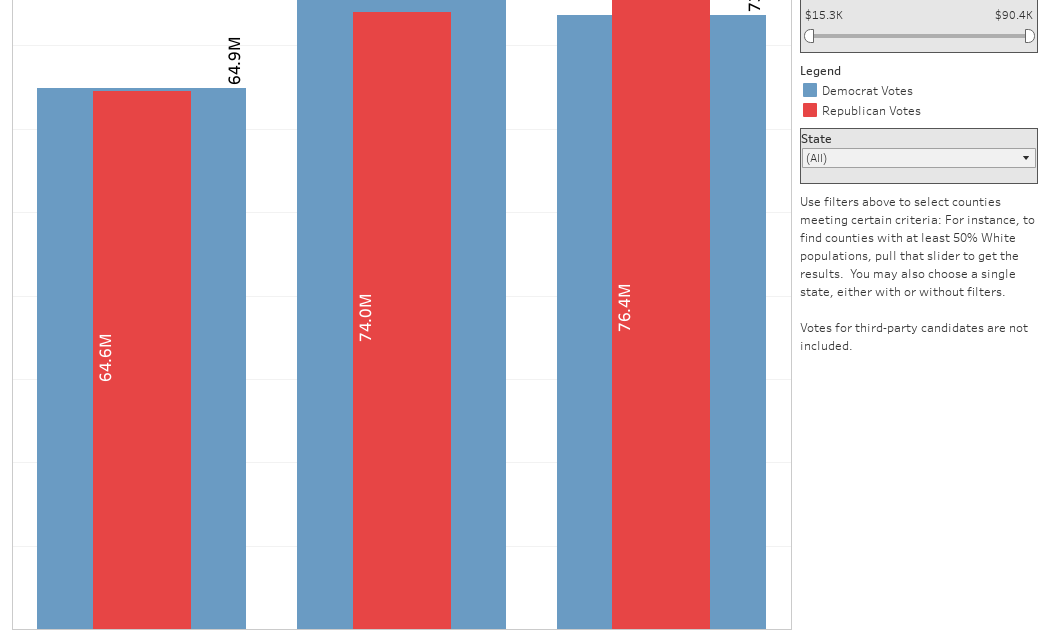
    National View shows all the data from all the counties rolled up to a year.  You can see Democrat and Republican votes on the bars.  Use the sliders to only include counties with certain levels of income, diversity or educational attainment, nationally or in a single state.  You’ll probably quickly see the great American divide.

    Ed Attainment Splits is the same data, but divided.  Each group of bars shows increasing attainment, from left to right.  So at the far left is the aggregation of all counties with lower attainment, and as you move to the right within a year, you see higher levels of bachelor’s degree attainment. The three tallest blue bars tell the story of 2024 in a way no political scientist can.

    The next three views show scatter plots, with Percent Voting Democrat on the y-axis (vertical).  The three different views just swap out three different values: Bachelor’s degree attainment, Median Income, and Simpson’s Diversity.  These three things largely covary, so the similar patterns should not surprise.  The bubbles are sized by the number of voters, and you can hover over any bubble for details.  Use the Highlight Tool at top to focus only on Blue, Purple, or Red counties.

    The cleverly named view titled “Map” shows every county colored by its political lean.  You can choose a year at top left, and only show certain counties using the various filters at top. Again, you can’t break anything by interacting, and a reset is a click away.

    And finally, because there is one in every group who points to the preponderance of red on the map and thinks it’s meaningful, the final view shows Land Doesn’t Vote. Los Angeles County (in yellow) has more people by itself than all the blue states plus Hawaii combined. And it has more people than all the orange states combined, too.  

    I hope you find this as interesting as I did.  

    Source link

  • Education Levels in the US, by State and Attainment

    Education Levels in the US, by State and Attainment

    Attainment has always been an interesting topic for me, every since I first got stunned into disbelief when I looked at the data over time.  Even looking at shorter periods can lead to some revelations that many don’t make sense at first.

    Here is the latest data from NCES, published in the Digest of Education Statistics. Please note that this is for informational purposes only, and I’ve not even attempted to visualize the standard errors in this data, which vary from state-to-state. 

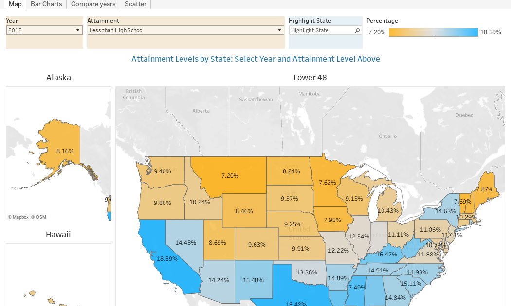
    There are four views year, all looking at educational attainment by state in 2012 and 2022.  

    The first shows data on a map: Choose the year, and choose the level of attainment.  Note that the top three categories can be confusing: BA means a Bachelor’s degree only; Grad degree means at least a Master’s (or higher, of course); and BA or more presumably combines those two.  Again, standard errors might mean the numbers don’t always add up perfectly.

    The second shows the data on a bar chart, in three views: 2012 data, 2022 data, and the change, in percentage points.  You can choose the attainment level, and then use the control to decide which column to sort the data by.

    The third view is a slope chart, where you can see the two years for any state.  Choose the attainment level, and then highlight the state you’re interested in.  Hover over the points for details. 

    And finally, the scatter shows the same data, with the same controls; the bubbles are sized by percentage-point change.  Additionally, you can use the filter to see which states have changed the most or the least.

    If anything surprises you here, drop a comment below, or send me an email.

    Source link