Nearly three dozen higher education organizations are urging U.S. Homeland Security Secretary Kristi Noem to exempt colleges from the new $100,000 fee for H-1B visa petitions, arguing in an Oct. 23 letter that these employees do work “crucial to the U.S. economy.”
President Donald Trump caught the higher education sector by surprise when he announced the large fee last month. Large research universities heavily rely on the H-1B visa program to hire international scholars.
Ted Mitchell, president of the American Council on Education, said in the Thursday letter that colleges’ H-1B workers educate domestic students for “high-demand occupations, conduct essential research, provide critical patient care, and support the core infrastructure of our universities.”
Dive Insight:
Trump shocked the higher ed world sector on Sept. 19 when he declared that new petitions for H-1B visas must come with a $100,000 payment to be processed. Yet colleges were left unsure which of their workers would be impacted amid scant details on the new policy and mixed messages from administration officials. The federal government is facing at least two lawsuits over the fee.
In the days and weeks since the fee was announced, the Trump administration has released additional information about the new policy. Just last week, U.S. Citizenship and Immigration Services released guidance that said the new fee wouldn’t apply to visa holders inside the country who are requesting a change of status or extension of stay — potentially exempting international students who recently graduated and have H1-B sponsorship.
Mitchell’s letter asked Noem to confirm that the new USCIS guidance includes those on F-1 or J-1 visas — both of which cover international students — converting to H-1B status. He also asked if the government would return the $100,000 fee if a petition is denied and how USCIS would process H-1B applications in a timely manner given the new requirements.
The letter points out that the proclamation included language that allows DHS to issue exemptions for workers if government officials deem hiring them is in the nation’s interest and doesn’t pose a security risk.
“The continuing education of our postsecondary students is in the national interest of the United States,” Mitchell wrote.
He cited recent CUPA-HR data showing that 7 in 10 faculty on H-1B visas in the U.S. are in tenured or tenure-track positions, with the largest shares in business, engineering and health disciplines.
Mitchell contended that exempting colleges from the new fee would be similar to the higher education sector’s current exemption from the cap on H-1B visas, which are awarded via a lottery process. The cap limits annual H-1B visa awards to 65,000 workers, with an additional 20,000 for international students who finished U.S. graduate programs.
Congress exempted higher education from the cap in recognition “of the special role that institutions of higher education play in hiring H-1Bs on our campuses,” Mitchell wrote.
ACE also took issue with a recent proposal that would change how the lottery system works. Under the new proposal from USCIS, visas for higher-wage applicants would be given more priority.
Mitchell urged USCIS to withdraw the rule in a public comment submitted Friday on behalf of ACE and 19 other higher education groups. He argued the change would harm international enrollment, as foreign students entering the workforce after completing their degrees at U.S. institutions would have much lower access to the H-1B visa program.
“A central reason for the excellence of our postsecondary institutions is their ability to attract and enroll talented, motivated, and curious students, whether born in this country or abroad,” Mitchell wrote. “This proposed rule will limit the ability of our institutions to recruit and retain these students, especially those that wish to remain in the United States.”
UK universities are under mounting financial pressure. Join HEPI and King’s College London Policy Institute on 11 November 2025 at 1pm for a webinar on how universities balance relatively stable but underfunded income streams against higher-margin but volatile sources. Register now. We look forward to seeing you there.
The Prime Minister’s new target is for two-thirds of young people to participate in higher-level learning by age 25. This encompasses not only undergraduate degrees but also higher technical education and apprenticeships, all delivered under a single funding model for all Level 4-6 courses. Some have described this as England’s turn to tertiary, six years after the Augar Review called for a more ‘joined-up system’.
Since at least the 1990s, English post-secondary education has been characterised by market-based regulatory apparatus and fragmentation. Further education is associated with technical and vocational education, and training and entry to the labour market; higher education with professions, leadership, and research. Oversight of both is dispersed across multiple agencies and further disconnected from adult and lifelong learning. Critics have argued that, consequently, market logics have sustained wasteful competition and produced a homogenised system that privileges higher education over further education, to the detriment of equity and national skills needs.
If Augar exposed the limits of market-driven differentiation between further education and higher education, tertiary approaches in the devolved nations illustrate how greater collaboration and integrated oversight offer a potential corrective. Wales and Scotland have advanced considerably in a ‘tertiary’ direction and developed governance modes that exercise holistic stewardship over funding and quality regimes. They are justified on grounds of efficiency, concertedness, and the capacity to advance the common good. In Wales, Medr uses its statutory powers under the Well-being of Future Generations Act to guide institutions in meeting duties on equality, sustainability, and civic mission. In Scotland, the Scottish Funding Council leads the Outcome Agreement process, through which colleges and universities set out activities in return for funding. Even in England, partnerships at a regional level, such as those in the North East or through Institutes of Technology, aim to facilitate partnerships to align lifelong learning with local economic needs. In 2021, the last time a representative survey of the scale of collaboration took place, 80% of colleges and 50% of universities in the UK had formal programme links (and it is likely that collaboration has grown since then).
Despite this prevalence and enthusiasm, research on how the benefits arising from tertiary collaboration manifest at the level of institutions and students is limited. In a short exploratory study with the Edge Foundation, I examined one facet of tertiary systems in Scotland and England: the creation of formal student transition ‘pathways’ between colleges and universities. The aim was not a comprehensive survey, but to sample something of the nature of collaboration in existing systems, to gather evidence to think with and about the concept of tertiary and the place of collaboration and competition.
Collaboration as an adaptive strategy
Existing collaborations are, perhaps surprisingly, not foremost concerned with any given common good. Instead, collaboration often emerges as an adaptive strategy within conditions of resource scarcity. Local ‘natural alliances’ in shared specialisms, mutual values, and commitments to widening participation were important in establishing trust necessary to sustain joint work. Yet, as the study found, institutional precarity is the principal driver.
One Scottish interviewee put it plainly:
‘If I’m sitting there and I’ve got 500 applications, like 10 applications for any place, I’ve got good, strong applications. I’m not going to be going, right, how am I going to look at different ways to bring in students?’
Well-resourced institutions do not collaborate out of necessity: those under pressure do. Partnerships often take the form of a ‘grow your own’ recruitment pipeline, guaranteeing transitions between partner institutions. Universities could ask ‘some tough questions’ of colleges if progression was lower than anticipated. In some cases, institutions agree to partition markets to avoid directly competing for the same students.
Collaboration could also be used as an instrument of competition. In Scotland, articulation agreements (under which universities recognise vocational qualifications such as HNDs and HNCs and admit students with advanced standing) are commonplace. Colleges in this research reported ‘some bad behaviour’ where partner universities would use these agreements to siphon off students from colleges to secure enrolment numbers. This was contrary to the wishes of colleges, which argued that many such students might benefit from the more intimate and supportive college environment for an additional year, better preparing them to enter the more independent learning environment of university.
What collaboration offers students
Where collaboration was stable, tangible benefits followed for learners. Partnerships combine colleges’ attentive pedagogies and flexible resources with university accreditation and facilities. This enables smaller class sizes, greater pastoral attention, and sometimes improved retention and progression, particularly in educational cold spots. Colleges bring local specialisms and staff expertise, often linked to industry, which enrich university courses through co-design and joint delivery.
This lends cautious support to the claims of tertiary advocates: that collaboration can widen access and enhance provision. Yet formal, longitudinal evidence of graduate outcomes remains rare. The value of such partnerships, their distinctiveness, public benefit, and contribution to regional prosperity need to be more readily championed.
From expedient to strategic collaboration
As an instrument, collaboration is worth understanding. The capacity to facilitate collaboration as a strategic good is an important policy lever where market mechanisms are unable to respond immediately or efficiently to the imperatives of national need and public finance. The study suggests four priorities for policymakers:
Clarify national priorities and reform incentives
Collaboration has greater utility than an institutional survival tool. With the bringing together of funding for further education and higher education, there is an opportunity to create stability. Together with the clear articulation of long-term educational goals, strategic cooperation in pursuit of these ends could be sustained.
Strengthen regional governance
Where regional stewardship exists, through articulation hubs or in Scotland’s Outcome Agreements, collaboration is more systematic. England’s existing fragmented oversight and policy churn undermine this. Regional coherence enables institutions to collectively make strategic planning decisions.
Value colleges’ distinct niche
Colleges’ localism, technical capacity, and pedagogical expertise are distinctive assets. Policy should promote these specialisms and encourage co-design and co-delivery rather than hierarchical franchising. Partnerships should foreground each institution’s unique contribution, not replicate the same provision in different guises.
Improve data sharing and evaluation
The absence of mechanisms to track students’ journeys and long-term outcomes, including ‘distance travelled’ evaluations, makes claims about distinctiveness and public benefit harder to substantiate.
Tertiary turns in resource scarcity
Policy discourse has tended to over-dichotomise competition and collaboration. The question is: to what extent each strategy is most helpful for achieving agreed social ends. Where partnership is an appropriate mechanism, it requires a policy architecture with clarity of purpose and stability. To what ends collaboration is put to must be settled through democratic means – a more complicated question altogether.
High Point University in North Carolina sets itself apart by offering a luxury experience.
Wikipedia
Two university campaigns hit the national spotlight in recent weeks. Each tells a very different story about how colleges market themselves.
Colorado Mesa University’s new Featherstone University spoof takes aim at elite school stereotypes, ending with the line “We care about who you are, not who you know.”
Days later, The Wall Street Journal profiled High Point University in a turnaround story built on private wealth and exclusivity. Its campus features etiquette lessons, manicured gardens and an airplane cabin for networking drills. HPU prepares students for a world where who you know still matters.
In an industry criticized for sameness, both CMU and HPU stand out as strategic outliers.
Trust, Value and the Split in Demand
Public trust in higher education is fragile. Concerns over cost, access and free speech have left families asking if it is worth it. Against this backdrop, two playbooks are emerging: anti-elitist authenticity and elite-adjacent experience.
Playbook A: CMU’s Skepticism as Fuel
Colorado Mesa University’s “Welcome to Featherstone” flips elite-school marketing on its head. The parody ends with a challenge: “We don’t care about who you know. We care about you.”
For a public university serving rural, first-generation, working-class students, the message fits. CMU has built its brand on affordability, access and trust by cutting tuition, growing CMU Tech and guaranteeing free tuition for Colorado families earning $70,000 or less.
This isn’t simply mocking the elite; it’s segmentation. CMU speaks to families who see higher education as a bridge, not a birthright. In a sea of interchangeable ads, it uses satire to say, “We hear your skepticism—and we’re still here for you.”
A Take From Rural America
CMU’s approach hit a nerve, but it also hit a truth.
I was born in East Detroit, then raised in Richmond, Mich., a farming town of 4,000. When my parents learned our local high school wasn’t accredited, they sent my brothers and me to school an hour away. At that time, only 32 percent of the local high school graduates pursued college. I still remember junior high classmates missing school to plant and harvest corn and soybeans.
For rural communities like these, college can feel distant—financially and culturally. CMU’s campaign speaks to them with rare honesty.
Playbook B: High Point’s Experience as Advantage
If CMU sells authenticity, High Point sells aspiration. Its campus hums with classical music and fountains, lined with rocking chairs and gardens designed for conversation. Students dine in on-campus restaurants that double as lessons in professional etiquette, and housing options range from traditional dorms to $40,000 tiny homes.
President Nido Qubein calls it preparation, not pampering: “Half of Wall Street sends their kids here.” The model caters to families who can pay full price and want an environment that mirrors the careers their children expect to enter.
It’s not subtle, but it shows the university understands its target audience. In an uncertain marketing environment, HPU is selling a vision of success that feels polished, predictable and safe.
What the Models Reveal
CMU and HPU reveal opposite, equally intentional strategies. CMU doubled down on affordability with its 2024 CMU Promise Tour, which reached 22 rural and urban communities, boosting first-year enrollment by 25 percent. HPU, meanwhile, courts families buying access and advantage through concierge-level amenities.
CMU uses satire to mock exclusivity; HPU leans into luxury to promise it. Both know exactly whom they’re speaking to.
Leadership Takeaways
In a landscape of sameness and skepticism, higher ed leaders should ask, “What do we stand for—and how do we prove it?”
Is it belonging and mobility like CMU, or exclusivity and polish like HPU? Either can work if it’s backed by programs, outcomes and transparency. Whatever your promise, ensure the experience delivers it.
Both institutions have likely alienated some audiences, but they’ve connected deeply with their own. That’s the point of strategic marketing. Their playbooks, while different, seem to be working for Colorado Mesa and High Point, which both had record enrollments in fall 2025 amid national headlines warning of a demographic cliff.
Beyond the Marketing
Beyond the spotlight, both universities must prove results. Time and measurement will tell if they are delivering on access and affordability, or on postgraduate success and networks.
Authenticity carries risk, as organizational psychologist Adam Grant recently noted in a New York Times op-ed, but when outcomes match promises, both models can be legitimate. Hide results or exaggerate benefits and either fails the test of ethics and equity.
In a nation this diverse, there is no single market for higher ed—there are many markets. And in a landscape this stratified, the unforgivable sin isn’t satire or spectacle; it’s sameness without substance.
Maria Kuntz is director of content marketing strategy and communications at the University of Colorado–Boulder. She leads content strategy for advancement, oversees the award-winning Coloradan alumni magazine and writes about storytelling, leadership and trust in higher education.
This audio is auto-generated. Please let us know if you have feedback.
Dive Brief:
New York is contributing $49 million in capital grants to 35 of the state’s private nonprofit colleges to help fund upgrades to facilities, build new labs and research spaces, and invest in new technology and equipment.
The state’s Higher Education Capital Matching Grant Program — led by a three-person board composed of political appointees — last week awarded grants ranging from tens of thousands of dollars to $5 million, New York Gov. Kathy Hochul announced on Friday.
Under the 20-year-old program, eligible colleges must invest $3 of their own money for every $1 of public funds. The next round of applications for projects is set to open in mid-December.
Dive Insight:
Since 2005, HECap has directed $369.8 million in state funding toward over 300 projects at private nonprofit colleges in New York, the governor’s office said.
The program makes the state a financial partner for private colleges, many of which were established well before the 1948 creation of the State University of New York system.
After a more than yearlong application process, the state’s HECap Board approved the latest round of projects at an Oct. 20 meeting. Colleges can use the funds to design, acquire, build, rebuild, renovate or equip buildings. Selected projects are meant to support a college’s academic offerings or student life, as well as to drive economic development in the state.
“These projects stand for our ongoing commitment to keeping New York at the forefront of education and economic opportunity,” Hochul said in a Friday statement.
The current round of combined public and institutional funds represents a $195 million capital investment in independent higher education facilities, according to Hochul’s office.
$1.8 million to Albert Einstein College of Medicine for renovations to a commons area and recreation center.
$5 million to Clarkson University for the first phase of renovations to an engineering and science complex.
$69,800 to Maria College to purchase and install technological equipment.
$1.8 million to Cornell University to build a large classroom space in a library.
$5 million to D’Youville University for renovations to a facility supporting its osteopathic medicine college.
$5 million to Hobart and William Smith Colleges for construction of a new science building and renovation of three adjacent facilities.
$1.8 million to the Rochester Institute of Technology to upgrade its electrical infrastructure.
$1.6 million to Sarah Lawrence College to create an experiential learning center.
New York’s continued public financing of capital projects comes while colleges across the country wrestle with sizable backlogs of deferred maintenance and facilities needs, many left over from the pandemic era as institutions put off those investments.
Last year, analysts with Moody’s Investor Service estimated a “hidden liability” of deferred maintenance needs at colleges potentially amounting to nearly $1 trillion — and just among the roughly 500 institutions Moody’s rated at the time.
Rising costs, high interest rates and financial pressures can make those needs all the more difficult to meet.
“Few have the necessary resources and credit strength to sustain the higher amounts needed to tackle the full extent of their infrastructure needs,” Moody’s analysts said in their report. Colleges that can’t afford upgrades face recruitment risks in enrollment and staff talent as buildings continue to deteriorate.
The backlog of projects is so large that capital spending increases on existing facilities have served only to slow the growth of unmet need, according to a report earlier this year from the building intelligence firm Gordian.
In early March, less than two months after President Donald Trump took office, his administration canceled $400 millionin federal research funding to the Ivy League institution.The funding cut came just days after federal officials announced a probe into the university, claiming it failed to protect Jewish students from harassment.
More civil rights investigations and funding freezes followed — at Harvard University, University of Pennsylvania, Brown University,University of California, Los Angeles and others. Along with allegations related to antisemitism and pro-Palestinian protests, the administration has attacked diversity efforts and policies allowing transgender women to compete on sports teams aligning with their gender identity.
The first to face a funding hit, Columbia in March also became the first university to agree to a host of demands from the Trump administration to see its federal funding restored.
The university then cut a larger deal in July. That agreement included a $221 million payment to the federal government,as well as academic and policy changes, in exchange for having its suspended funding mostly restored.Despite concerns in the higher education world about Columbia’s concessions, Brown, Penn and the University of Virginia also inked their own accords with the administration to resolve investigations.
Other deals could follow. Harvard, for example, has been supposedly on the cusp of a deal with the administration for months now — according to periodic news reports — as it seeks an end to a multi-front attack on the university by Trump’s government.
Moreover, the administration has directly offered priority for federal funding to select universities that agree to a broad set of terms covering academics, tuition, speech and other areas historically left to institutions to decide. So far, seven have rejected the compact and none have formally accepted, though Trump appeared to open the offer up to all colleges earlier in October.
Here’s a look at the deals signed so far between colleges and the government — and the impact on the institutions involved.
This audio is auto-generated. Please let us know if you have feedback.
When it comes to colleges where Pell Grant recipients are at least 55% likely to graduate, there are not a whole lot throughout the U.S. In fact, nearly half of states — many of them Southern with some of the highest poverty rates in the country — don’t have any at all.
That’s what Becca Spindel Bassett, higher education professor at the University of Arkansas, discovered in a recent analysis in which she sought to identify and map institutions of higher education that she describes as “equity engines.”
These are colleges where at least 34% of the students receive Pell Grants and at least 55% of those Pell Grant recipients earn a bachelor’s degree within six years.
Out of the 1,584 public and private nonprofit four-year institutions that Bassett studied nationwide, she found only 91 — or less than 6% — that qualified for her “equity engine” distinction.
And they’re all clustered in 26 states, resulting in what Bassett calls a “spatial injustice” for low-income students who live in one of the states without any equity engines or in areas with limited access to such institutions.
The almost eight dozen existing equity engines represent a diverse range of institutional types, including regional public universities, small Christian colleges and historically Black institutions.
As for whether states can invest more in colleges that are close to being equity engines — a key recommendation of Bassett’s study — it all depends.
“It’s worth noting that over half of Equity Engines are private colleges and universities, so their relationship to the state and dependency on state funding varies,” Bassett said in an email to Higher Ed Dive.
But improving Pell graduation rates isn’t only a question of funding models, she said.
Leaders at aspiring equity engines can learn best practices and approaches from these colleges and should be prepared to enact “organizational learning and change,” Bassett said. However, much is unknown about what enables colleges to become equity engines, including whether it depends on their programs and services or their policy and funding environments.
While Bassett’s study doesn’t answer those questions, a forthcoming book will describe how two of the colleges she identified as equity engines were able to achieve their results, she said.
Michael Itzkowitz, founder and president of the HEA Group, a higher ed-focused research firm and consultancy, said in an email that identifying colleges with strong graduation rates is a “good first step” because students who earn a degree “typically earn more than those who do not.”
However, Itzkowitz, who under former President Barack Obama served as the director of The College Scorecard — an online federal tool with various data on higher education institutions — added that it’s also critical to consider whether graduates are actually better off economically since “not all institutions and degrees are created equal.”
“Students who earn a credential at one institution may experience wildly different outcomes if they earned the same degree elsewhere,” he said.
David Hawkins, chief education and policy officer at the National Association for College Admission Counseling, said in an email that colleges would do well to emulate the equity engines Bassett identified, such as the University of Illinois Chicago. Bassett’s study calls the university a “major driver” of bachelor’s degree completion among Pell Grant recipients in the state, noting those students have a 58% six-year graduation rate.
Among other things, Hawkins said, such institutions deploy a wide range of services — such as evening or online courses for working students, and transportation to campus — that have been proven to help low-income students cross the finish line.
“From my perspective, the United States will only remain competitive if we can invest in a postsecondary infrastructure that serves all students who seek opportunity through higher education,” Hawkins said.
While generative artificial intelligence tools have proliferated in education and workplace settings, not all tools are free or accessible to students and staff, which can create equity gaps regarding who is able to participate and learn new skills. To address this gap, San Diego State University leaders created an equitable AI alliance in partnership with the University of California, San Diego, and the San Diego Community College District. Together, the institutions work to address affordability and accessibility concerns for AI solutions, as well as share best practices, resources and expertise.
In the latest episode of Voices of Student Success, host Ashley Mowreader speaks with James Frazee, San Diego State University’s chief information officer, about the alliance and SDSU’s approach to teaching AI skills to students.
An edited version of the podcast appears below.
Q: Can you give us the high-level overview: What is the Equitable AI Alliance? What does it mean to be equitable in AI spaces?
James Frazee, chief information officer at San Diego State University
A: Our goal is simple but ambitious: to make AI literacy and access available as opportunities to all of our students, and I mean every student, whether they started at a community college, a California State University like ours or at a University of California school. We want to make sure they all have that same foundation to understand and apply AI responsibly in their lives, in their careers and during their academic journey.
Through this alliance, we’re trying to align resources and expand access to institutionally supported AI tools. So when people are using the free tools, they’re not free, right? They’re paying for them with their privacy, with their intellectual property. We want to make sure that they have access, not only to the training they need to use these tools responsibly, but also to the high-quality tools that are more accurate and that have commercial data protection so that they can rest assured that their intellectual property isn’t being used to train the underlying large language models.
Q: The alliance strives to work across institutions, which is atypical in many cases in higher ed. Can you talk about that partnership and why this is important for your students?
A: The Equitable AI Alliance emerged from survey results. We have this listening infrastructure we’ve created here at San Diego State—we launched an AI survey in 2023, within months of ChatGPT going public. We really wanted to establish a baseline and determine what tools our students were using, what opinions did they have about AI and maybe, most importantly, what did they expect from us institutionally in order to help them meet the moment?
During the analysis of those survey findings, we discovered evidence of a growing digital divide. For instance, we asked students about how many devices they had. If you have a smartphone, a tablet, a desktop and a laptop, you would have four smart devices.
What we found was more devices led to people being more likely to say that AI had positively affected their education, and more devices meant that they were more likely to be paying for the paid versions of these tools. We also saw in the open-ended responses … people being concerned about fee increases as a result of AI, people being concerned about students who didn’t have access to these tools or fluency with these tools being disadvantaged.
People were saying, “The people who are using these have an unfair advantage,” right? Students were asking questions about, is everybody going to be able to afford what they need in order to keep up with AI? So that really was a key driver in forming this alliance.
Q: When it comes to consolidating those resources or making sure that students have access, what does that look like? And how do you all share?
A: The Equitable AI Alliance is really two things. First, it’s a consortium that’s all about saving time and saving money and having universities and colleges come together to really look at ways to form these partnerships to democratize access to these high-quality tools. And also to provide the training that people need. So that’s kind of the first part of it, and that’s much larger than the regional consortium.
But we have a regional consortium between our San Diego Community College District, San Diego State University and the University of California at San Diego, which is also dubbed the Equitable AI Alliance. And the mission there is to ensure that every student, no matter where they begin their journey, has access to AI literacy, to those high-quality tools and opportunities to leverage those to help them succeed, both inside and outside of the classroom.
It’s really, ultimately about responding to the workforce needs that we’re seeing. Employers today are demanding students come to them with fluency using these tools, and if they don’t have that fluency, they’re not going to get that internship or that job interview. So it’s really important. That’s where those microcredentials that we’re sharing across our institutions are really powerful, because they can put that badge on their LinkedIn profile, which may make the difference between them getting the interview or not, just having that little artifact there that demonstrates that they have some skills and knowledge can really make an impact.
Q: What is the microcredential? How are students engaging with that?
A: The microcredentials themselves are really powerful because they’re basically mini courses in our learning management system. We try and make them bite-size enough to where people actually get through them.
There are five modules. The first module is really kind of demystifying AI—this is not some dark art. We try to explain, at a high level, how does AI work?
The second module, which is arguably the most important one, is all about responsible use. The fact that these models are built on information from human beings, which is inherently biased. How to be critical consumers of that information, the environmental costs, the human costs, talking about how to cite the use of these tools in your work, both academically and professionally.
Then there’s a module on what AI can do for you. And so we have different microcredentials, a microcredential for faculty, there’s microcredentials for students. For instance, in the microcredential for students, it’s focusing on using AI to find jobs, prepare for jobs, tailor your résumé for a particular job or internship, how to do role-playing—to practice for an interview, let’s say.
And then there’s finding apps, finding generative AI tools, how to do that, because there’s different AI tools you might want to use for certain things, like maybe you want to create some sort of graphic—you might want to use Midjourney or DALL-E, or whatever it might be.
And then there’s the activities. Part of the idea with the activities, which they have to do in order to earn the badge, is that we’re designing activities that try and keep the microcredential evergreen. So for instance, when we first rolled out the microcredential, nobody had heard of DeepSeek, because it didn’t exist. So now we have an activity that has people going out and looking for the latest large language models that are emerging. Every day, there’s some new model, it seems—that is something to be aware of.
And then bringing it back to again, why it’s important for them to be able to be in the loop, pointing out the fact that these models are often very sycophantic, right? They want to tell you what they think you want to hear. And so you really have to go back and forth and ideate with the tools, which requires a little practice, a little coaching, and you have to fact-check everything. And so that’s a really big part of this idea of, what does it mean to be literate when it comes to using these tools?
Q: When it came to developing the microcredential, who were the stakeholders at the table?
A: We have a long history of engaging with faculty and providing fellowships to faculty. That’s a way for us to incentivize engagement with faculty.
That manifests itself in the form of course release. So, in other words, we provide them with reassigned time, buy them out of teaching a course, so that they can come and work with us and consult with us. We have a long history of doing that, and this goes back decades, first helping us with faculty development around moving courses online.
We wanted that to be done by faculty for faculty. Yes, we have instructional designers who are staff, but we really wanted the faculty to be driving that. We identified in 2023 our first AI faculty fellows, and we got a faculty member from information systems and a faculty member from anthropology—very different in terms of their skill sets and their orientation to research. One a qualitative ethnographic researcher, another more of a quantitative machine learning focus. Very complementary in terms of just balancing each other out.
Twenty twenty-three was the first time we had ever provided fellowships to students. We provided fellowships to two students. One was an engineering student and another was an Africana studies student. Again, very different in terms of the academic domain and the discipline they were in, but again, very balanced.
So those two AI student fellows and the two AI faculty fellows helped us design the survey instrument, get the IRB [institutional review board] approvals, launch the survey, promote the survey. I really want to give credit where credit is due: We got an incredible response rate. We’re lucky if we usually get like a 3 percent response rate from a student survey. We got a 21 percent response rate in 2023; 7,811 students responded to that survey.
The credit for that goes to Associated Students, our student government. The president of Associated Students that year ran on a platform of getting students high-paying jobs, and he knew for students to get high-paying jobs, they needed to be conversant with AI. So he helped us promote that survey, and the whole campaign was around “your voice matters.” So thanks to his help and the help of these AI student fellows, we got this incredible response from our students.
So anyway, the students and the faculty fellows helped us analyze those results and then use that data to build these microcredentials. So very much involving faculty and students and our University Senate, our library. I mean, the library knows a thing or two about information literacy, right? They absolutely have to be at the table. Our Center for Teaching and Learning, which is responsible for providing faculty with professional development on campus, they were also very involved from the very outset, so very much of a collaborative effort.
Q: I wanted to ask about culture and creating a campus culture that embraces AI. How are you all thinking about engaging stakeholders in these hard conversations and bringing different disciplines to the playing field?
A: I think it’s really important. That’s what the data has done for us. It’s really created space for these conversations, because faculty will respond to evidence. If you have data that is from their students, who they care about deeply, that creates space for these conversations.
For instance, one of the things that emerged from the survey findings was inconsistency. In the same course, maybe taught by different instructors, there would be different expectations and policies with regard to AI.
In multiple sections of Psychology 101—and that’s not a real example, I’m just using that as a fictitious example—one instructor might completely forbid the use of AI and another one might require it, and that’s stressful for students because they didn’t know what to expect.
In fact, one of the comments that really resonated with me from the survey was, and this is a verbatim quote, “Just tell us what you expect and be clear about it.” Students were getting mixed messages.
So that led to conversations with our University Senate about the need to be clear with our students. I’m happy to report, just this past May, our University Senate unanimously passed a policy that requires an AI … statement in every syllabus. That was an important step in the right direction.
The University Senate also created guidelines for the use of generative AI in assessments and deliverables. You know, it’s important that you not be prescriptive with your faculty. You need to provide them with lots of examples of language that they can use or tweak, because they own the curriculum, and knowing that you don’t have to take a one-size-fits-all approach.
Maybe one assignment, it’s restricted; in another assignment, it’s unrestricted, right? You can do that. And they’re like, “Oh yeah, I can do that.” Giving them examples of language they can use, and also encouraging them to use this as an opportunity to have a conversation with their students.
The students want more direction on how to use these tools appropriately. And I think if you race to a policy that’s all about academic misconduct, it’s frankly insulting to the students, to just assume everybody’s cheating, and then when they leave here and go into their place of business, they’re going to be expected to use these tools. So, really powerful conversations.
That’s been key here—just talking about [AI]. I mean, it’s this seismic kind of epistemic shift for our faculty and how knowledge is created, how we acquire knowledge, how we represent knowledge, how we assess knowledge. It’s a stressful time for our faculty—they need to be able to process that with other faculty, and that’s super important.
Q: It’s also important that you’re having that conversation collegewide, because if this is a career competency and students do need AI skills, it needs to happen in every classroom, or at least be addressed in every classroom.
A: That’s a really good point, Ashley. In fact, we’re launching a program this year that we’re calling the AI-ready course design workshop, and the idea for that is that we’re identifying a faculty member from every major and we are paying them—and this is super important, too: It’s really a sign of respect, in terms of acknowledging the labor required to reimagine an assignment, to weave AI into the fabric of that assignment.
The goal is to have a faculty member from every major who teaches a required course in that major at least two times. We want to make sure that they have an opportunity to do this and then refine it and do it again. They’re being paid over break this winter to reimagine an assignment that leverages AI, and it is a deliverable. They will produce a three- to five-minute introspective video where they reflect on what they did, why they did it and what were the learning outcomes, both for them and for their students.
That is great because we will have an example from every major of how you can use AI in the fabric of your teaching. And I think that’s what faculty need right now. Again, they need lots of examples, and we’re incentivizing that through this program. We already have something we call the “AI in action” video series, so we already have some examples, but we don’t have examples from every major.
For us right now, I think you’re seeing a lot of engagement from faculty in engineering and sciences. We’re concerned that our humanities faculty need to engage; we need to engage the political scientists. We need to engage the philosophers and the historians. They can’t just sit this out. They’re really going to be key players in moving this forward, to prepare our students, regardless of major, for this AI-augmented world that we’re living in.
Q: What are some of the lessons that you’ve learned that you hope higher education can learn from? How do you all hope to be a model to your peers across the sector?
A: I think key is the importance of data and using data to inform the choices you’re making, whether it’s in the classroom, whether it’s in the cabinet. I report to the president, and using data to really drive those conversations, and using that to make sure that you’re engaging all of those stakeholders.
For instance, we’re looking at the survey data. That survey that we did in 2023 and repeated in 2024, we’ve now scaled up to the entire California State University system, and that is underway right now. In fact, I was just looking at the latest response rates. We have had, as of this morning, 77,714 people responding to the survey … which is about a 15 percent response rate. We’ve got half a million students in the CSU, so it’s a big number.
I was looking at [the data] with the council of vice presidents and my colleague … the provost, and I said, “When you look at the numbers for San Diego State, we’ve had 10,682 responses from students. We’ve had 406 responses from faculty and 556 responses from staff. But relative to the students, the response rate from faculty is pretty low.” So I talked with [the provost] about sending a message out to our academic leaders—the deans and the department chairs and the school directors—encouraging their faculty to respond to the survey, so that we have a balanced perspective.
Everybody has a voice. That is certainly something that I want to encourage; this whole idea of incentivizing faculty engagement, I think, is important. I think you really need to provide that encouragement for faculty to experiment, to show off, and then to really use that as an opportunity to recognize those faculty and celebrate them. That does a couple things. One, it honors them for taking the risk to do this work. Then it might inspire another faculty [member] to build on that work, or have coffee with that person and talk about what they wish they would have known that they could advise this person on who maybe is early career and would appreciate their advice. I think that idea of incentivizing faculty engagement is another thing that I would encourage the audience to consider.
Q: What’s next for you all? Are there other cool interventions or programs that are coming out?
A: That survey data is going to do quite a few things for us. It’s going to help us to not only refine the microcredentials and the work we’re doing with the microcredentials, but it’s also going to allow us to scaffold conversations with industry and our industry partners in terms of being responsive to the competencies they’re going to need in their industry.
I think it’s something like 35 out of the top 50 AI companies are housed here in California, but they can’t find the talent they need in California, let alone the United States, so they’re having to go abroad to get the people they need to continue to innovate. So using this as an opportunity to work with our industry partners to make sure we’re preparing this workforce that they need to continue to innovate, that’s a key element of it, and then using this data also to help us get additional resources and use that data to say, “Hey, here’s a gap we’ve identified. We need to fill this gap,” and using that data to make the case for that investment.
This story was produced by the Associated Press and reprinted with permission.
WASHINGTON – For a generation of young Americans, choosing where to go to college — or whether to go at all — has become a complex calculation of costs and benefits that often revolves around a single question: Is the degree worth its price?
Public confidence in higher education has plummeted in recent years amid high tuition prices, skyrocketing student loans and a dismal job market — plus ideological concerns from conservatives. Now, colleges are scrambling to prove their value to students.
Borrowed from the business world, the term “return on investment” has been plastered on college advertisements across the U.S. A battery of new rankings grade campuses on the financial benefits they deliver. States such as Colorado have started publishing yearly reports on the monetary payoff of college, and Texas now factors it into calculations for how much taxpayer money goes to community colleges.
“Students are becoming more aware of the times when college doesn’t pay off,” said Preston Cooper, who has studied college ROI at the American Enterprise Institute, a conservative think tank. “It’s front of mind for universities today in a way that it was not necessarily 15, 20 years ago.”
Related:Interested in more news about colleges and universities? Subscribe to our free biweekly higher education newsletter.
A wide body of research indicates a bachelor’s degree still pays off, at least on average and in the long run. Yet there’s growing recognition that not all degrees lead to a good salary, and even some that seem like a good bet are becoming riskier as graduates face one of the toughest job markets in years.
A new analysis released Thursday by the Strada Education Foundation finds 70 percent of recent public university graduates can expect a positive return within 10 years — meaning their earnings over a decade will exceed that of a typical high school graduate by an amount greater than the cost of their degree. Yet it varies by state, from 53 percent in North Dakota to 82 percent in Washington, D.C. States where college is more affordable have fared better, the report says.
It’s a critical issue for families who wonder how college tuition prices could ever pay off, said Emilia Mattucci, a high school counselor at East Allegheny schools, near Pittsburgh. More than two-thirds of her school’s students come from low-income families, and many aren’t willing to take on the level of debt that past generations accepted.
Instead, more are heading to technical schools or the trades and passing on four-year universities, she said.
“A lot of families are just saying they can’t afford it, or they don’t want to go into debt for years and years and years,” she said.
Education Secretary Linda McMahon has been among those questioning the need for a four-year degree. Speaking at the Reagan Institute think tank in September, McMahon praised programs that prepare students for careers right out of high school.
“I’m not saying kids shouldn’t go to college,” she said. “I’m just saying all kids don’t have to go in order to be successful.”
American higher education has been grappling with both sides of the ROI equation — tuition costs and graduate earnings. It’s becoming even more important as colleges compete for decreasing numbers of college-age students as a result of falling birth rates.
Tuition rates have stayed flat on many campuses in recent years to address affordability concerns, and many private colleges have lowered their sticker prices in an effort to better reflect the cost most students actually pay after factoring in financial aid.
The other part of the equation — making sure graduates land good jobs — is more complicated.
A group of college presidents recently met at Gallup’s Washington headquarters to study public polling on higher education. One of the chief reasons for flagging confidence is a perception that colleges aren’t giving graduates the skills employers need, said Kevin Guskiewicz, president of Michigan State University, one of the leaders at the meeting.
“We’re trying to get out in front of that,” he said.
The issue has been a priority for Guskiewicz since he arrived on campus last year. He gathered a council of Michigan business leaders to identify skills that graduates will need for jobs, from agriculture to banking. The goal is to mold degree programs to the job market’s needs and to get students internships and work experience that can lead to a job.
Bridging the gap to the job market has been a persistent struggle for U.S. colleges, said Matt Sigelman, president of the Burning Glass Institute, a think tank that studies the workforce. Last year the institute, partnering with Strada researchers, found 52 percent of recent college graduates were in jobs that didn’t require a degree. Even higher-demand fields, such as education and nursing, had large numbers of graduates in that situation.
“No programs are immune, and no schools are immune,” Sigelman said.
The federal government has been trying to fix the problem for decades, going back to President Barack Obama’s administration. A federal rule first established in 2011 aimed to cut federal money to college programs that leave graduates with low earnings, though it primarily targeted for-profit colleges.
A Republican reconciliation bill passed this year takes a wider view, requiring most colleges to hit earnings standards to be eligible for federal funding. The goal is to make sure college graduates end up earning more than those without a degree.
Others see transparency as a key solution.
For decades, students had little way to know whether graduates of specific degree programs were landing good jobs after college. That started to change with the College Scorecard in 2015, a federal website that shares broad earnings outcomes for college programs. More recently, bipartisan legislation in Congress has sought to give the public even more detailed data.
Lawmakers in North Carolina ordered a 2023 study on the financial return for degrees across the state’s public universities. It found that 93 percent produced a positive return, meaning graduates were expected to earn more over their lives than someone without a similar degree.
The data is available to the public, showing, for example, that undergraduate degrees in applied math and business tend to have high returns at the University of North Carolina at Chapel Hill, while graduate degrees in psychology and foreign languages often don’t.
Colleges are belatedly realizing how important that kind of data is to students and their families, said Lee Roberts, chancellor of UNC-Chapel Hill, in an interview.
“In uncertain times, students are even more focused — I would say rightly so — on what their job prospects are going to be,” he added. “So I think colleges and universities really owe students and their families this data.”
The Associated Press’ education coverage receives financial support from multiple private foundations. AP is solely responsible for all content. Find AP’s standards for working with philanthropies, a list of supporters and funded coverage areas at AP.org.
The Strada Education Foundation, whose research is mentioned in this story, is one of the many funders of The Hechinger Report.
The Hechinger Report provides in-depth, fact-based, unbiased reporting on education that is free to all readers. But that doesn’t mean it’s free to produce. Our work keeps educators and the public informed about pressing issues at schools and on campuses throughout the country. We tell the whole story, even when the details are inconvenient. Help us keep doing that.
By Dean Hoke, October 13, 2025 – In the small towns of America, where factories have closed and downtowns often stand half-empty, a small college can be the heartbeat that keeps a community alive. These institutions—sometimes enrolling only a few hundred students—serve as economic anchors, cultural centers, and symbols of hope for regions that might otherwise face decline.
From the farmlands of Indiana to the mountain towns of Appalachia, small colleges generate economic energy far beyond their campus gates. They attract students, faculty, and visitors, stimulate local business, and provide the trained workforce that rural economies desperately need. They also embody something deeper: a sense of identity and connection that sustains civic life.
Economic Impact: Anchors in Fragile Economies
Small colleges are powerful, if often overlooked, economic engines. Their presence is felt in every paycheck, every restaurant filled with students and parents, and every local business that relies on their purchasing power.
Across the United States, nearly half of all public four-year colleges, over half of all public two-year colleges, and a third of private four-year colleges make up the 1,100 rural-serving institutions as identified by the Alliance for Research on Regional Colleges (ARRC). These colleges educate 1.6 million students, accounting for more than a quarter of total U.S. enrollments. Yet their role extends far beyond classrooms and degrees.
Rural-serving institutions are frequently among the largest employers in their counties, especially where other industries have faded. In areas where 35% or more of working-age adults are unemployed, 83% of local colleges are rural-serving, making them pillars of economic stability. Unlike large universities in metropolitan areas, their spending is highly localized—on utilities, food service, maintenance, and partnerships with small vendors.
Economic models underscore their importance. The Brookings Institution found that high-performing four-year colleges contribute roughly $265,000 more per student to local economies than lower-performing institutions, while two-year colleges add about $184,000. In many rural towns, every institutional dollar recirculates multiple times, magnifying its effect.
Beyond direct payroll and procurement, small colleges attract outside dollars. Students and visitors rent housing, dine locally, and shop downtown. Athletic events, alumni weekends, and summer programs bring tourists who fill hotels and restaurants. The IMPLAN consulting group estimated that when a college closes, the average regional loss equals 265 jobs, $14 million in labor income, and $32 million in total economic output—a devastating hit in thin rural economies.
Human Capital and Workforce Development
If small colleges are the economic engines of rural communities, they are also the primary producers of human capital. They educate the teachers, nurses, business owners, and civic leaders who sustain local life.
The Federal Reserve Bank of Richmond describes community colleges as “anchor institutions” that shape regional labor markets. Many partner with local employers to design training programs that meet specific workforce needs—often at minimal cost to businesses. In one case study, a rural college collaborated with an advanced manufacturing firm to tailor instruction for machine technicians, ensuring a steady local labor supply and convincing the company to expand rather than relocate.
Rural-serving colleges are also critical in addressing educational disparities. Only 22% of rural adults hold a bachelor’s degree, compared with 37% of non-rural Americans. This gap translates directly into income inequality: according to the U.S. Department of Agriculture’s Economic Research Service, nonmetro workers with a bachelor’s degree earned a median of $52,837 in 2023, compared with substantially higher earnings for their urban counterparts. In states such as Indiana, Ohio, and Pennsylvania, rural degree attainment lags 10 to 15 percentage points behind state averages.
Beyond Economics: RSIs as Equity Infrastructure
Rural-serving institutions are more than economic engines—they are critical equity infrastructure, often providing the only realistic pathway to higher education for students the system has historically marginalized.
RSIs enroll far higher proportions of high-need students than their urban counterparts. Nearly 50% of undergraduates at RSIs receive Pell Grants, compared to 34% nationally. These institutions also serve disproportionate numbers of first-generation students, working adults, and students from underrepresented communities who lack access to flagship universities.
For many rural students, the local college isn’t a choice—it’s the only option. Geographic isolation, family obligations, and financial constraints make residential college attendance impossible. Research shows that every ten miles from the nearest college reduces enrollment probability by several percentage points. For students without transportation, without broadband for online learning, or without family support to relocate, the local institution is existential.
When rural colleges close, equity suffers most. Displaced students, if they re-enroll at all, face higher debt burdens and lower completion rates. Wealthier students can transfer to distant institutions; low-income students stop out. Communities of color, already underserved, lose ground.
Policymakers often evaluate colleges through narrow metrics: completion rates and graduate earnings. But this ignores mission differentiation. RSIs serve students that flagship universities would never admit, in places that for-profit colleges would never enter, at prices that private colleges could never match. Investing in rural-serving institutions isn’t charity—it’s infrastructure investment in equity, ensuring every region has pathways to economic mobility. If America is serious about educational equity, it must recognize RSIs as essential public infrastructure, not discretionary spending.
Despite these barriers, rural institutions remain lifelines for upward mobility. They offer affordable tuition, flexible programs for working adults, and pathways for first-generation students who might otherwise forgo higher education.
However, the pressures are real. Rural students face tighter finances, higher borrowing costs, and fewer grant opportunities. Nearly half of rural undergraduates receive Pell Grants, but average aid remains lower than that at urban institutions. Many graduates leave rural areas to find higher-paying jobs, a “brain drain” that weakens local economies. Yet for those who stay—or return later—their impact is outsized, driving new business formation, civic leadership, and generational stability.
Example: Goshen College and Elkhart County, Indiana — A Model of Mutual Benefit
The following example illustrates the positive interdependence of a small college and its surrounding community—how shared growth, service, and opportunity can strengthen both the institution and the region it calls home.
Few examples better demonstrate this relationship than Goshen College in northern Indiana. Founded in 1894 by the Mennonite Church, Goshen sits in Elkhart County, a region best known for its manufacturing and recreational vehicle industries. While the area has long been an economic hub, its continued success depends heavily on education and workforce development—both areas where Goshen College has quietly excelled for more than a century.
Goshen employs more than 300 full-time and part-time faculty and staff, making it one of the city’s largest private employers. Its local purchasing—from food services to maintenance and printing—injects millions of dollars annually into the county’s economy. The student body, drawn from across the Midwest and around the world, supports rental housing, restaurants, and small businesses throughout the region.
According to the 2024 Independent Colleges of Indiana Economic Impact Study, Goshen College contributes roughly $33 million each year to the regional economy through employment, operations, and visitor spending. Beyond the numbers, the college enriches community life. The Goshen College Music Center and Merry Lea Environmental Learning Center are regional treasures, hosting performances, lectures, and research programs that attract thousands of visitors annually. During the COVID-19 pandemic, the college partnered with local health officials to serve as a testing and vaccination site—further demonstrating its civic commitment. Its nursing, environmental studies, and teacher preparation programs continue to meet critical workforce needs across Elkhart County and beyond.
Goshen College stands as a model of how a small private college and its community can thrive together. Its example underscores a broader truth: when rural colleges remain strong, the benefits extend far beyond campus—bolstering jobs, sustaining income, and enriching the civic and cultural life that define their regions.
Social and Cultural Role: The Heart of Civic Life
Beyond numbers, the social and cultural influence of rural colleges may be their most irreplaceable contribution. In many counties, the college auditorium doubles as the performing arts center, the gym as the public gathering space, and the library as a community hub.
Rural colleges host art shows, festivals, lectures, and athletics that bring people together across generations. They sponsor service projects, tutoring programs, and food drives that connect students with their neighbors. For residents who might otherwise feel isolated or overlooked, the local college provides a sense of belonging and civic pride.
Research from the National Endowment for the Arts underscores that local arts participation strengthens community bonds and well-being. Rural colleges amplify that effect by providing both venues and expertise. Their faculty often lead community theater, music ensembles, or public workshops—bringing culture to places that might otherwise lack access.
The COVID-19 pandemic vividly demonstrated this social bond. While large universities shifted to remote learning with relative ease, small rural colleges had to improvise with limited broadband access and fewer resources. Yet many became essential service providers—hosting testing centers, distributing food, and maintaining human contact in otherwise isolated communities.
In these moments, small colleges revealed what they have always been: not just educators, but neighbors and caretakers.
Challenges: Fragility and the Risk of Decline
Despite their immense value, small rural colleges operate under fragile conditions. Their scale limits efficiency, their funding sources are volatile, and demographic shifts threaten their enrollment base.
Enrollment Declines and Demographic Pressures.
A steep decline in traditional-age students is projected to start by 2026, with the number of new high school graduates expected to fall by about 13 percent by 2041, according to The Chronicle of Higher Education, March 3, 2025, article “What is the Demographic Cliff”. For rural colleges already competing for a shrinking pool of students, this decline threatens their enrollment base and financial viability. Many have already experienced double-digit enrollment drops since the Great Recession. Rural public bachelor’s/master’s institutions enroll 5% fewer students today than in 2005, while community colleges struggle to recover from pandemic-era losses.
Financial Constraints. Small colleges rely heavily on tuition revenue and relatively modest endowments. According to the Urban Institute, the median private nonprofit four-year college holds about $33,000 in endowment assets per student, compared with hundreds of thousands of dollars per student at elite universities such as Amherst or Princeton. For many rural private colleges, endowment resources are often well below this national median. Their financial models depend heavily on tuition and auxiliary income, leaving them vulnerable when enrollment softens. Fundraising capacity is also limited: alumni bases are smaller and often less affluent than those of major research universities, making sustained growth in endowment and annual giving more difficult to achieve.
Operational Challenges. Compliance, accreditation, and technology costs weigh disproportionately on small staffs. Many rural colleges lack the personnel to pursue major grants or expand programs quickly. Geographic isolation compounds difficulties in recruiting faculty and attracting external partnerships.
Brain Drain and Opportunity Gaps. Even when colleges succeed in educating local students, retaining them can be difficult. Many leave for urban areas with higher wages and broader opportunities. The irony is painful: the better a rural college fulfills its mission of empowerment, the more likely it may lose its graduates.
Closures and Community Fallout. When a small college shuts its doors, the ripple effects are severe. Studies estimate average regional losses of over $20 million in GDP and hundreds of jobs per closure. Local businesses—cafés, landlords, bookstores—suffer immediately. Housing markets soften, municipal tax revenues drop, and cultural life diminishes. It can take a decade or more for a community to recover, if it ever does.
Reversing the Talent Flow: Retention Strategies That Work
The brain drain challenge is not insurmountable. Several states and institutions have pioneered retention strategies that show measurable results.
Loan forgiveness programs specifically targeting rural retention have gained traction. Kansas’s Rural Opportunity Zones offer up to $15,000 in student loan repayment for graduates who relocate to designated counties. Maine provides annual tax credits up to $2,500 for graduates who live and work in-state. Early data suggests these programs can shift settlement patterns, particularly in high-demand fields like nursing and teaching.
The most effective models involve tri-party partnerships: colleges provide education and career counseling, employers offer competitive wages and loan assistance, and municipalities contribute housing support or tax relief. In one Ohio example, a regional hospital, community college, and county government created a “stay local” nursing pathway that reduced turnover by 40% over five years.
Place-based scholarships are also emerging as retention tools. “Hometown Scholarships” provide enhanced aid for students from surrounding counties who commit to working regionally after graduation. When paired with community-engaged learning and local internships throughout the curriculum, these programs cultivate regional identity—shifting the narrative from “I have to leave to succeed” to “I can build a meaningful career here.”
Federal policy could amplify these efforts. A Rural Talent Corps modeled on the National Health Service Corps could leverage student loan forgiveness to address workforce shortages while stabilizing rural economies. The brain drain will never disappear entirely, but intentional investment can shift the calculus from inevitable loss to manageable flow.
Policy Pathways and Strategies for Resilience
Sustaining small colleges—and the communities they support—requires creativity, collaboration, and policy attention.
1. Deepen Local Partnerships. Rural colleges thrive when they align closely with regional needs. Employer partnerships, dual-enrollment programs, and apprenticeships can connect education directly to local labor markets. In Indiana and Ohio, several colleges now co-design health care and manufacturing programs with regional employers, ensuring steady pipelines of skilled workers.
2. Form Regional Alliances. Small institutions can collaborate rather than compete. Shared academic programs, cross-registration, and joint purchasing agreements can reduce costs and expand offerings. Examples such as the New England Small College Innovation Consortium show how collective action can extend capacity and visibility.
3. Diversify Revenue and Mission. Rural colleges can strengthen financial resilience by expanding adult education, microcredentials, and workforce training. Many are converting underused buildings into community hubs, co-working spaces, or conference centers. Others are developing online and hybrid programs to reach place-bound learners in neighboring counties.
4. Increase State and Federal Support. Federal recognition of Rural-Serving Institutions within the Higher Education Act could unlock targeted funding similar to programs for Minority-Serving Institutions. States should adapt funding formulas to reflect mission-based outcomes—rewarding colleges that serve low-income, first-generation, and local students rather than penalizing them for small scale.
5. Encourage Philanthropic Investment. Foundations and donors have historically overlooked rural institutions in favor of urban flagships. Increasing awareness of their impact could mobilize new giving streams, particularly from community foundations and regional philanthropists.
6. Invest in Infrastructure. Broadband access, housing, and transportation are essential to sustaining rural higher education. Expanding digital infrastructure allows colleges to deliver online learning, attract remote faculty, and connect to global markets.
Looking Ahead: The Role of Small Colleges in Rural Renewal
As rural America seeks to reinvent itself in the 21st century, small colleges are uniquely positioned to lead that renewal. They combine local trust with national expertise, and they possess the physical, intellectual, and moral infrastructure to drive change from within.
Their future will depend on adaptability. Colleges that align programs with regional industries, embrace digital learning, and form strategic alliances can thrive despite demographic headwinds. Institutions that cling to older models may struggle.
Yet the measure of success should not be enrollment size alone. A rural college’s value lies in its multiplier effect—on jobs, community life, and civic identity. For many counties, it is the last remaining institution still rooted in the public good.
Conclusion: Investing in Irreplaceable Infrastructure
Small colleges in rural America are far more than schools. They are community builders, employers, cultural anchors, and symbols of local resilience. Their closure can hollow out a county; their success can revive one.
The rural-serving institutions identified by ARRC represent a quarter of U.S. enrollments but touch nearly half the nation’s geography. They serve regions facing population loss, persistent poverty, and limited opportunity—yet they continue to educate, employ, and inspire.
The choice facing policymakers, philanthropists, and citizens is simple: either we invest in these engines of opportunity, or we risk watching the lights go out in hundreds of rural towns.
The question is no longer whether we can afford to support small rural colleges but whether America can afford not to.
Sources and References
Alliance for Research on Regional Colleges (ARRC).Identifying Rural-Serving Institutions in the United States (2022).
Brookings Institution.The Value of Higher Education to Local Economies (2021).
Federal Reserve Bank of Richmond.Community Colleges as Anchor Institutions: A Regional Development Perspective (2020).
National Student Clearinghouse Research Center.High School Benchmarks 2022: National College Progression Rates.
National Endowment for the Arts.Rural Arts, Design, and Innovation in America (2017).
Lumina Foundation.Stronger Nation: Learning Beyond High School Builds American Talent (2024).
National Skills Coalition.Building a Skilled Workforce for Rural America (2021).
IMPLAN Group, LLC.Measuring the Economic Impact of Higher Education Institutions (2023).
U.S. Census Bureau.Educational Attainment in the United States: 2023 (American Community Survey Tables).
Bureau of Labor Statistics.Employment and Earnings by Educational Attainment, 2023.
Goshen College.Economic Impact Report 2022 and institutional data from the Office of Institutional Research.
Dean Hoke is Managing Partner of Edu Alliance Group, a higher education consultancy, and a Senior Fellow for the Sagamore Institute located in Indianapolis, Indiana. He formerly served as President/CEO of the American Association of University Administrators (AAUA). Dean is a champion for small colleges in the US. and is committed to celebrating their successes, highlighting their distinctions and reinforcing how important they are to the higher education ecosystem in the US. Dean is the creator and co-host for the podcast series Small College America.
Two years ago, the Supreme Court dealt a devastating blow to opportunity in America when it gutted access to higher education for underrepresented groups. That decision was not only legally misguided but also turned a blind eye to the deep inequities that have long shaped our education system. Our colleges and universities scrambled to find lawful tools to ensure that their student bodies still reflected the breadth of talent and promise in this country.
One of those tools was Landscape, a program recently canceled by the College Board that gave admissions officers data about a student’s high school and neighborhood while explicitly excluding race or ethnicity.
Standardized test scores and GPAs never tell the whole story. Median family income, access to Advanced Placement courses, local crime rates and other key indicators help admissions officers see the full picture and provide crucial context to help identify high-achieving students from disadvantaged communities. These are students whom universities might otherwise overlook. Tools that give context level the playing field—not by lowering standards, but by lifting students up according to their merit and the obstacles they have overcome.
The Supreme Court, even in striking down diversity initiatives, still made clear that universities could explore race-neutral alternatives to achieve equity. The use of socioeconomic and geographic factors is exactly such an alternative. Despite U.S. Attorney General Pamela Bondi’s recent nonbinding guidance warning against the use of geographic indicators as “proxies” for race, make no mistake: Abandoning consideration of these elements of an applicant’s background is not a legal requirement but a political choice, reflecting fear rather than courage.
Without tools that account for the barriers students face, colleges will fall back on practices that overwhelmingly favor the privileged, shutting out low-income and first-generation students who have already beaten the odds. This spoils opportunity for millions, and our campuses and our nation will suffer for it. Diversity is not a box to check; it is a vital engine of education and democracy. Classrooms that bring together students from different walks of life prepare all graduates to lead a diverse society, foster innovation and strengthen our communities.
We cannot allow the Supreme Court’s decision—and the chilling effect in its wake—to undo decades of progress. And we cannot allow educational institutions to abdicate their responsibility in this moment of crisis. The data that provides broader context for applicants remains available, but without the will to use it, too many doors will remain closed for the students who need them most.
America has always promised to reward hard work and perseverance, no matter where you come from. That promise rings hollow if we allow the wealthy and well connected to monopolize educational opportunity. Colleges and universities must honor that promise by continuing to seek out and support students who have succeeded against the odds. Fairness demands it, equal opportunity requires it and the future of our country depends on it.
The authors all serve as state attorneys general: New York Attorney General Letitia James, Connecticut Attorney General William Tong, Delaware Attorney General Kathy Jennings, Illinois Attorney General Kwame Raoul, Minnesota Attorney General Keith Ellison, New Jersey Attorney General Matthew Platkin, Vermont Attorney General Charity Clark and Washington Attorney General Nick Brown.


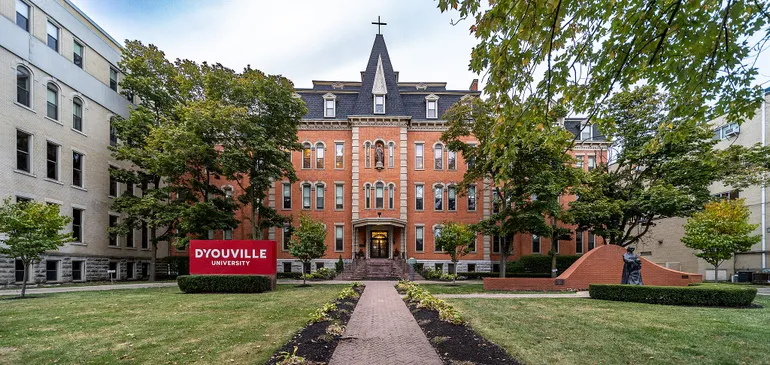

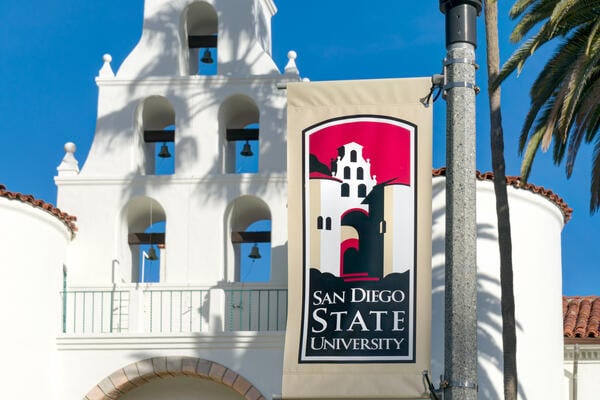
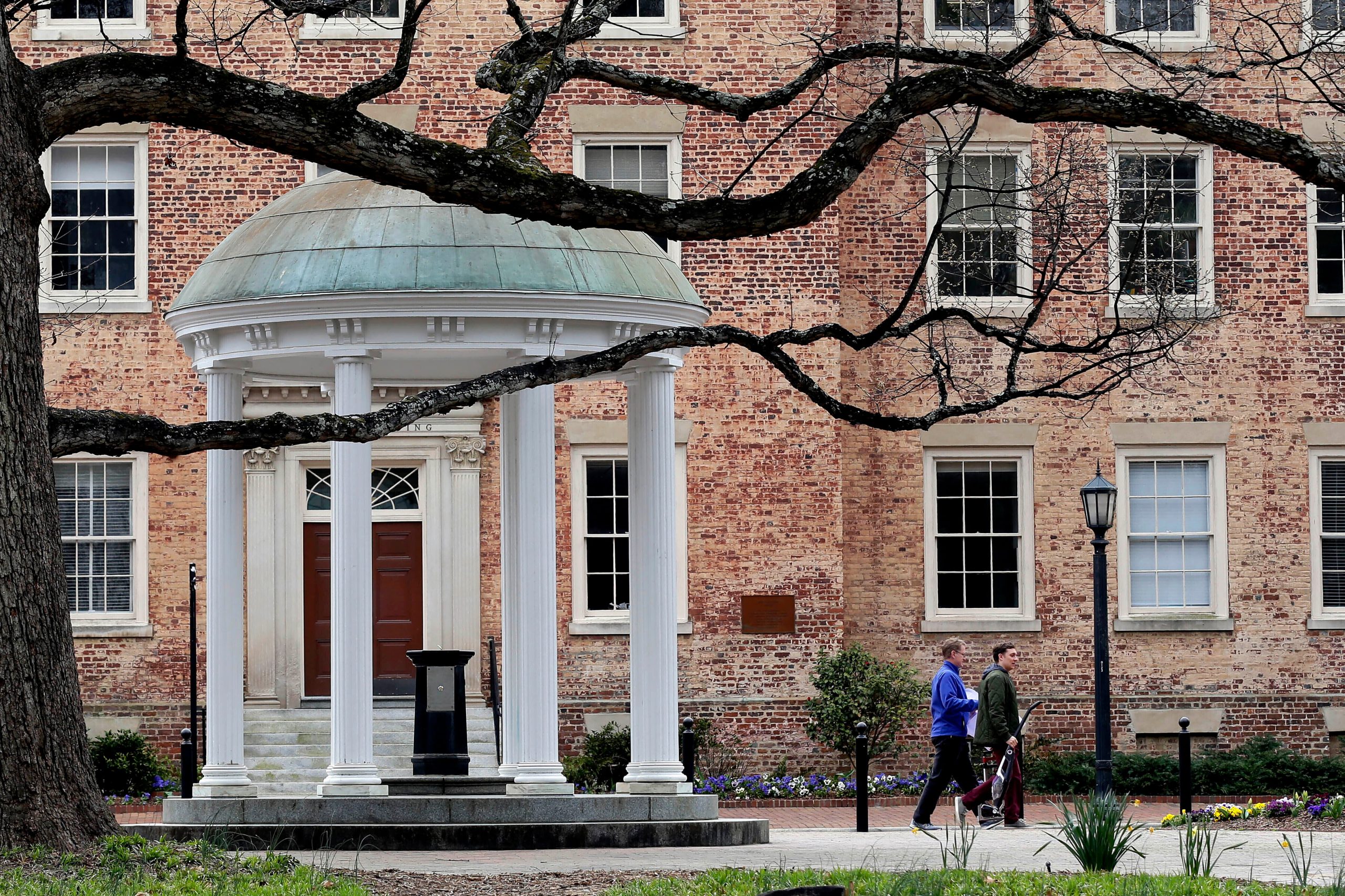
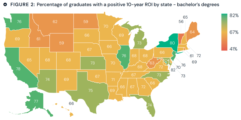
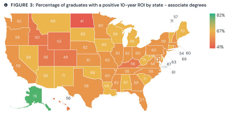


