While one end of your university is focused entirely on the number of undergraduate students that get a place (and pay a fee) each year, another equally important driver is who these students are and where they come from.
A part of the initial quid pro quo offered to the sector when we lost the last vestiges of student number control and managed expansion in 2012 was that some of this new capacity would be made available for students from non-traditional backgrounds – and that this would happen from everywhere: from the poshest ancient university to the most practical and locally-focused further education college.
Though regulators all over the UK do keep an eye on how providers are doing at making this egalitarian dream a reality, in England at least the focus has been more on what providers are doing to widen access (and how they know it is working) and less on the actual numbers or entry rates.
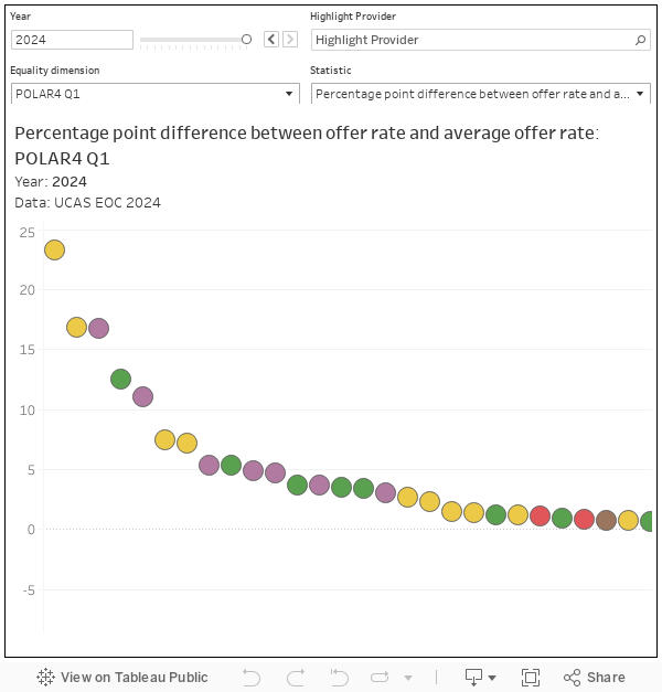
Deprivation
UCAS has always provided data on what proportion of main scheme UK applicants from major demographics end up with an offer. Because of some smart choices by UCAS in its data design, I can also offer you an main scheme acceptance rate: the proportion of applications that end up with an accepted offer.
(UCAS main scheme? That’s the one where an applicant applies to up to five courses before the 30 June deadline. It doesn’t include stuff like direct entry to clearing, or records of prior acceptance – where someone applies directly to the provider.)
We don’t get as many metrics as we used to (what’s happened to UCAS’ own Multiple Equality Measure, or MEMs, I wonder) – and I’ve chosen to look at indices of multiple deprivation as a common way of thinking about participation from economically disadvantaged small areas. There are four of them (SIMD, WIMD, NIMD, and IMD – one for each home nation) and it makes no sense to see them all on one graph. By default we are seeing England (more data points!) but you can also choose to see Wales, Scotland, or Northern Ireland using the “nations/regions” filter.
You choose your quintile of interest at the top (default is one, the most deprived 20 per cent), a year (default is 2025), chosen measure (offer rate or acceptance rate) and Age (default is “all”). This changes the display at the top: an ordered plot of providers, with the size of the dot showing the number of accepted students. Mouse over a dot to show annual proportions by quintile for main scheme applications, offers, and accepted applicants.
By default you can see the proportion of applications that end with an accepted applicant – but a low score does not mean a provider is terrible at widening access. Recall there are a lot of variables here, with as much to do with student choice (or portfolio) and performance as what the provider does. For this reason the offer rate (how many applications end with an offer being made) is a more popular measure.
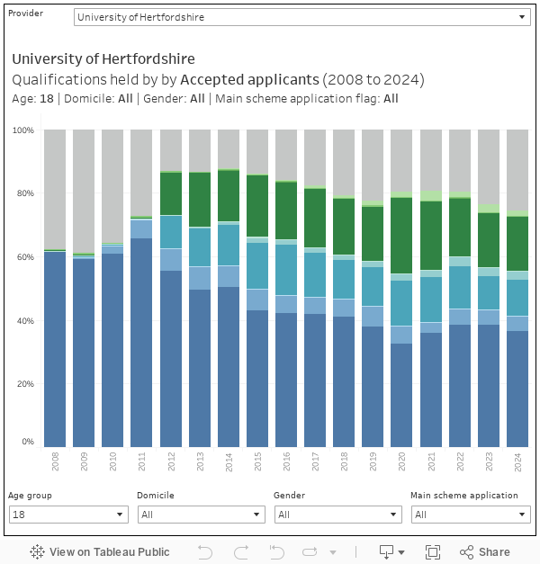
Entry qualifications
I feel like I keep saying this, but you can’t really talk about access without talking about what qualifications an applicant is likely to be bringing with them. A level performance is a spectacular proxy for how rich your parents are and how nice your house is – even the choice to take A levels is less common among disadvantaged groups.
On the first issue we still don’t get data on actual (A level or tariff) points at provider level as structured data. The data exists – it’s on course pages at an individual course level, but supposedly it is far too commercially powerful to publish openly in a structured way at provider level. It feels like a policy from another age, and it doesn’t make anyone look good.
The best we get is a provider-level look at the types of qualification held by accepted applicants (and those that get offers). I’ve not plotted this to enable comparison, but it is fascinating to find individual providers slowly moving away from recruiting A level students only and into the “other” qualification that suggest mature learners, and (less clearly) local rather than national recruitment.

Unconditional
Back at the end of the 2010s there was a great deal of policy concern around the idea of unconditional offers. This was eventually refined into the “conditional unconditional offer”, a situation where a “firm” commitment from an applicant was rewarded with a lack of insistence on a particular set of grades or tariff points.
Though there were often valid reasons given for direct unconditional offers (for example, when admission to an arts course was by portfolio, or where – rarely – a provider set its own entrance exams or used a detailed interview process to inform selection) nobody ever really managed to convincingly defend the conditional unconditional offer in a way that stopped being banned (with the briefest of blips when it was accidentally unbanned for a month or so in the 2022 cycle). It was odd as the best available evidence showed that such offers didn’t have an impact on student outcomes.
I’ve been starting to hear stories about a growth in other forms of unconditional offers in this last cycle – the pressure to lock in applicants may be prompting usual academic requirements to be suspended or lowered. The available data suggest a very slight growth in “other unconditional offers” that regulators may want to keep an eye on, but only back to roughly 2023 levels from a slight dip last year.

In England, at least, we’ve rather taken our eye off the ball when it comes to participation metrics – they exist, but there’s very little (other than the required existence of an access and participation plan for those who want to charge higher fees) to connect them to regulation. There have been some suggestions from ministers that this may change, and if you are in planning or strategy you may wish to get yourself reacquainted with the state of the art in 2025.