Tag: Dashboards

  • OfS Access and Participation data dashboards, 2025 release

    OfS Access and Participation data dashboards, 2025 release

    The sector level dashboards that cover student characteristics have a provider-level parallel – the access and participation dashboards do not have a regulatory role but are provided as evidence to support institutions develop access and participation plans.

    Though much A&P activity is pre-determined – the current system pretty much insists that universities work with schools locally and address stuff highlighted in the national Equality of Outcomes Risk Register (EORR). It’s a cheeky John Blake way of embedding a national agenda into what are meant to be provider level plans (that, technically, unlock the ability to charge fees up to the higher level) but it could also be argued that provider specific work (particularly on participation measures rather than access) has been underexamined.

    The A&P dashboards are a way to focus attention on what may end up being institutionally bound problems – the kinds of things that providers can fix, and quickly, rather than the socio-economic learning revolution end of things that requires a radicalised cadre of hardened activists to lead and inspire the proletariat, or something.

    We certainly don’t get any detailed mappings between numeric targets declared in individual plans and the data – although my colleague Jim did have a go at that a while ago. Instead this is just the raw information for you to examine, hopefully in an easier to use and speedier fashion than the official version (which requires a user guide, no less)

    Fun with indicators

    There are four dashboards here, covering most of what OfS presents in the mega-board. Most of what I’ve done examines four year aggregations rather than individual years (though there is a timeseries at provider level), I’ve just opted for the 95 per cent confidence interval to show the significance of indicator values, and there’s a few other minor pieces that I’ve not bothered with or set a sensible default on.

    I know that nobody reads this for data dashboard design tips, but for me a series of simpler dashboards are far more useful to the average reader than a single behemoth that can do anything – and the way HESA presents (in the main) very simple tables or plain charts to illustrate variations across the sector represents to me a gold standard for provider level data. OfS is a provider of official statistics, and as such is well aware that section V3.1 of the code of practice requires that:

    Statistics, data and explanatory material should be relevant and presented in a clear, unambiguous way that supports and promotes use by all types of users

    And I don’t think we are quite there yet with what we have, while the simple release of a series of flat tables might get us closer

    If you like it you should have put a confidence interval on it

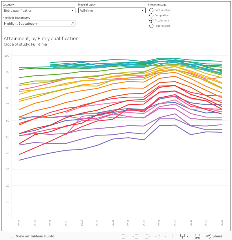
    To start with, here is a tool for constructing ranked displays of providers against a single metric – here defined as a life cycle stage (access, continuation, completion, attainment, progression) expressed as a percentage of successful achievements for a given subgroup.

    Choose your split indicator type on the top right, and the actual indicator on the top right – select the life cycle stage on the box in the middle, and set mode and level (note certain splits and stages may only be available for certain modes and levels). You can highlight a provider of interest using the box on the bottom right, and also find an overall sector average by searching on “*”. The colours show provider group, and the arrows are upper and lower confidence bounds at the standard 95 per cent level.

    You’ll note that some of the indicators show intersections – with versions of multiple indicators shown together. This allows you to look at, say, white students from a more deprived background. The denominator in the tool tip is the number students in that population, not the number of students where data is available.

    [singles rank]

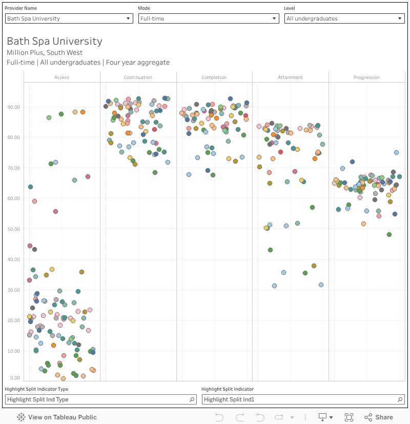
    I’ve also done a version allowing you to look at all single indicators at a provider level – which might help you to spot particular outliers that may need further analysis. Here, each mark is a split indicator (just the useful ones, I’ve omitted stuff like “POLAR quintiles 1,2,4, and 5” which is really only worth bothering with for gap analysis), you can select provider, mode, and level at the top and highlight a split group (eg “Age (broad)”) or split (eg “Mature aged 21 and over”).

    Note here that access refers to the proportion of all entrants from a given sub-group, so even though I’ve shown it on the same axis for the sake of space it shows a slightly different thing – the other lifecycle stages relate to a success (be that in continuation, progression or whatever) based on how OfS defines “success”.

    [singles provider]

    Oops upside your head

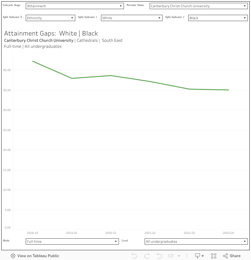
    As you’ve probably spotted from the first section, to really get things out of this data you need to compare splits with other relevant splits. We are talking, then, about gaps – on any of the lifecycle stages – between two groups of students. The classic example is the attainment gap between white and Black students, but you can have all kinds of gaps.

    This first one is across a single provider, and for the four lifecycle stages (this time, we don’t get access) you can select your indicator type and two indicators to get the gap between them (mode, and level, are at the bottom of the screen). When you set your two split, the largest or most common group tends to be on indicator 1 – that’s just the way the data is designed.

    [gaps provider]

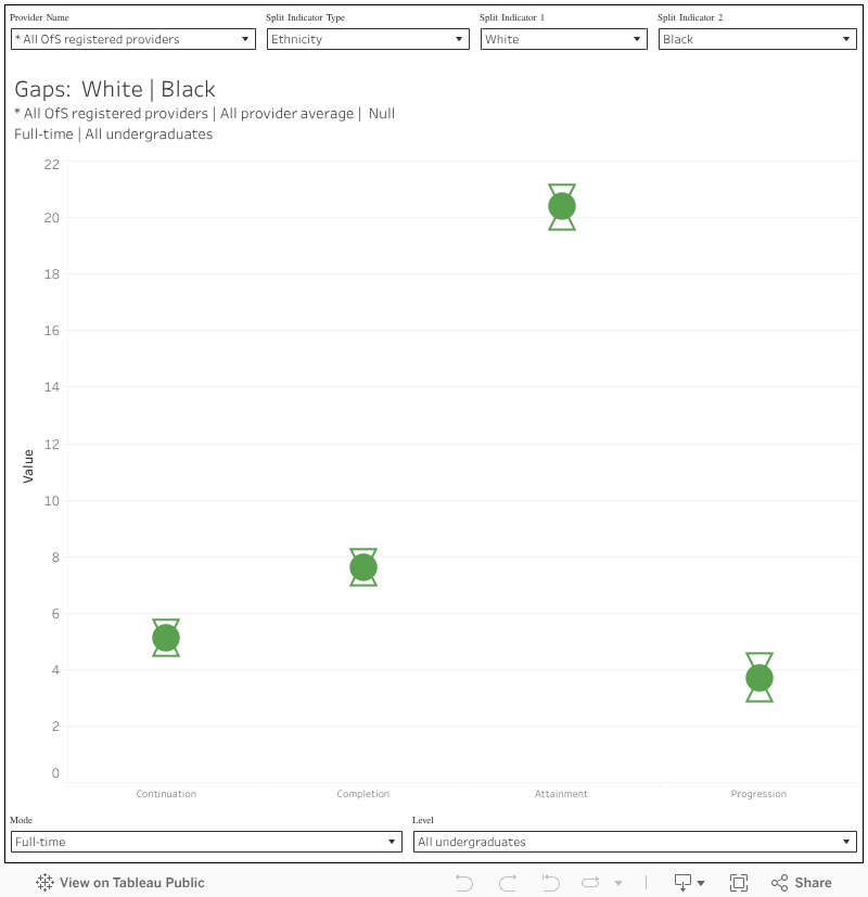
    As a quick context you can look for “*” again on the provider name filter to get sector averages, but I’ve also built a sector ranking to help you put your performance in context with similar providers.

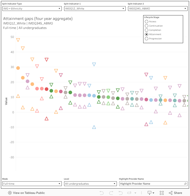
    This is like a cross between the single ranking and the provider-level gaps analysis – you just need to set the two splits in the same way.

    [gaps rank]

    Sign o’ the times

    The four year aggregates are handy for most applications, but as you being to drill in you are going to start wondering about individual years – are things getting gradually worse or gradually better? Here I’ve plotted all the individual year data we get – which is, of course, different for each lifecycle stage (because of when data becomes available). This is at a provider level (filter on the top right) and I’ve included confidence intervals at 95 per cent in a lighter colour.

    [gaps provider timeseries]

    Source link

  • OfS characteristics dashboards, 2025 release

    OfS characteristics dashboards, 2025 release

    The Office for Students releases a surprisingly large amount of data for a regulator that is supported by a separate “designated data body”.

    Some of it is painfully regulatory in nature – the stuff of nightmares for registrars and planning teams that are not diligently pre-preparing versions of the OfS’ bespoke splits in real time (which feels like kind of a burden thing, but never mind).

    Other parts of it feel like they might be regulatory, but are actually descriptive. No matter how bad your provider looks on any of the characteristics, or access and participation, indicators it is not these that spark the letter or the knock on the door. But they still speak eloquently about the wider state of the sector, and of particular providers within it.

    Despite appearances, it is this descriptive data that is likely to preoccupy ministers and policymakers. It tells us about the changing size and shape of the sector, and of the improvement to life chances it does and does not offer particular groups of students.

    Outcomes characteristics

    How well do particular groups of students perform against the three standard OfS outcomes measures (continuation, completion, progression) plus another (attainment) that is very much in direct control of individual providers?

    It’s a very pertinent question given the government’s HE Reform agenda language on access and participation – and the very best way to answer it is via an OfS data release. Rather than just the traditional student characteristics – age, ethnicity, the various area based measures – we get a range of rarities: household residual income, socioeconomic status, parental higher education experience. And these come alongside greatly expanded data on ethnicity (15 categories) and detail on age.

    Even better, as well as comparing full time and part-time students, we can look at the performance of students by detailed (or indeed broad) subject areas – and at a range of levels of study.

    We learn that students from better off (residual income at £42,601 or greater) are more likely to progress to a positive outcome – but so are students of nursing. Neither of these at the level of medical students, or distance learning students – but very slightly above Jewish students. The lowest scoring group on progression is currently students taught via subcontractual arrangements – but there are also detriments for students with communication-related disabilities, students from Bangladeshi backgrounds, and students with “other” sexual orientations.

    In some cases there are likely explanatory factors and probably intersections – in others it is anyone’s guess. Again and again, we see a positive relationship between parental income or status and doing well at higher education: but it is also very likely that progression across the whole of society would show a similar pattern.

    On this chart you can select your lifecycle stage on the top left-hand side, and use the study characteristics drop down to drill into modes of study or subject – there’s also an ability to exclude sub-contractual provision outside of registered provider via the population filter. At the bottom you can set domicile (note that most characteristics are available only for UK students) and level of study (again note that some measures are limited to undergraduates). The characteristics themselves are seen as the individual blobs for each year: mouse over to find similar blobs in other years or use the student characteristic filter or sub-characteristic highlighter to find ones that you want.

    [Full screen]

    The “attainment” life cycle stage refers to the proportion of undergraduate qualifiers that achieve a first or upper second for their first degree. It’s not something we tend to see outside of the “unexplained first” lens, and it is very interesting to apply the detailed student characteristics to what amounts to awarding rates.

    It remains strikingly difficult to achieve a first or upper second while being Black. Only 60 per cent of UK full time first degree students managed this in 2023-24 which compares well to nearer 50 per cent a decade ago, but not so well with the 80 per cent of their white peers. The awarding gap remains stark and persistent.

    Deprivation appears to be having a growing impact on continuation – again for UK full time first degree students, the gap between the most (IMD Q1, 83.3 per cent) and least (Q5 93.1 per cent) deprived backgrounds has grown in recent years. And the subject filters add another level of variation – in medicine the different is tiny, but in natural sciences it is very large.

    Population characteristics

    There are numerators (number of students where data is included) and denominators (number of students with those characteristics) within the outcomes dashboard, but sometimes we just need to get a sense of the makeup of the entire sector – focusing on entrants, qualifiers, or all students.

    We learn that nearly 10 per cent of UK first degree students are taught within a subcontractual arrangement – rising to more than 36 per cent in business subjects. Counter-intuitively, the proportion of UK students studying other undergraduate courses (your level 4 and 5 provision) has fallen in previous years – 18 per cent of these students were taught via sub contractual arrangements in 2010, and just 13 per cent (of a far lower total) now. Again, the only rise is in business provision – sub-contractual teaching is offered to nearly a quarter of non-degree undergraduates from UK domiciles there.

    More than a third (33.14 per cent) of UK medicine or dentistry undergraduates are from managerial or professional backgrounds, a higher proportion than any other subject area, even though this has declined slightly in recent years.

    Two visualisations here – the first shows student characteristics as colours on the bars (use the filter at the top) and allows you to filter what you see by mode or subject area using the filters on the second row. At the bottom you can further filter by level of study, domicile, or population (all, entrants, or qualifiers). The percentages include students where the characteristic is “not applicable” or where there is “no response” – this is different from (but I think clearer than) the OfS presentation.

    [by student characteristic]

    The second chance puts subject or mode as the colours, and allows you to look at the make up of particular student characteristic groups on this basis. This is a little bit of a hack, so you need to set the sub characteristic as “total” in order to alter the main characteristic group.

    [by study characteristic]

    Entry qualification and subject

    Overall, UK undergraduate business students are less likely to continue, complete, attain a good degree, or a positive progression outcome than their peers in any other subject area – and this gap has widened over time. There is now a 1.5 percentage point progression gap between business students and creative or performing arts students: on average a creative degree is more likely to get you into a job or further study than one in business, and this has been the case since 2018.

    And there is still a link between level 3 qualifications and positive performance at every point of the higher education life cycle. The data here isn’t perfect – there’s no way to control for the well documented link between better level 3 performance (more As and A*s, less Cs, Ds and BTECs) and socioeconomic status or disadvantage. Seventy two per cent of the best performing BTEC students were awarded a first or upper second, 96 per cent of the best performing A level students.

    This is all taken from a specific plot of characteristics (entry qualification and subject) data – unfortunately for us it contains information on those two topic only, and you can’t even cross plot them.

    [Full screen]

    What OfS makes of all this

    Two key findings documents published alongside this release detail the regulatory observations. The across-the-board decline in continuation appears to have been halted, with an improvement in 2022-23 – but mature entrants are still around 9 percentage points less likely to continue.

    We get recognition of the persistent gap in performance at all levels other than progression between women (who tend to do better) and men (who tend to do worse). And of the counterintuitive continuation benefits experienced by disabled students. And we do get a note on the Black attainment gap I noted above.

    Again, this isn’t the regulatory action end of OfS’ data operations – so we are unlikely to see investigations or fines related to particularly poor performance on some of these characteristics within individual providers. Findings like these at a sector level suggest problems at a structural rather than institutional level, and as is increasingly being made plain we are not really set up to deal with structural higher education issues in England – indeed, these two reports and millions of rows of data do not even merit a press release.

    We do get data on some of these issues at provider level via the access and participation dashboards, and we’ll dive into those elsewhere.

    Source link

  • State Dashboards Help Students See Higher Education’s Long-Term Value

    State Dashboards Help Students See Higher Education’s Long-Term Value

    Title: Bridging Education and Opportunity: Exploring the ROI of Higher Education and Workforce Development

    Author: Paula Nazario

    Source: HCM Strategists

    New insights from HCM Strategists highlight how continued state investments in higher education are creating pathways to economic mobility, with the majority of degree programs delivering increased earnings and a solid return on investment (ROI). However, despite the continued success and quality of many degree programs, both students and the public have increased concerns about whether postsecondary credentials are worth the time and money.

    If consumers do not understand the ROI of their credentials, this can contribute to decreased enrollment, funding, and research, which would in turn produce broader economic and social consequences. While the data are clear that a majority of postsecondary programs do pay off, there are many degrees that fail to provide a measurable ROI. HCM Strategists’ recent analysis of College Scorecard data shows that the average student at over 1,000 institutions earns less 10 years after they first enrolled than the typical high school graduate. While nearly two-thirds of these institutions are certificate-focused, for-profit institutions, there are still many private nonprofit and public colleges that do not provide strong economic outcomes.

    To help students and the public understand the differences between institutions and degree programs that provide positive and negative value, the author of the brief urges states and policymakers to provide clear data on post-graduation outcomes. Some states have already advanced initiatives to help consumers see in real time the differences in earnings for those that enroll in higher education.

    The author highlights several states initiatives that help students see the value of their credentials including California Community Colleges’ Salary Surfer tool, the Texas Higher Education Coordinating Board’s student outcomes dashboards and reports, and the Virginia Office of Education Economics’ College and Career Outcomes Explorer. Ohio and Colorado are also highlighted for their investments in employer partnerships to expand graduates’ opportunities for well-paying and workforce relevant jobs.

    To read more on these new insights from HCM Strategists, click here.

    —Austin Freeman


    If you have any questions or comments about this blog post, please contact us.

    Source link