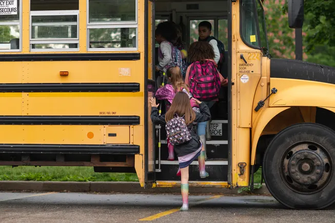
As K-12 schools prepare for 2026, edtech and innovation are no longer driven by novelty–it’s driven by necessity. District leaders are navigating tighter budgets, shifting enrollment, rising cybersecurity threats, and an urgent demand for more personalized, future-ready learning.
At the same time, AI, data analytics, and emerging classroom technologies are reshaping not only how students learn, but how educators teach, assess, and support every learner.
The result is a defining moment for educational technology. From AI-powered tutoring and automated administrative workflows to immersive career-connected learning and expanded cybersecurity frameworks, 2026 is poised to mark a transition from experimental adoption to system-wide integration. The year ahead will test how effectively schools can balance innovation with equity, security with access, and automation with the irreplaceable role of human connection in education.
Here’s what K-12 industry experts, stakeholders, and educators have to say about what 2026 will bring:
AI becomes fully mainstream: With clearer guardrails and safety standards, AI will shift from pilot projects to a natural part of daily classroom experiences. AI tackles the biggest challenges: learning gaps and mental health: Chronic absenteeism, disengagement and widening readiness levels are creating urgent needs, and AI is one of the only tools that can scale support quickly. Hyper-personalized learning becomes standard: Students need tailored, real-time feedback more than ever, and AI will adapt instruction moment to moment based on individual readiness. AI tutoring expands without replacing teachers: Quick, focused bursts of AI-led practice and feedback can relieve overwhelmed teachers and give students support when they need it most. The novelty era of AI is over: In 2026, districts will prioritize solutions that measurably improve student outcomes, relevance and wellbeing, not just cool features.
–Kris Astle, Education Expert and Manager of Learning and Adoption, SMART Technologies
In 2026, workforce readiness will no longer be seen as someone else’s responsibility, but will become a collective mission. Schools, employers, families, and policymakers will increasingly work together to connect students’ strengths to real opportunities. Career and technical education (CTE) and industry certifications will move to the center of the conversation as districts rethink graduation requirements to prioritize alignment between student aptitudes and workforce demand. The goal will shift from ‘graduation’ to readiness. Students don’t lack ambition, they lack connection between what they’re good at and where those talents are needed. When education, industry, and community align, that connection becomes clear. The result? A generation that enters the world not just credentialed, but confident and capable.
—Edson Barton, CEO & Co-Founder, YouScience
As the number of edtech applications continues to surge across classrooms nationwide, teachers and administrators will need to become increasingly discerning consumers. The challenge for 2026 won’t be finding tools, it will be identifying which ones truly move the needle for teaching and learning. To maximize impact, district leaders should look for tools that demonstrate clear instructional value, support data-driven teaching, and extend what humans alone can accomplish. This includes intentionally selecting tools that embody strong learning science, effectively personalize the learning experience, empower teachers with meaningful data, and align tightly to instructional goals. If a tool doesn’t demonstrably provide purposeful practice to enhance student learning or make teachers’ work easier, it’s unlikely to earn a place in the modern classroom.
–Dr. Carolyn Brown, Chief academic Officer & Co-Founder of Foundations in Learning, Creator of WordFlight
In 2026, schools will continue to prioritize clear, consistent communication between families, students and staff. The expectations around what good communication looks like will rise significantly as communication modality preferences evolve and expand. Parents increasingly rely on digital tools to stay informed, and districts will feel growing pressure to ensure their online presence is not only accurate but intuitive, engaging, accessible and available in real time. New elements such as AI chatbots and GEO practices will shift from “nice-to-have” features to essential components of a modern school communication toolbox. These tools help families find answers quickly, reduce the burden on office staff and give schools a reliable, user-friendly way to reach every stakeholder with urgent updates or important news at a moment’s notice. Historically, digital methods of school-to-home communication have been overlooked or deprioritized in many districts. But as competition for students and teachers increases and family expectations continue to rise, schools will be forced to engage more intentionally through digital channels, which are often the only reliable way to reach families today. As a result, modernizing communications will become a core strategic priority rather than an operational afterthought.
–Jim Calabrese, CEO, Finalsite
Educator wellness programs will increasingly integrate with student well-being initiatives, creating a truly holistic school climate. Schools may roll out building-wide morning meditations, joint movement challenges, or shared mindfulness activities that engage both staff and students. By connecting teacher and student wellness, districts will foster healthier, more resilient communities while boosting engagement and morale across the school.
—Niki Campbell, M.S., Founder/CEO, The Flourish Group
In 2026, we will see more talk about the need for research and evidence to guide education decisions in K-12 education. Reports on student achievement continue to show that K-12 students are not where they need to be academically, while concerns about the impact of new technologies on student well-being are on the rise. Many in the education space are now asking what we can do differently to support student learning as AI solutions rapidly make their way into classrooms. Investing in research and development with a focus on understanding teaching and learning in the age of AI will be vital to addressing current education issues.
—Auditi Chakravarty, CEO, AERDF
District leaders will harness school safety as a strategic advantage. In 2026, K-12 district leaders will increasingly see school safety as a key driver of their biggest goals–from increasing student achievement to keeping great teachers in the classroom. Safety will show up more naturally in everyday conversations with teachers, parents, and students, underscoring how a secure, supportive environment helps everyone do their best work. As districts point to the way safer campuses improve focus, attract strong educators, and build community trust, school safety will become a clear advantage that helps move the whole district forward.
—Brent Cobb, CEO, CENTEGIX
Learning is no longer confined to a classroom, a schedule, or even a school building. New models are expanding what’s possible for students and prompting educators to reconsider the most effective strategies for learning. A key shift is asking students, “What is school doing for you?” Virtual and hybrid models provide students the space and time to reflect on this question, and these non-traditional approaches are expected to continue growing in 2026. Education is shifting from a focus on test-taking skills to an approach that helps students become well-rounded, self-directed learners who understand what motivates them and are better prepared for career readiness and long-term success. With that comes a need for a stronger emphasis on fostering independence. It’s equally important that students learn to build resilience themselves, and for parents and teachers to recognize that letting students stumble is part of helping them without life-altering consequences will support the best citizens of the future. Aligning education with these priorities is crucial to advancing learning for the next generation.
–Dr. Cutler, Executive Director, Wisconsin Virtual Academy
With reading skills continuing to lag, 2026 will be pivotal for improving K–12 literacy–especially for middle school students. Schools must double down on evidence-based strategies that foster engagement and achievement, such as targeted reading interventions that help students build confidence and reconnect with reading. We’ll likely see a strong push for tools like digital libraries and personalized reading programs to help learners gain ground before entering high school. Audiobooks and other accessible digital formats can play a key role in supporting comprehension and fluency, particularly when paired with interactive resources and educator guidance. Middle school remains a crucial stage for developing lifelong reading habits that extend beyond the classroom. The top priority will be closing learning gaps by cultivating meaningful, enjoyable reading experiences for students both in and out of school.
–Renee Davenport, Vice President of North American Schools, OverDrive
Virtual set design, which is popular in professional theaters and higher education institutions, is now making its way into K-12 theaters. It allows schools to use the technologies they are familiar with such as short-throw projection technology, and combine it with computer graphics, 3D modeling, real-time rendering, and projection mapping technologies to create visually-stunning sets that could not be created by building traditional sets. A great example of this is highlighted in this eSchool News’ article. Overall, virtual sets elevate theater productions at a fraction of the cost and time of building physical sets, and when students are involved in creating the virtual sets, they learn a variety of tech-related skills that will help them in future careers.
–Remi Del Mar, Group Product Manager, Epson America, Inc.
In 2026, more school districts will take deliberate steps to integrate career-connected learning into the K–12 experience. As the workforce continues to evolve, educators recognize that students need more than academic mastery – they need technical fluency, transferable skills, and the confidence to navigate unfamiliar challenges. Districts will increasingly turn to curricula that blend rigorous instruction with meaningful, hands-on experiences, helping students understand how what they learn in the classroom connects to real opportunities beyond it. In turn, we’ll see a growing emphasis on activity-, project-, and problem-based learning that promotes relevance, exploration, and purposeful engagement. This shift will also deepen partnerships between schools, local industries, and higher education to help ensure learning experiences reflect real workforce expectations and expose students to future pathways. By embedding these experiences into daily learning, schools can help students develop a strong foundation for lifelong learning and adaptability–redefining educational success to include readiness for life and work.
–David Dimmett, President & CEO, Project Lead the Way
AI will push America’s century-old education system to a breaking point. AI will make it impossible to ignore that our current education priorities are obsolete and, for millions, downright harmful. The root cause? Education’s very failed ‘success’ metrics. At long last, high-school math will get its day of reckoning, with growing calls for redirecting focus toward the ideas that matter, not micro-tidbits that adults never use and smartphones perform flawlessly. Society is in a technology revolution, but how we teach our youth hasn’t changed. Frustration is growing. Students are bored and disengaged. Parents are fearful for their children’s future. Career centers will soon become ghost towns as young people question the relevance of what and how they’re being prepared for the future. The schools that rebuild around problem-solving, reasoning, and genuine human creativity will thrive, while the rest stagnate in unavoidable debate about whether their model has any real-world value.
—Ted Dintersmith, Founder, What School Could Be
In 2026, I anticipate several meaningful shifts in early childhood education. First, with growing recognition of the academic, social-emotional, and physical benefits of outdoor learning, more schools will prioritize creating intentional outdoor learning environments. More than just recess time, this means bringing indoor activities outdoors, so children have the chance to not only learn in nature but about nature. Additionally, as we see expansion in early childhood programs across the nation, I expect a continued focus on play-based learning. Research indicates that is how children learn best, and while there is pressure for academics and rigor, early childhood educators know play can provide that very thing. Lastly, while it’s widely known that children use their senses to learn about the world around them, I see educators being more intentional about meeting the sensory needs of all learners in their classrooms. We’ll continue to see a quest to provide environments that truly differentiate to meet individual needs in an effort to help everyone learn in the way that works best for them.
–Jennifer Fernandez, Education Strategist, School Specialty
As district leaders look ahead to 2026, there is a widening gap between growing special ed referrals and limited resources. With referrals now reaching more than 15 percent of all U.S. public school students, schools are under increasing pressure to make high-stakes decisions with limited staff and resources. The challenge is no longer just volume–it’s accuracy. Too often, students–especially multilingual learners–are placed in special ed not because of disability, but because their learning needs are misunderstood. Ensuring that every student receives the right support begins with getting identification right from the start. The districts that will make the most progress in the new year will focus more on improving assessment quality, not speed. This means leveraging digital tools that ease the strain on special ed teachers and school psychologists, streamlining efficiency while keeping their expert judgment at the heart of support. When accuracy becomes the foundation of special ed decision-making, schools can reallocate resources where they’re needed most and ensure that every learner is understood, supported, and given the opportunity to thrive.
—Dr. Katy Genseke, Psy.D., Director of Clinical Product Management, Riverside Insights
In the coming year, we’ll see more districts formalize removing cell phone access in classrooms and during the school day, along with reducing passive screen time, as educators grapple with student disengagement and rising concerns about attention, learning, and well-being. This shift will spark a renewed emphasis on real-world, hands-on learning where students can physically explore scientific principles and understand where mathematical and scientific ideas come from. Schools will increasingly prioritize experiences that connect scientific concepts to the real world, helping students build curiosity and confidence in their science and math skills. Ultimately, these changes will result in learners seeing themselves in roles connected to these experiences, such as health sciences, bio tech, engineering, agricultural science, and many more, as a way to engage and prepare them for meaningful and in-demand postsecondary professions or further education.
–Jill Hedrick, CEO, Vernier Science Education
Across the country, I’m inspired by how many districts are embracing evidence-based literacy practices and seeking stronger alignment in their approach. At the same time, I see areas where teachers require more consistent training, tools, and support to implement these practices effectively. This moment presents a genuine opportunity for leaders to foster greater coherence and enhance implementation in meaningful ways. Looking toward 2026, my hope is that district leaders embrace a comprehensive, long-term vision for literacy and commit to true alignment across classrooms and grade levels. That means giving teachers the time, structure, and support required for effective implementation; leading with empathy as educators adopt new practices; and recognizing that real change doesn’t come from training alone but from ongoing coaching, collaboration, and commitment from leadership. National data make the urgency clear: reading gaps persist in the early grades and beyond, and too many students enter adolescence without the foundational literacy skills they need. It’s time to change the story by building teacher capacity, strengthening implementation, and ensuring every learner at every level in every classroom has access to high-quality, science-backed reading instruction.
—Jeanne Jeup, CEO & Founder, IMSE
If 2023-2025 were the “panic and pilot” years for AI in schools, 2026 will be the year habits harden. The policies, tools, and norms districts choose now will set the defaults for how a generation learns, works, and thinks with AI. The surprise: students use AI less to shortcut work and more to stretch their thinking. In 2023 the fear was simple: “Kids will use AI to cheat.” By the end of 2026, the bigger surprise will be how many students use AI to do more thinking, not less, in schools that teach them how. We already see students drafting on their own, then using AI for formative feedback aligned to the teacher’s rubric. They ask “Why is this a weak thesis?” or “How could I make this clearer?” instead of “Write this for me.” Where adults set clear expectations, AI becomes a studio, not a vending machine. Students write first, then ask AI to critique, explain, or suggest revisions. They compare suggestions to the rubric and explain how they used AI as part of the assignment, instead of hiding it. The technology didn’t change. The adult framing did.
–Adeel Khan, CEO, MagicSchool
School safety conversations will include more types of emergencies. In a 2025 School Safety Trends Report that analyzed 265,000+ alerts, 99 percent of alerts were for everyday emergencies, including medical incidents and behavioral issues, while only 1 percent involved campus-wide events, such as lockdowns. Effective school safety planning must include a variety of types of emergencies, not just the extreme. While most people think of lockdowns when they hear “school safety,” it’s critical that schools have plans in place for situations like seizures or cardiac arrest. In these scenarios, the right protocols and technology save lives–in fact, approximately 1 in 25 high schools have a sudden cardiac arrest incident each year. In 2026, I believe wearable panic buttons and technology that maps the locations of medical devices, like AEDs, will become the standard for responding to these incidents.
—Jill Klausing, Teacher, School District of Lee County
One quarter of high seniors say they have no plans for the future, and that percentage will only grow. Educators, nonprofits, and policymakers must work to connect learning with real world skills and experiences because most kids don’t know where to start. DIY digital career exploration and navigation tools are dramatically shaping kids’ futures. High quality platforms that kids can access on their phones and mobile devices are exploding, showing options far beyond a college degree.
–Julie Lammers, CEO, American Student Assistance
A significant trend emerging for 2026 is the focus on evidence-based learning strategies that directly address cognitive load and instructional equity. For example, as districts implement the Science of Reading, it will become even more imperative for every student to audibly distinguish soft consonant sounds and phonemes. The hidden challenge is ambient classroom noise, which increases extraneous cognitive load, forcing students to expend unnecessary mental energy just trying to hear the lesson, and diverting their focus away from processing the actual content. Therefore, instructional audio must be treated as foundational infrastructure—as essential to learning as curriculum itself. By delivering the teacher’s voice to every student in the classroom, this technology minimizes the hearing hurdle, enabling all learners to fully engage their brains in the lesson and effectively close achievement gaps rooted in communication barriers.
–Nathan Lang-Raad, VP of Business, Lightspeed
AI-driven automation will help schools reclaim time and clarity from chaos: School districts will finally gain control over decades of ghost and redundant data, from student records to HR files through AI-powered content management. AI will simplify compliance, communication, and collaboration: By embedding AI tools directly into content systems, schools will streamline compliance tracking, improve data accuracy, and speed up communication between departments and families. Accessible, data-driven experiences will redefine engagement: Parents and students will expect school systems to deliver personalized, seamless experiences powered by clean, connected data.
–Andy MacIsaac, Senior Strategic Solutions Manager for Education, Laserfiche
In the K-12 sector, we are moving away from a ‘content delivery’ model, and toward what I call ‘The Augmented Educator.’ We know that AI and predictive algorithms are improving on the technical side of learning. They can analyze student performance data to spot micro-gaps in knowledge – like identifying that a student is struggling with calculus today because they missed a specific concept in geometry three years ago. That is predictive personalization, and it creates a perfect roadmap for what a student needs to learn. However, a roadmap is useless if the student isn’t fully on board. This is where human-connection becomes irreplaceable. AI cannot empathize with a frustrated 10-year-old. It cannot look a student in the eye and build the psychological safety required to fail and try again. The future of our industry isn’t about choosing between AI or humans; it’s about this specific synergy: Technology provides the diagnostic precision, but the human provides the emotional horsepower. I predict that the most successful tutors of the next decade will be ‘coaches’ first and ‘teachers’ second. They will use technology to handle curriculum planning, allowing them to focus 100 percent of their energy on motivation, pedagogy, and building confidence. That is the only way to keep K-12 students engaged in a digital-first world.
—Gaspard Maldonado, Head of SEO, Superprof
If there’s one thing we see every day in classrooms, it’s that students learn differently and at their own pace, which is why committing to personalized learning is the next big step in education. This means moving beyond the old “one-size-fits-all” model and finally embracing what we’ve always known about how learning actually works. Personalization gives students something incredibly powerful: a clear sense of their own learning journey. When the curriculum, instruction, and pacing are tailored to their strengths, interests, and needs, students have better clarity and allow them to engage with their education in a way that they wouldn’t be able to in other ways. And for teachers, this shift doesn’t have to mean more complexity. With the support of smarter tools, especially AI-driven insights, the administrative burden lightens, making space for what matters most: mentoring, connecting, and building meaningful relationships with students. But personalization isn’t just about improving academic outcomes. It’s about helping students grow into resilient, self-directed thinkers who understand how to navigate their own path. When we move from generalized instruction to student-centered learning, we take a real step toward ensuring that every student has the chance to thrive.
–Lynna Martinez-Khalilian, Chief Academic Officer, Fusion Academy
The conversation around AI in education won’t be about replacement, it will be about renaissance. The most forward-thinking schools will use AI to automate the mundane so teachers can focus on what only humans can do: connect, inspire, and challenge students to think critically and create boldly. The future belongs to those who can harness both computational power and human imagination.
–Jason McKenna, VP of Global Educational Strategy, VEX Robotics
Across sectors, educational ecosystems are rapidly evolving toward skills-focused, technology-enabled, models that prepare students for a dynamic future of work. Learners are using online platforms such as iCEV to access course work, create artifacts, and share their knowledge of the subject in a creative and improved manner. Platforms like this will be utilized by CTE teachers to assist learners in building technical competencies by implementing a variety of learning models.
–Dr. Richard McPherson, Agricultural Science Teacher, Rio Rico High School in the Santa Cruz Valley Unified School District
In 2026, districts will confront a widening gap between the growing number of students diagnosed with specialized needs and the limited pool of clinicians available to support them. Schools will continue to face budget constraints and rising demand, which will push the field toward greater consolidation and more strategic partnerships that expand access, especially in regions that have long lacked adequate services. The organizations that succeed will be those able to scale nationally while still delivering localized, student-first support. We expect to see more attention focused on the realities of special education needs: the increasing number of students who require services, the truly limited resources, and the essential investment required in high-quality, integrated support systems that improve outcomes and make a measurable difference in students’ lives.
–Chris Miller, CEO, Point Quest Group
The future of K-12 projectors lies in integrated, high-performance chipsets that embed a dedicated Small Language Model (SLM), transforming the device into an AI Instructor Assistant. This powerful, low-latency silicon supports native platforms like Apple TV while primarily enabling real-time, on-board AI functions. Instructors can use simple voice commands to ask the projector to perform complex tasks: running real-time AI searches and summarization, instantly generating contextual quizzes, and providing live transcription and translation for accessibility. Additionally, specialized AI handles automated tasks like instant image auto-correction and adaptive light adjustment for student eye health. This integration turns the projector into a responsive, autonomous edge computing device, simplifying workflows and delivering instant, AI-augmented lessons in the classroom. Epson makes a great ultra short throw product that is well suited for a chipset such as this in the future.
–Nate Moore, Executive Director of Technology, Kearsley Community Schools
I anticipate a renewed focus on the classroom technologies that most directly strengthen student engagement. In recent research, 81 percent of K–12 IT leaders reported that student engagement is their primary measure of success, and 91 percent expect interactive tools like interactive displays, classroom cameras, and headsets to increase classroom participation in the coming year. This signals a shift toward investing in tools that enable every student to see and be seen, and hear and be heard across all learning environments. Rather than investing in the next big trend, I believe districts will prioritize technologies that consistently help learners stay focused and engaged. The year ahead will be defined not by rapid experimentation, but by the thoughtful adoption of tools that make learning more immersive, inclusive, and meaningful.
—Madeleine Mortimore, Global Education Innovation and Research Lead, Logitech
Technology advancements will continue to accelerate in 2026 which will have a direct impact on teaching and learning. As schools seek out new and innovative ways to engage students and support deeper learning, I predict immersive technologies such as VR (virtual reality), XR (extended reality), and hybrid learning models which integrate traditional in-person teaching and online learning with VR experiences, will become more mainstream.
–Ulysses Navarrete, Executive Director, Association of Latino Administrators and Superintendents (ALAS)
In 2026, mathematics education will continue to shift toward teaching math the way the brain learns, prioritizing visual and meaningful context over rote memorization. By presenting concepts visually and embedding them in engaging, real-world context first, students can better understand the structure of problems, build reasoning skills, and develop confidence in their abilities. Districts that implement research-backed, neuroscience-informed approaches at scale will help students tackle increasingly complex challenges, develop critical thinking, and approach math with curiosity rather than anxiety—preparing them for a future where problem-solving and adaptive thinking are essential.
–Nigel Nisbet, Vice President of Content Creation, MIND Education
My prediction for 2026 is that as more people start to recognize the value of career and technical education (CTE), enrollment in CTE programs will increase, prompting schools to expand them. Technology will enhance curricula through tools such as virtual reality and artificial intelligence, while partnerships with industry will provide students with essential, real-world experiences. Moreover, there will be a greater emphasis on both technical and soft skills, ensuring graduates are well-prepared for the workforce.
–Patti O’Maley, Vice Principal & CTE Coordinator, Payette River Tech Academy & Recently Profiled in Building High-Impact CTE Centers: Lessons from District Leaders
In 2026, schools are poised to shift from using AI mainly as a time saver to using it as a genuine driver of better teaching and learning. Educators will still value tools that streamline tasks, but the real momentum will come from applications that sharpen instructional practice and strengthen coaching conversations. Observation Copilot is already giving a glimpse of this future. It has changed the way I conduct classroom observations by capturing evidence with clarity and aligning feedback to both district and state evaluation frameworks. As tools like this continue to evolve, the focus will move toward deeper instructional insight, more precise feedback, and richer professional growth for teachers.
–Brent Perdue, Principal, Jefferson Elementary School in Spokane Public Schools
The upper grades intervention crisis demands action. Most science of reading policies focus on K-3, but the recent NAEP scores showing historically low literacy among graduating seniors signal where policy will move next. States like Virginia are already expanding requirements to serve older students, and I expect this to be a major legislative focus in 2026. The pandemic-impacted students are now in seventh grade and still struggling. We can’t ignore them any longer.
–Juliette Reid, Director of Market Research, Reading Horizons
High schools and career and technical education (CTE) centers are increasingly seeking out opportunities to provide immersive, hands-on experiences that prepare students for the workforce. In 2026, we will see a surge in demand for virtual and augmented reality (VR/AR) tools to fill this need. VR/AR experiences promote deeper understanding, better knowledge retention and faster skills acquisition, giving students a realistic way to experience different careers, understand job expectations, and learn transferable skills like communication and teamwork. Whether it’s by letting students virtually step into the role of a nurse, welder, or chef; or enabling them to participate in a VR simulated job interview, VR/AR helps students build knowledge, skills and confidence as they explore career paths and it will be a critical technology for workforce development in 2026 and beyond.
–Gillian Rhodes, Chief Marketing Officer, Avantis Education, Creators of ClassVR
In 2026, expect growing urgency around middle school literacy. The students who were in K–3 during the pandemic are now in middle school, and many still haven’t caught up–only 30 percent of eighth graders are reading proficiently, with no state showing gains since 2022. While there is a myth that students transition from learning to read to reading to learn after third grade, the reality is that many older students need ongoing reading support as they take on more complex texts. Years of testing pressure, fragmented time for reading instruction, and limited focus on adolescent literacy have left students underprepared for complex, content-rich texts. In 2026, expect more states and districts to invest in systemic literacy supports that extend beyond elementary school: embedding reading across subjects, rethinking instructional time, and rebuilding students’ stamina and confidence to tackle challenging material. The middle school reading crisis is as much about mindset as mechanics – and solving it will require both.
—Julie Richardson, Principal Content Designer for Literacy, NWEA
In 2026, I expect AI in education to shift from novelty to essential infrastructure, provided we keep human involvement and student safety at the center. Across districts we’ve worked with, we consistently see that the real value of AI is not just in creating faster workflows, but in providing students and teachers with personalized support to result in more effective teaching and learning outcomes. Research and pilot programs show the strongest gains when AI augments human teaching, offering individualized feedback and tailored practice while educators focus on higher-order instruction and student connection. As adoption accelerates, the work ahead is less about whether to use AI and more about building systems that ensure it’s safe, equitable, and pedagogically sound. Beyond just product development, means districts will need AI strategies that center governance, privacy protections, and investing in professional development so educators have the tools and confidence they need to use AI responsibly.
—Sara Romero-Heaps, Chief Operating Officer, SchoolAI
In 2026, K–12 education will reach a critical moment as students navigate an increasingly complex, AI-enabled world. The widening gap between the skills students develop in school and the demands of tomorrow’s workforce will draw growing attention, underscoring the need for Decision Education in classrooms nationwide. Students, parents, teachers, and education leaders are all experiencing uncertainty about the future. Schools and districts will need to integrate Decision Education more systematically so students build the dispositions and skills to make informed choices about their learning, careers, and lives. Strengthening decision-making skills gives students greater agency and helps them navigate uncertainty more effectively. Education leaders who prioritize practical approaches to closing this skills gap will be best positioned to help students thrive in a rapidly changing world.
–David Samuelson, Executive Director, Alliance for Decision Education
I believe 2026 will be defined by the power of local communities stepping up. We’ll see grassroots networks of educators, families, and community organizations building new models of support at the city, state, and regional levels. There will be even greater local reliance on family engagement organizations and public-private partnerships ensuring no learner gets left behind. The resilience and creativity of local communities will be education’s greatest strength in the year ahead.
—Julia Shatilo, Senior Director, SXSW EDU
Chronic absenteeism hasn’t eased as districts hoped–it’s proving sticky. At the same time, families are exploring and normalizing hybrid and home learning models. These two patterns may share roots in flexibility, agency, and the search for alignment between how students learn and how schools operate. Taken together, they suggest significant changes in how families relate to school. In response, we’ll likely see districts and states focus on earlier, more flexible outreach and clearer visibility into alternative learning pathways–not sweeping reform, but steady adjustments aimed at keeping students connected, however and wherever learning happens.
—Dr. Joy Smithson, Data Science Manager, SchoolStatus
The goal for literacy remains the same: Every child deserves to become a capable, confident reader. But our understanding has deepened, and this will shape conversations and best practices ahead. Too often, we’ve examined each dimension of literacy in isolation–studying how children decode words without considering how teachers learn to teach those skills; creating research-backed interventions without addressing how schools can implement them with integrity; and celebrating individual student breakthroughs while overlooking systemic changes needed for ALL students to succeed. We now recognize that achieving literacy goals requires more than good intentions or strong programs. It demands clarity about what to teach, how to teach, how students learn, and how schools sustain success. The future of literacy isn’t about choosing sides between competing approaches, but about understanding how multiple sciences and disciplines can work together through an interdependent, systems-thinking approach to create transformative change. We must strengthen pathways into the profession, provide high-quality teacher preparation programs, support strong leadership, and focus on effective implementation that facilitates high-impact instruction at scale. These aren’t technical challenges but human ones that require solutions that emerge when multiple sciences and systems-thinking converge to drive lasting literacy change–and educational change more broadly.
–Laura Stewart, Chief Academic Officer, 95 Percent Group
In 2026, K-12 leaders are done tolerating fragmented data. Budgets are tightening, every dollar is under a microscope, and districts can’t keep making uninformed decisions while insights sit scattered across disconnected systems. When 80 percent of spending goes to people and programs, guesswork isn’t an option. This is the year districts flip the script. Leaders will want all their insights in one place–financial, staffing, and student data together–eliminating silos that obscure the ROI of their initiatives. Centralized visibility will be essential for confident decision-making, enabling districts to spot ineffective spending, remove redundant technology, and strategically redirect resources to interventions that demonstrably improve student outcomes.
–James Stoffer, CEO, Abre
America’s 250th anniversary this year will offer an opportunity to connect students with history and civic learning in more interactive and engaging ways. Educators will increasingly rely on approaches that help students explore the stories behind our nation’s landmarks, engage with historical events, and develop a deeper understanding of civic life. By creating hands-on and immersive learning experiences–both in-person and virtually–schools can help students build connections to history and foster the skills and curiosity that support informed citizenship.
–Catherine Townsend, President & CEO, Trust for the National Mall
In 2026, AI will move beyond static personalization to create truly adaptive learning paths that adjust in real time. We’ll see systems that can read engagement, emotional tone, and comprehension using signals like voice cues, interaction data, or optional camera-enabled insights. These systems will then adjust difficulty, modality, and pacing in response. The result will be the early stages of a personal tutor experience at scale, where learning feels less like a fixed curriculum and more like a responsive conversation that evolves with the learner. We are going to increasingly see the exploration of immersive learning, and how we can use VR or XR to create tailored experiences to meet specific learning goals. The real potential comes from immersive learning which is backed by learning science and has clear pedagogical patterns: brief, targeted activities that reinforce concepts, whether through gamified exploration or realistic skill-building. The market will mature into offering both creative conceptual journeys and hands-on practice, making immersive learning a strategy for deepening understanding and building real-world skills.
—Dave Treat, Global CTO, Pearson
In 2026, edtech will move decisively beyond digital worksheets toward tools that truly enrich the teaching experience. Educators will increasingly expect platforms that integrate curriculum, pedagogy, and professional learning–supporting them in real time, not adding to their workload. With AI and better learning design, edtech will help teachers focus more on student inquiry and collaboration, igniting deeper learning rather than just digitizing old practices.
—Chris Walsh, Chief Technology & Product Officer, PBLWorks
This year, a major pivot point will be how schools choose to allocate funding—toward emerging AI programs like ChatGPT’s education initiatives or toward hands-on materials and science equipment that ground learning in the physical world. Determining how we leverage edtech and AI without sacrificing teacher expertise, nuance, or the human connection that makes classrooms thrive will be especially important.
–Nick Watkins, Science Teacher, Franklin Pierce School District & Vernier Trendsetters Community Member
In 2026, independent schools will continue to navigate a period of momentum, with many experiencing rising applications and stronger retention. At the same time, leaders will face ongoing challenges: managing tighter staffing ratios, rising operational costs, and the growing gap between financial aid need and available resources; schools that prioritize strategic and nimble framing of the school’s future, innovative partnerships and programs, and intentional community engagement will be best positioned to support their students and families effectively. Independent schools will also face new opportunities and challenges that come from external forces such as the expansion of school choice and the growth of artificial intelligence. Their overall focus will continue to be on creating sustainable, student-centered environments that balance academic excellence and engagement with social-emotional care and access, ensuring independent schools remain resilient, inclusive, and impactful in a rapidly evolving educational landscape.
–Debra P. Wilson, President, National Association of Independent Schools
In 2026, technological advancements will continue to transform test preparation, making learning more accessible, personalized, and efficient. AI, adaptive learning, and optimized UI/UX will enable students to focus on mastering content rather than managing resources or navigating cognitive overload. These tools allow learners to target areas of improvement with precision, creating study experiences tailored to individual strengths, weaknesses, and learning styles. AI will play an increasingly central role in personalizing education, such as smarter study plans that adapt in real time, instant explanations that accelerate comprehension, and 24/7 AI tutoring that provides continuous support outside the classroom. As these technologies evolve, test prep will shift from a one-size-fits-all approach to highly customized learning journeys, enabling students to optimize their preparation and achieve measurable outcomes more efficiently. The next wave of AI-driven tools will not just assist learning, they will redefine it, empowering students to engage more deeply and achieve higher results with greater confidence.
–Scott Woodbury-Stewart, Founder & CEO, Target Test Prep
Edtech is advancing at an extremely rapid pace, driven by the proliferation of AI and immersive tools. In the next year, there will be leaps in how these technologies are integrated into personalized learning pathways. Specifically, schools will be able to utilize technology to make education much smarter and more personalized via AI, and more immersive and experiential via augmented and virtual reality. Additionally, the integration of gamification and true learning science is likely to broaden the ways students will engage with complex material. With these advancements, educators can expect the emergence of holistic and integrated ecosystems that go beyond just teaching academic content to ones that monitor and support mental health and well-being, build work-applicable skills, offer college and career guidance, develop peer communities, and follow students throughout their academic careers.
–Dr. A. Jordan Wright, Chief Clinical Officer, Parallel Learning
In 2026, meaningful progress in math education will depend less on chasing the next new idea and more on implementing proven instructional practices with consistency and coherence. Schools and districts will need to move beyond fragmented reforms and align leadership, curriculum, and instruction around a shared vision of high‑quality math learning. This includes cultivating strong math identity for learners and educators, balancing conceptual understanding with procedural fluency, and ensuring learning builds logically and cumulatively over time. When systems commit to these evidence‑based principles and support teachers with aligned professional learning, the conditions are set for sustained improvements in student math outcomes nationwide.
–Beth Zhang, Co‑President of Lavinia Group, K12 Coalition
Laura Ascione is the Editorial Director at eSchool Media. She is a graduate of the University of Maryland’s prestigious Philip Merrill College of Journalism.
Latest posts by Laura Ascione
(see all)


