Tag: Data

  • Open-Admission Colleges Won’t Have to Report Disaggregated Data

    Open-Admission Colleges Won’t Have to Report Disaggregated Data

    In August, the Trump administration issued an executive action ordering colleges and universities to submit disaggregated data about their applicants and prove they are following the letter of the law when it comes to race in admissions. But a new notice, published to the Federal Register Wednesday, clarifies that the mandate only applies to four-year institutions.

    “We posed a directed question to the public to seek their feedback … [and] based both upon our initial thinking and public comment, we propose limit[ing] eligibility of [the new IPEDS Admissions and Consumer Transparency Supplement] to the four-year sector,” the notice stated.

    Colleges that are obligated to comply must still submit six years’ worth of application and admissions data, disaggregated by student race and sex, during the next survey cycle, it said. But any college that admits 100 percent of its applicants and does not award merit or identity-based aid will be exempt.

    Since the action was first published, institutions across the sector have warned the Trump administration that collecting and reporting such data would be a difficult task and place an undue burden on admissions offices. But with smaller staff sizes and limited resources, community colleges were particularly adamant about the challenge the requirement posed. 

    “It’s not just as easy as collecting data,” Paul Schroeder, the executive director of the Council of Professional Associations on Federal Statistics, told Inside Higher Ed in August. “It’s not just asking a couple questions about the race and ethnicity of those who were admitted versus those who applied. It’s a lot of work. It’s a lot of hours. It’s not going to be fast.”

    Source link

  • Advocates warn of risks to higher ed data if Education Department is shuttered

    Advocates warn of risks to higher ed data if Education Department is shuttered

    by Jill Barshay, The Hechinger Report
    November 10, 2025

    Even with the government shut down, lots of people are thinking about how to reimagine federal education research. Public comments on how to reform the Institute of Education Sciences (IES), the Education Department’s research and statistics arm, were due on Oct. 15. A total of 434 suggestions were submitted, but no one can read them because the department isn’t allowed to post them publicly until the government reopens. (We know the number because the comment entry page has an automatic counter.)

    A complex numbers game 

    There’s broad agreement across the political spectrum that federal education statistics are essential. Even many critics of the Department of Education want its data collection efforts to survive — just somewhere else. Some have suggested moving the National Center for Education Statistics (NCES) to another agency, such as the Commerce Department, where the U.S. Census Bureau is housed.

    But Diane Cheng, vice president of policy at the Institute for Higher Education Policy, a nonprofit organization that advocates for increasing college access and improving graduation rates, warns that shifting NCES risks the quality and usefulness of higher education data. Any move would have to be done carefully, planning for future interagency coordination, she said.

    “Many of the federal data collections combine data from different sources within ED,” Cheng said, referring to the Education Department. “It has worked well to have everyone within the same agency.”

    Related: Our free weekly newsletter alerts you to what research says about schools and classrooms.

    She points to the College Scorecard, the website that lets families compare colleges by cost, student loan debt, graduation rates, and post-college earnings. It merges several data sources, including the Integrated Postsecondary Education Data System (IPEDS), run by NCES, and the National Student Loan Data System, housed in the Office of Federal Student Aid. Several other higher ed data collections on student aid and students’ pathways through college also merge data collected at the statistical unit with student aid figures. Splitting those across different agencies could make such collaboration far more difficult.

    “If those data are split across multiple federal agencies,” Cheng said, “there would likely be more bureaucratic hurdles required to combine the data.”

    Information sharing across federal agencies is notoriously cumbersome, the very problem that led to the creation of the Department of Homeland Security after 9/11.

    Hiring and $4.5 million in fresh research grants

    Even as the Trump administration publicly insists it intends to shutter the Department of Education, it is quietly rebuilding small parts of it behind the scenes.

    In September, the department posted eight new jobs to replace fired staff who oversaw the National Assessment of Educational Progress (NAEP), the biennial test of American students’ achievement. In November, it advertised four more openings for statisticians inside the Federal Student Aid Office. Still, nothing is expected to be quick or smooth. The government shutdown stalled hiring for the NAEP jobs, and now a new Trump administration directive to form hiring committees by Nov. 17 to approve and fill open positions may further delay these hires.

    At the same time, the demolition continues. Less than two weeks after the Oct. 1 government shutdown, 466 additional Education Department employees were terminated — on top of the roughly 2,000 lost since March 2025 through firings and voluntary departures. (The department employed about 4,000 at the start of the Trump administration.) A federal judge temporarily blocked these latest layoffs on Oct. 15.

    Related: Education Department takes a preliminary step toward revamping its research and statistics arm

    There are also other small new signs of life. On Sept. 30 — just before the shutdown — the department quietly awarded nine new research and development grants totaling $4.5 million. The grants, listed on the department’s website, are part of a new initiative called, “From Seedlings to Scale Grants Program” (S2S), launched by the Biden administration in August 2024 to test whether the Defense Department’s DARPA-style innovation model could work in education. DARPA, the Defense Advanced Research Projects Agency, invests in new technologies for national security. Its most celebrated project became the basis for the internet. 

    Each new project, mostly focused on AI-driven personalized learning, received $500,000 to produce early evidence of effectiveness. Recipients include universities, research organizations and ed tech firms. Projects that show promise could be eligible for future funding to scale up with more students.

    According to a person familiar with the program who spoke on background, the nine projects had been selected before President Donald Trump took office, but the formal awards were delayed amid the department’s upheaval. The Institute of Education Sciences — which lost roughly 90 percent of its staff — was one of the hardest hit divisions.

    Granted, $4.5 million is a rounding error compared with IES’s official annual budget of $800 million. Still, these are believed to be the first new federal education research grants of the Trump era and a faint signal that Washington may not be abandoning education innovation altogether.

    Contact staff writer Jill Barshay at 212-678-3595, jillbarshay.35 on Signal, or [email protected].

    This story about risks to federal education data was produced by The Hechinger Report, a nonprofit, independent news organization focused on inequality and innovation in education. Sign up for Proof Points and other Hechinger newsletters.

    This <a target=”_blank” href=”https://hechingerreport.org/proof-points-risks-higher-ed-data/”>article</a> first appeared on <a target=”_blank” href=”https://hechingerreport.org”>The Hechinger Report</a> and is republished here under a <a target=”_blank” href=”https://creativecommons.org/licenses/by-nc-nd/4.0/”>Creative Commons Attribution-NonCommercial-NoDerivatives 4.0 International License</a>.<img src=”https://i0.wp.com/hechingerreport.org/wp-content/uploads/2018/06/cropped-favicon.jpg?fit=150%2C150&amp;ssl=1″ style=”width:1em;height:1em;margin-left:10px;”>

    <img id=”republication-tracker-tool-source” src=”https://hechingerreport.org/?republication-pixel=true&post=113283&amp;ga4=G-03KPHXDF3H” style=”width:1px;height:1px;”><script> PARSELY = { autotrack: false, onload: function() { PARSELY.beacon.trackPageView({ url: “https://hechingerreport.org/proof-points-risks-higher-ed-data/”, urlref: window.location.href }); } } </script> <script id=”parsely-cfg” src=”//cdn.parsely.com/keys/hechingerreport.org/p.js”></script>

    Source link

  • What might lower response rates mean for Graduate Outcomes data?

    What might lower response rates mean for Graduate Outcomes data?

    The key goal of any administered national survey is for it to be representative.

    That is, the objective is to gather data from a section of the population of interest in a country (a sample), which then enables the production of statistics that accurately reflect the picture among that population. If this is not the case, the statistic from the sample is said to be inaccurate or biased.

    A consistent pattern that has emerged both nationally and internationally in recent decades has been the declining levels of participation in surveys. In the UK, this trend has become particularly evident since the Covid-19 pandemic, leading to concerns regarding the accuracy of statistics reported from a sample.

    A survey

    Much of the focus in the media has been on the falling response rates to the Labour Force Survey and the consequences of this on the ability to publish key economic statistics (hence their temporary suspension). Furthermore, as the recent Office for Statistics Regulation report on the UK statistical system has illustrated, many of our national surveys are experiencing similar issues in relation to response rates.

    Relative to other collections, the Graduate Outcomes survey continues to achieve a high response rate. Among the UK-domiciled population, the response rate was 47 per cent for the 2022-23 cohort (once partial responses are excluded). However, this is six percentage points lower than what we saw in 2018-19.

    We recognise the importance to our users of being able to produce statistics at sub-group level and thus the need for high response rates. For example, the data may be used to support equality of opportunity monitoring, regulatory work and understand course outcomes to inform student choice.

    So, HESA has been exploring ways in which we can improve response rates, such as through strategies to boost online engagement and offering guidance on how the sector can support us in meeting this aim by, for example, outlining best practice in relation to maintaining contact details for graduates.

    We also need, on behalf of everyone who uses Graduate Outcomes data, to think about the potential impact of an ongoing pattern of declining response rates on the accuracy of key survey statistics.

    Setting the context

    To understand why we might see inaccurate estimates in Graduate Outcomes, it’s helpful to take a broader view of survey collection processes.

    It will often be the case that a small proportion of the population will be selected to take part in a survey. For instance, in the Labour Force Survey, the inclusion of residents north of the Caledonian Canal in the sample to be surveyed is based on a telephone directory. This means, of course, that those not in the directory will not form part of the sample. If these individuals have very different labour market outcomes to those that do sit in the directory, their exclusion could mean that estimates from the sample do not accurately reflect the wider population. They would therefore be inaccurate or biased. However, this cause of bias cannot arise in Graduate Outcomes, which is sent to nearly all those who qualify in a particular year.

    Where the Labour Force Survey and Graduate Outcomes are similar is that submitting answers to the questionnaire is optional. So, if the activities in the labour market of those who do choose to take part are distinct from those who do not respond, there is again a risk of the final survey estimates not accurately representing the situation within the wider population.

    Simply increasing response rates will not necessarily reduce the extent of inaccuracy or bias that emerges. For instance, a survey could achieve a response rate of 80 per cent, but if it does not capture any unemployed individuals (even when it is well known that there are unemployed people in the population), the labour market statistics will be less representative than a sample based on a 40 per cent response rate that captures those in and out of work. Indeed, the academic literature also highlights that there is no clear association between response rates and bias.

    It was the potential for bias to arise from non-response that prompted us to commission the Institute for Social and Economic Research back in 2021 to examine whether weighting needed to be applied. Their approach to this was as follows. Firstly, it was recognised that for any given cohort, it is possible that the final sample composition could have been different had the survey been run again (holding all else fixed). The sole cause of this would be a change in the group of graduates who choose not to respond. As Graduate Outcomes invites almost all qualifiers to participate, this variation cannot be due to the sample randomly chosen to be surveyed being different from the outset if the process were to be repeated – as might be the case in other survey collections.

    The consequence of this is that we need to be aware that a repetition of the collection process for any given cohort could lead to different statistics being generated. Prior to weighting, the researchers therefore created intervals – including at provider level – for the key survey estimate (the proportion in highly skilled employment and/or further study) which were highly likely to contain the true (but unknown) value among the wider population. They then evaluated whether weighted estimates sat within these intervals and concluded that if they did, there was zero bias. Indeed, this was what they found in the majority of cases, leading to them stating that there was no evidence of substantial non-response bias in Graduate Outcomes.

    What would be the impact of lower response rates on statistics from Graduate Outcomes?

    We are not the only agency running a survey that has examined this question. Other organisations administering surveys have also explored this matter too. For instance, the Scottish Crime and Justice Survey (SCJS) has historically had a target response rate of 68 per cent (in Graduate Outcomes, our target has been to reach a response rate of 60 per cent for UK-domiciled individuals). In SCJS, this goal was never achieved, leading to a piece of research being conducted to explore what would happen if lower response rates were accepted.

    SCJS relies on face-to-face interviews, with a certain fraction of the non-responding sample being reissued to different interviewers in the latter stages of the collection process to boost response rates. For their analysis, they looked at how estimates would change had they not reissued the survey (which tended to increase response rates by around 8-9 percentage points). They found that choosing not to reissue the survey would not make any material difference to key survey statistics.

    Graduate Outcomes data is collected across four waves from December to November, with each collection period covering approximately 90 days. During this time, individuals have the option to respond either online or by telephone. Using the 2022-23 collection, we generated samples that would lead to response rates of 45 per cent, 40 per cent and 35 per cent among the UK-domiciled population by assuming the survey period was shorter than 90 days. Similar to the methodology for SCJS therefore, we looked at what would have happened to our estimates had we altered the later stages of the collection process.

    From this point, our methodology was similar to that deployed by the Institute for Social and Economic Research. For the full sample we achieved (i.e. based on response rate of 47 per cent), we began by generating intervals at provider level for the proportion in highly skilled employment and/or further study. We then examined whether the statistic observed at a response rate of 45 per cent, 40 per cent and 35 per cent sat within this interval. If it did, our conclusion was there was no material difference in the estimates.

    Among the 271 providers in our dataset, we found that, at a 45 per cent response rate, only one provider had an estimate that fell outside the intervals created based on the full sample. This figure rose to 10 (encompassing 4 per cent of providers) at a 40 per cent response rate and 25 (representing 9 per cent of providers) at a 35 per cent response rate, though there was no particular pattern to the types of providers that emerged (aside from them generally being large establishments).

    What does this mean for Graduate Outcomes users?

    Those who work with Graduate Outcomes data need to understand the potential impact of a continuing trend of lower response rates. While users can be assured that the survey team at HESA are still working hard to achieve high response rates, the key-take away message from our study is that a lower response rate to the Graduate Outcomes survey is unlikely to lead to a material change in the estimates for the proportion in highly skilled employment and/or further study among the bulk of providers.

    The full insight and associated charts can be viewed on the HESA website:
    What impact might lower response rates have had on the latest Graduate Outcomes statistics?

    Read HESA’s latest research releases. If you would like to be kept updated on future publications, please sign-up to our mailing list.

    Source link

  • Princeton president misunderstands FIRE data — and campus free speech

    Princeton president misunderstands FIRE data — and campus free speech

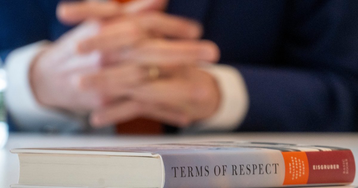
    The first step to solving a problem is admitting you have one. In his new book Terms of Respect: How Colleges Get Free Speech Right, Princeton University President Christopher L. Eisgruber reports on FIRE’s data on free speech and First Amendment norms on campus while making no effort to understand it and misusing the data of others. In other words, he’s skipped that first step — and now Princeton is tumbling down the staircase. 

    Eisgruber’s book makes many questionable claims, from dismissing good-faith critiques to muddying examples of censorship. But for our purposes here, let’s cabin our criticism to the nine pages of Chapter 5 that he devotes to dismissing data, including FIRE’s.

    Our research

    FIRE’s research — like all research — is imperfect, and we welcome criticism. Research isn’t about proving you’re right. It’s about stress-testing ideas to see what holds up. Scrutiny is how the process works, and it’s how the work gets better. 

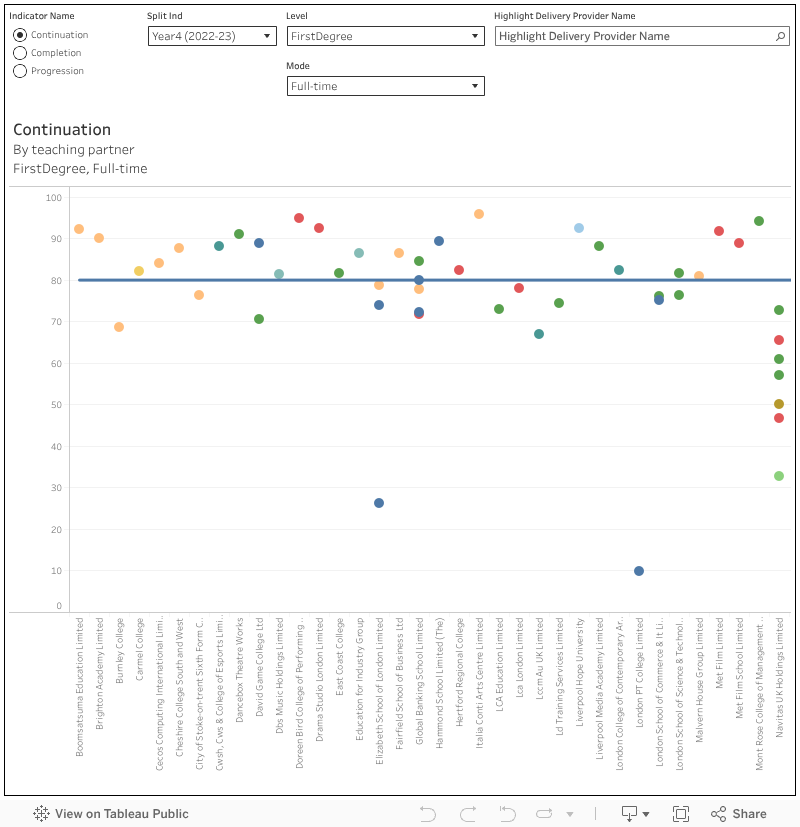
    Our largest and most ambitious annual research project is the College Free Speech Rankings, which combines three factors: written speech policies, a national survey of student views on campus free expression, and outcomes from campus speech controversies. Reasonable minds can differ on how to weigh these factors, which is why we make all our data available to anyone who requests it. If someone believes these factors should be weighed differently, or has different factors they would like to include, they are welcome to do so, and to use our data.

    College Free Speech Rankings

    The College Free Speech Rankings is a comprehensive comparison of the student experience of free speech on their campuses.


    Read More

    We’re also transparent about our methodology. This year, we preregistered our methodology before our survey data came back, in part to make clear that we do not — and cannot — reverse-engineer outcomes to put certain schools on top or bottom.

    Every year when we release the report, we get feedback. We take the thoughtful critiques seriously and have often used them to improve our work. Again, feedback is part of the process. But not all feedback comes from a place of good faith.

    Bias or projection?

    Eisgruber introduces FIRE in a manner intended to discredit us, but that probably ends up saying more about his biases than any of ours:

    An organization called FIRE (the Foundation for Individual Rights and Expression) has probably done as much as any other entity to create the impression that free speech is under continuous assault on college campuses. FIRE is a nonprofit advocacy organization that describes itself as defending free speech and free thought for all Americans; it was founded in 1999 with a focus on campus speech issues and now receives a substantial portion of its funding from foundations often associated with conservative political causes.

    Eisgruber provides no footnote explaining or citing the conservative foundations to which he objects, when the “now” period started, or how “substantial” are those alleged funds. In reality, FIRE is funded by a very politically diverse cohort, and in the last fiscal year, 74% of our funding came from individual donors compared to 26% from foundation grants.

    Eisgruber’s implication is that FIRE is biased towards conservatives because we have conservative donors. (So does Princeton, and few would accuse it of being politically conservative.) He has to rely on these vague implications because if you look at the evidence, you have to contend with FIRE’s many cases on behalf of liberal students and professors. Or our lawsuit against the Trump administration. Or against the governments of Texas and Florida, in which we succeeded in blocking speech restrictions passed by deep-red legislatures.

    If he actually had any evidence that donors were influencing our research or casework, he’d have shown it. And with regard to our research, if the methodology and procedures are solid, it wouldn’t even matter if we were conservative, liberal, or from another planet entirely. If someone you hate tells you the sky is blue, the fact that you don’t like them is irrelevant to the truth or falsity of their statements. So he’s just tossing out the accusation and hoping that’s enough to bias his audience against us in the section that follows.

    Eisgruber then brings up FIRE’s supposed bias to praise another group’s research in a similar vein about free expression in the University of North Carolina system (more on that later):

    Unlike at FIRE and its kin, the researchers brought no discernible ideological or advocacy agenda to their work: The three original collaborators on the project included one self-identified conservative (McNeilly) and one self-identified liberal (Larson).

    If he had bothered to fact-check this claim by contacting FIRE, he would have found that our research department and those of us who work on the rankings share at least that level of political diversity (as does FIRE as a whole)! As for their indiscernible advocacy agenda, he may have missed their excellent recommendations for free expression:

    In sum, we recommend that efforts to improve the campus culture for free expression and constructive dialogue be holistic and attentive to the diverse contexts in which students encounter politics. Tangibly, we suggest that the UNC system encourage researchers from member institutions to review these data, conduct their own analyses, and develop campus-specific plans for creating and evaluating their own interventions.

    As agendas go, that’s a praiseworthy one to have, but it is an agenda.

    But while Eisgruber is quick to baselessly accuse FIRE of bias, in all his discussion of our findings, he never once pauses to consider his own biases. His defense of the status quo for free speech on campus is, not coincidentally, a defense of his own record as president. That’s a pretty big blind spot, and it shows. Even worse, his desire to justify himself leads to some exceptionally lazy takes on our research. 

    When ‘it’s not clear’ really means ‘I didn’t bother to look into it’

    Eisgruber takes issue with the methodology of FIRE’s Campus Deplatforming Database. He notes that before 2024, it was called the Disinvitation Database, and adds a footnote: “It is not clear what changed when the database expanded.” That’s not even close to correct, as we published a complete explanation about the changes on Feb. 8, 2024. It would be absurd for us to completely overhaul the methodology and purpose of our database without explaining those changes somewhere. That’s why we did explain it. He could have found this out with a simple Google search.

    One might be forgiven for missing this kind of mistake when writing a critique on X. It’s less excusable in the context of a book, for which he presumably had research assistance and certainly had an editor. (Or did he? Curiously, the same footnote also says that the database was “accessed November 17, 2025,” which, at the time of this writing, has not yet occurred.)

    As for the substance of his critique, Eisgruber calls the database a “hot mess,” claiming our inclusion criteria are too broad and that we “[conflate] disinvitation with deplatforming and censorship.” He never defines these terms, so it’s hard to know what distinction he thinks we missed. His example? He cites as “absurd” our decision to classify as a disinvitation attempt a situation in which NYU students tried to replace their commencement speaker, former Princeton President Shirley Tilghman, with someone more famous, followed by several similar efforts at Princeton.

    Reasonable minds can disagree on what such episodes mean, but by our stated methodology, they clearly count as deplatforming attempts: 

    A deplatforming attempt . . . is an attempt to prevent someone from expressing themselves in a public forum on campus. Deplatforming attempts include attempts to disinvite speakers from campus speeches or commencement ceremonies.

    That definition is public and consistent. It doesn’t depend on some subjective criterion for how “bad” we or Eisgruber think an incident was, or how justified students felt in opposing it. If Eisgruber wants to challenge our data, he could propose his own definition and see what share of our dataset fits it. Instead, he cherry-picks anecdotes he happens not to care about, and conveniently ignores more egregious examples.

    He also objects to the idea that disinvitations — even successful ones — can threaten free speech, arguing that FIRE “confuses the exercise of free speech with threats to free speech.” But that’s a false dichotomy. The exercise of free speech can absolutely threaten others’ ability to speak.

    As FIRE has noted on many occasions, calls for disinvitation are themselves protected speech — so are calls for violence in response to speech that don’t meet the bar for incitement. 

    Eisgruber agrees with FIRE that shoutdowns are never acceptable and are incompatible with free speech. But it’s hard to reconcile that with his position that disinvitation attempts can never threaten free speech. They often involve appeals to university authorities to shut down an event or speech. In other words, they are attempts by one group of people to decide for their peers what speech their peers will be able to hear, similar to a heckler’s veto.

    Eisgruber also presents a heckler’s veto from 1970 that doesn’t appear in our database, as if to prove that campus illiberalism didn’t start with Gen Z. Believe me, we’re aware. We’ve written plenty about McCarthy-era censorship and the Red Scare. Plus, FIRE was founded back in 1999, long before today’s version of the culture wars. Illiberalism on campus isn’t new, and we certainly wouldn’t argue that it is new after 25 years of fighting it. It just takes different forms in different eras — and we track it wherever it appears. The reason Eisgruber’s example wasn’t included in our database is simply that we made the decision to limit the database to incidents that occurred since FIRE’s founding.

    REPORT: Faculty members more likely to self-censor today than during McCarthy era

    Today, one in four faculty say they’re very or extremely likely to self-censor in academic publications, and over one in three do so during interviews or lectures — more than during and Second Red Scare and McCarthyism.


    Read More

    He praises Princeton for not having given in to a heckler’s veto since then: “Hickel got shouted down not by Gen Z but by members of an older generation that now criticizes young people for failing to respect free speech. Princeton students allowed every speaker in the next half century to have their say.” Unfortunately, this may have jinxed Princeton, as, apparently after Eisgruber’s manuscript was finalized, two speaking events at Princeton were disrupted.

    Survey critiques suggest he didn’t read our survey

    Eisgruber next tries to argue that concerns about self-censorship are overblown. He starts reasonably enough, noting that survey data can be tricky: 

    Polling data is, however, notoriously sensitive to sampling biases and small differences in the formulation of questions. Data about concepts such as free speech requires careful interpretation that it rarely gets.

    We agree! But then he cites FIRE’s 2021 finding that over 80% of college students self-censor at least sometimes, and 21% do so often, only to dismiss it: “Should we worry about these numbers? Not without more evidence and better poll questions.”

    What’s wrong with the poll question? He never says. He just moves on to talk about other surveys. So let’s stay on this one. What does he think about self-censorship? Well, as he defines it, he actually thinks it’s good:

    Indeed, I am most concerned about the substantial fraction of people who say they never self-censor. Do they really say everything that pops into their heads? . . . Of course people self-censor! Politeness, tact, and civility require it. And as we become more aware of the sensibilities of the diverse people around us, we may realize that we need to self-censor more often or differently than we did before.

    Do students share his conception of self-censorship as politeness or conscientious refusal to offend? Here’s how we have asked that question for the past four years:

    This next series of questions asks you about self-censorship in different settings. For the purpose of these questions, self-censorship is defined as follows: Refraining from sharing certain views because you fear social (exclusion from social events), professional (losing job or promotion), legal (prosecution or fine), or violent (assault) consequences, whether in person or remotely (by phone or online), and whether the consequences come from state or non-state sources.

    Q: How often do you self-censor during conversations with other students on campus?

    Q: How often do you self-censor during conversations with your professors?

    Q: How often do you self-censor during classroom discussions?

    • Never

    • Rarely
    • Occasionally, once or twice a month
    • Fairly often, a couple times a week
    • Very often, nearly every day

    As you can see, this isn’t asking about garden-variety tact or politeness. To be fair to Eisgruber, we didn’t provide this definition when we asked the question in 2021 (though he should have sought the most recent data; that he did not is itself strange). Unfortunately for him, since adding this clarifying definition, the portion of students who self-censor at least rarely has increased to 91-93%, depending on the context, and those reporting that they often self-censor now stand at 24-28%.

    In other words, a quarter of university students in America regularly silence themselves out of fear of social, professional, legal, or violent consequences. As for his request for “more evidence,” the responses are dire year after year. Maybe Eisgruber still thinks that’s fine, but we don’t. 

    Support for violence and shoutdowns is worse than he admits

    Eisgruber also downplays how many students think it’s acceptable to use violence or shoutdowns to silence speakers, and tries to hand-wave away data in an explanation that utterly mangles First Amendment law:

    One explanation highlights ambiguities in the survey questions. For example, American free speech law agrees with students who say that it is “rarely” or “sometimes” acceptable to stop people from talking. Not all speech is protected. If, for example, speakers are about to shout “fire” falsely in a crowded theater, or if they are preparing to incite imminent violence, you may and should do what you can to (in the words of the poll question) “prevent them from talking.”

    We would be remiss to pass up an opportunity to once again address the immortal, zombie claim that you can’t shout “fire” in a crowded theater. Eisgruber did better than many others by including “falsely,” but it’s still incomplete and misleading (did a panic occur? Was it likely or intended? These questions matter) and has been for a very long time. It’s dispiriting to see it come from the president of an Ivy League university — one who has a law degree, no less. But also, the fact that you as a listener think someone might be about to engage in unprotected speech doesn’t mean you should dole out vigilante justice to prevent it. If you do, you’ll probably go to jail.

    Different wording, same story: growing student support for violence and shoutdowns shows campus free speech is in danger.

    But leaving that aside, what of his contention that the high levels of support are just an artifact of the “prevent them from talking” wording? Well, here’s the wording of our latest poll question on that subject:

    How acceptable would you say it is for students to engage in the following actions to protest a campus speaker?

    Q: Shouting down a speaker to prevent them from speaking on campus.

    Q: Blocking other students from attending a campus speech.

    Q: Using violence to stop a campus speech.

    • Always acceptable
    • Sometimes acceptable
    • Rarely acceptable
    • Never acceptable

    With this different wording, we find 71% at least “rarely” accept shoutdowns, 54% at least “rarely” support blocking, and 34% at least “rarely” support violence. Different wording, same story: growing student support for violence and shoutdowns shows campus free speech is in danger. 

    It’s important to note that Eisgruber offers only quibbles with question wording, and offers theories for how students may be interpreting questions. He doesn’t offer competing data. While that might be understandable for the typical social media critic, if all this could be debunked by “better poll questions,” no one is in a better position to commission said research (at least on his or her campus) than the president of a university. Instead of offering unconvincing dismissals of existing data, he could have contributed to the body of knowledge with his “better” questions. We still encourage him to do so. Seriously. Please run a free speech survey at Princeton.

    As much as FIRE or Eisgruber may wish these poll numbers were different, we need to deal with the world as it is.

    Refuting FIRE data with . . . data that agree with FIRE’s data

    So what data does Eisgruber use to support his case that the situation on campus is rosier than FIRE’s data suggests? As mentioned earlier, he turns to a study of the UNC system called “Free Expression and Constructive Dialogue in the University of North Carolina.” We were darkly amused by this because FIRE Chief Research Advisor Sean Stevens, who heads up our College Free Speech Rankings survey, was approached by that study’s authors based on his work on surveys for FIRE and Heterodox Academy — and they consulted with Stevens about what questions to include in their survey. Here’s Eisgruber:

    I believe, however, that the analysis by Ryan, Engelhardt, Larson, and McNeilly accurately describes most colleges and universities. Certainly it chimes with my own experiences at Princeton. 

    This could be in a textbook next to “confirmation bias.” The data that jibes with his experience he sees as more trustworthy. Yet this survey does not refute FIRE’s findings, but is perfectly compatible with them. The rosy finding upon which Eisgruber puts a lot of weight is their finding that faculty do not push political agendas in class. This isn’t an area that FIRE studies, so it’s not a refutation of our work. More importantly, it’s not asking the same question.

    Eisgruber goes on:

    There is another reason why the North Carolina study’s conclusions are plausible. They mesh with and reflect broader, well-documented trends in American political life. A mountain of evidence shows that over the past several decades, and especially in the twenty-first century, political identities have hardened.

    But FIRE’s data is also perfectly compatible with the idea of increasing polarization. It’s hard, therefore, even to find the disagreement to which he’s pointing when he says their data is good and our data is bad.

    The UNC survey, like ours, found “campuses do not consistently achieve an atmosphere that promotes free expression” and “students who identify as conservative face distinctive challenges.” This is fully compatible with our data. It’s not clear where Eisgruber finds meaningful disagreement, and to the extent he frames this data as hopeful, it seems to misinterpret the authors’ findings.

    Even if the data coming out of UNC schools were wildly different from our national-level data, it would be a mistake to take it as representative of the nation as a whole. The mistake, specifically, would be cherry-picking. Six of the seven UNC schools that we rank are in the top 20 of our College Free Speech Rankings. The most amusing part, from a FIRE perspective, is that this is not a coincidence. Those six each worked with FIRE’s policy reform team and achieved our highest “green light” rating for free speech, and have implemented programming to support free expression on campus. Indeed, since the early days of FIRE’s speech code ratings, FIRE has made a special effort to evaluate the speech codes of all of the UNC System schools, even the smaller ones, thanks to a partnership with the state’s James G. Martin Center for Academic Renewal (then called the Pope Center). So if UNC campuses are far more likely to have a “green light” than the rest of the nation, that’s in significant part because of FIRE’s ongoing work. Princeton, in comparison, receives FIRE’s lowest “red light” rating.

    If anything, the UNC schools provide evidence that the way to improve free speech on campus is to address it head-on, rather than grasp about for some explanation to justify the current state of affairs. Speaking of which:

    Don’t be like Eisgruber — real leaders listen

    In the process of writing this piece, we received word of a very different response to FIRE data from administrators at Wellesley College:

    “Both FIRE stats and our own research, in some ways, have been similar,” said [Wellesley Vice President of Communications and Public Affairs Tara] Murphy. “We are taking this seriously.”

    In November [2024], Wellesley commissioned Grand River Solutions to conduct a survey on civil discourse among students. Out of 2,281 students invited to participate, 668 responded to at least one of the three questions, yielding a 29% response rate. The data was similar to the FIRE report: 36.8% of respondents said they felt either “very reluctant or somewhat reluctant” to share their views on controversial topics in the classroom, and 30% felt similarly hesitant outside of class. 

    That’s the kind of response we hope for. If campuses aren’t sure that FIRE has it right, they should be getting their own data so that they can address any campus free speech problems that the data may bear out.  

    We’re happy to report that in that sense FIRE’s rankings have been extremely successful. Many schools have reached out and worked with us to improve their policies and begin to implement programming to support free speech on campus. As dire as some of the stats can appear to be, FIRE has seen green shoots in the form of faculty and administrators who recognize the problem and want to do something about it.

    Our research deserves, and has, more thoughtful critics. Princeton’s community deserves a president who is more curious about what’s happening on his campus, and serious about improving the environment for free speech. Maybe it’s a coincidence that the academic experience that ultimately led Alan Charles Kors and Harvey Silverglate to found FIRE began when they met during their freshman year at … Princeton University. Or maybe it’s not. 

    If finding out ever becomes a priority for Eisgruber, we’d be happy to help.

    Source link

  • The Student Satisfaction Inventory: Data to Capture the Student Experience

    The Student Satisfaction Inventory: Data to Capture the Student Experience

    Student Satisfaction Inventory: Female college student carrying a notebook
    Satisfaction data provides insights across the student experience.

    The Student Satisfaction Inventory (SSI) is the original instrument in the family of Satisfaction-Priorities Survey instruments.  With versions that are appropriate for four-year public/private institutions and two-year community colleges, the Student Satisfaction Inventory provides institutional insight and external national benchmarks to inform decision-making on more than 600 campuses across North America. 

    With its comprehensive approach, the Student Satisfaction Inventory gathers feedback from current students across all class levels to identify not only how satisfied they are, but also what is most important to them. Highly innovative when it first debuted in the mid-1990’s, the approach has now become the standard in understanding institutional strengths (areas of high importance and high satisfaction) and institutional challenges (areas of high importance and low satisfaction).

    With these indicators, college leaders can celebrate what is working on their campus and target resources in areas that have the opportunity for improvement. By administering one survey, on an annual or every-other-year cycle, campuses can gather student feedback across the student experience, including instructional effectiveness, academic advising, registration, recruitment/financial aid, plus campus climate and support services, and track how satisfaction levels increase based on institutional efforts.

    Along with tracking internal benchmarks, the Student Satisfaction Inventory results provide comparisons with a national external norm group of like-type institutions to identify where students are significantly more or less satisfied than students nationally (the national results are published annually). In addition, the provided institutional reporting offers the ability to slice the data by all of the standard and customizable demographic items to provide a clearer approach for targeted initiatives. 

    Like the Adult Student Priorities Survey and the Priorities Survey for Online Learners (the other survey instruments in the Satisfaction-Priorities Surveys family), the data gathered by the Student Satisfaction Inventory can support multiple initiatives on campus, including to inform student success efforts, to provide the student voice for strategic planning, to document priorities for accreditation purposes and to highlight positive messaging for recruitment activities. Student satisfaction has been positively linked with higher individual student retention and higher institutional graduation rates, getting right to the heart of higher education student success. 

    Sandra Hiebert, director of institutional assessment and academic compliance at McPherson College (KS) shares, “We have leveraged what we found in the SSI data to spark adaptive challenge conversations and to facilitate action decisions to directly address student concerns. The process has engaged key components of campus and is helping the student voice to be considered. The data and our subsequent actions were especially helpful for our accreditation process.”

    See how you can strengthen student success with the Student Satisfaction Inventory

    Learn more about best practices for administering the online Student Satisfaction Inventory at your institution, which can be done any time during the academic year on your institution’s timeline.

    Source link

  • Smarter, faster, and more secure classroom connectivity

    Smarter, faster, and more secure classroom connectivity

    Key points:

    As digital learning continues to evolve, K-12 districts are under pressure to deliver connectivity that’s as fast, secure, and flexible as the learning it supports. Outdated infrastructure can’t keep up with the growing demands of cloud-based instruction, data-heavy applications, and connected devices across campuses, buses, and beyond.

    In this can’t-miss webinar, you’ll hear how forward-thinking school systems are building future-ready networks–combining 5G, LTE, Wi-Fi-as-WAN, and hybrid solutions to power learning anywhere, protect sensitive data, and stretch limited budgets even further with strategic E-rate funding.

    In just one session, you’ll walk away with actionable insights on how to:

    • Modernize district and campus networks with hybrid WAN architectures that keep uptime consistent and students connected
    • Extend connectivity beyond the classroom–to buses, portables, athletic fields, and events–with mobile Wi-Fi, POS tools, location services, and security integrations
    • Simplify network management and strengthen protection through centralized cloud control, out-of-band alerts, and zero-trust security principles

    Whether you’re upgrading your network or rethinking your entire connectivity strategy, this session will help you turn today’s infrastructure challenges into tomorrow’s opportunities.

    Don’t fall behind–learn how leading K-12 IT professionals are future-proofing their districts and powering digital learning at scale.

    Register now to reserve your spot and secure your district’s digital future!

    Laura Ascione
    Latest posts by Laura Ascione (see all)

    Source link

  • Higher education data explains why digital ID is a good idea

    Higher education data explains why digital ID is a good idea

    Just before the excitement of conference season, your local Facebook group lost its collective mind. And it shows no sign of calming down.

    Given everything else that is going on, you’d think that reinforcing the joins between key government data sources and giving more visibility to the subjects of public data would be the kind of nerdy thing that the likes of me write about.

    But no. Somebody used the secret code word. ID Cards.

    Who is she and what is she to you?

    I’ve written before about the problems our government faces in reliably identifying people. Any entitlement– or permission– based system needs a clear and unambiguous way of assuring the state that a person is indeed who they claim they are, and have the attributes or documentation they claim to.

    As a nation, we are astonishingly bad at this. Any moderately serious interaction with the state requires a parade of paperwork – your passport, driving license, birth certificate, bank statement, bank card, degree certificate, and two recent utility bills showing your name and address. Just witness the furore over voter ID – to be clear a pointless idea aimed at solving a problem that the UK has never faced – and the wild collection of things that you might be allowed to pull out of your voting day pocket that do not include a student ID.

    We are not immune from this problem in higher education. I’ve been asking for years why you need to apply to a university via UCAS, and apply for funding via the Student Loans Company, via two different systems. It’s then never been clear to me why you then need to submit largely similar information to your university when you enroll.

    Sun sign

    Given that organs of the state have this amount of your personal information, it is then alarming that the only way it can work out what you earn after graduating is by either asking you directly (Graduate Outcomes) or by seeing if anyone with your name, domicile, and date of birth turns up in the Inland Revenue database.

    That latter one – administrative matching – is illustrative of the government’s current approach to identity. If it can find enough likely matches of personal information in multiple government databases it can decide (with a high degree of confidence) that records refer to the same person.

    That’s how they make LEO data. They look for National Insurance Number (NINO), forename, surname, date of birth, postcode, and sex in both HESA student records and the Department for Work and Pension’s Customer Information System (which itself links to the tax database). Keen Wonkhe readers will have spotted that NINO isn’t returned to HESA – to get this they use “fuzzy matching” with personal data from the Student Loans Company, which does. The surname thing is even wilder – they use a sound-based algorithm (SOUNDEX) to allow for flexibility on spellings.

    This kind of nonsense actually has a match rate of more than 90 per cent (though this is lower for ethnically Chinese graduates because sometimes forenames and surnames can switch depending on the cultural knowledge of whoever prepared the data).

    It’s impressive as a piece of data engineering. But given that all of this information was collected and stored by arms of the same government it is really quite poor.

    The tale of the student ID

    Another higher education example. If you were ever a student you had a student ID. It was printed on your student card, and may have turned up on various official documents too. Perhaps you imagined that every student in the UK had a student number, and that there was some kind of logic to the way that they were created, and that there was a canonical national list. You would be wrong.

    Back in the day, this would have been a HESA ID, itself created from your UCAS number and your year of entry (or your year of entry, HESA provider ID, and an internal reference number if you applied directly). Until just a few years ago, the non-UCAS alternative was in use for all students – even including the use of the old HESA provider ID rather than the more commonly used UKPRN. Why the move away from UCAS – well, UCAS had changed how they did identifiers and HESA’s systems couldn’t cope.

    You’re expecting me to say that things are far more sensible now, but no. They are not. HESA has finally fixed the UKPRN issue within a new student ID field (SID). This otherwise replicates the old system but with one important difference: it is not persistent.

    Under the old approach, the idea was you had one student number for life – if you did an undergraduate degree at Liverpool, a masters at Manchester Met, and a PhD at Royal Holloway these were all mapped to the same ID. There was even a lookup service for new providers if the student didn’t have their old number. I probably don’t even need to tell you why this is a good idea if you are interested – in policy terms – in the paths that students within their career in higher education. These days we just administratively match if we need to. Or – as in LEO – assume that the last thing a student studied was the key to or cause of their glittering or otherwise career.

    The case of the LLE

    Now I hear what you might be thinking. These are pretty terrible examples, but they are just bodges – workarounds for bad decisions made in the distant past. But we have the chance to get it right in the next couple of years.

    The design of the Lifelong Learning Entitlement means that the government needs tight and reliable information about who does what bit of learning in order that funds can be appropriately allocated. So you’d think that there would be a rock-solid, portable, unique learner number underpinning everything.

    There is not. Instead, we appear to be standardising on the Student Loans Company customer reference number. This is supposed to be portable for life, but it doesn’t appear in any other sector datasets (the “student support number” is in HESA, but that is somehow different – you get two identifiers from SLC, lucky you). SLC also holds your NINO (you need one to get funding!), and has capacity to hold another additional number of an institution’s choice, but not (routinely) your HESA student ID or your UCAS identifier.

    There’s also space to add a Unique Learner Number (ULN) but at this stage I’m too depressed to go into what a missed opportunity that is.

    Why is standardising on a customer reference number not a good idea? Well, think of all the data SLC doesn’t hold but HESA does. Think about being able to refer easily back to a school career and forward into working life on various government data. Think about how it is HESA data and not SLC data that underpins LEO. Think about the palaver I have described above and ask yourself why you wouldn’t fix it when you had the opportunity.

    Learning to love Big Brother

    I’ll be frank, I’m not crazy about how much the government knows about me – but honestly compared to people like Google, Meta, or – yikes – X (formerly twitter) it doesn’t hugely worry me.

    I’ve been a No2ID zealot in my past (any employee of those three companies could tell you that) but these days I am resigned to the fact that people need to know who I am, and I’d rather be more than 95 per cent confident that they could get it right.

    I’m no fan of filling in forms, but I am a fan of streamlined and intelligent administration.

    So why do we need ID cards? Simply because in proper countries we don’t need to go through stuff like this every time we want to know if a person that pays tax and a person that went to university are the same person. Because the current state of the art is a mess.

    Source link

  • Higher ed groups blast Trump plan to expand applicant data collection

    Higher ed groups blast Trump plan to expand applicant data collection

    This audio is auto-generated. Please let us know if you have feedback.

    More than three dozen higher education organizations, led by the American Council on Education, are urging the Trump administration to reconsider its plan to require colleges to submit years of new data on applicants and enrolled students, disaggregated by race and sex.

    As proposed, the reporting requirements would begin on Dec. 3., giving colleges just 17 weeks to provide extensive new admissions data, ACE President Ted Mitchell wrote in an Oct. 7 public comment. Mitchell argued that isn’t enough time for most colleges to effectively comply and would lead to significant errors.

    ACE’s comment came as part of a chorus of higher education groups and colleges panning the proposal. The plan’s public comment period ended Tuesday, drawing over 3,000 responses.

    A survey conducted by ACE and the Association for Institutional Research found that 91% of polled college leaders expressed concern about the proposed timeline, and 84% said they didn’t have the resources and staff necessary to collect and process the data.

    Delaying new reporting requirements would leave time for necessary trainings and support services to be created, Mitchell said. The Education Department — which has cut about half its staff under President Donald Trump — should also ensure that its help desk is fully crewed to assist colleges during implementation, Mitchell said.

    Unreliable and misleading data?

    In August, Trump issued a memo requiring colleges to annually report significantly more admissions data to the National Center for Education Statistics, which oversees the Integrated Postsecondary Education Data System.

    The Education Department’s resulting proposal would require colleges to submit six years’ worth of undergraduate and graduate data in the first year of the IPEDS reporting cycle, including information on standardized test scores, parental education level and GPA. 

    In a Federal Register notice, the Education Department said this information would increase transparency and “help to expose unlawful practices″ at colleges. The initial multi-year data requirement would “establish a baseline of admissions practices” before the U.S. Supreme Court’s 2023 ruling against race-conscious admissions, it said.

    But the department’s proposal and comments have caused unease among colleges, higher ed systems and advocacy groups in the sector.

    “While we support better data collection that will help students and families make informed decisions regarding postsecondary education, we fear that the new survey component will instead result in unreliable and misleading data that is intended to be used against institutions of higher education,” Mitchell said in the coalition’s public comment.

    The wording of the data collection survey — or lack thereof — also raised some red flags.

    Mitchell criticized the Trump administration for introducing the plan without including the text of the proposed questions. Without having the actual survey to examine, “determining whether the Department is using ‘effective and efficient’ statistical survey methodology seems unachievable,” he said.

    The Education Department said in the Federal Register notice that the additional reporting requirements will likely apply to four-year colleges with selective admissions processes, contending their admissions and scholarships “have an elevated risk of noncompliance with the civil rights laws.”

    During the public comment period, the department specifically sought feedback on which types of colleges should be required to submit the new data.

    The strain on institutions ‘cannot be overstated’

    Several religious colleges voiced concerns about the feasibility of completing the Education Department’s proposed request without additional manpower.

    “Meeting the new requirements would necessitate developing new data extracts, coding structures, validation routines, and quality assurance checks — all while maintaining existing reporting obligations,” Ryon Kaopuiki, vice president for enrollment management at the University of Indianapolis, said in a submitted comment. 

    Source link

  • Outcomes data for subcontracted provision

    Outcomes data for subcontracted provision

    In 2022–23 there were around 260 full time first degree students, registered to a well-known provider and taught via a subcontractual arrangement, that had a continuation rate of just 9.8 per cent: so of those 260 students, just 25 or so actually continued on to their second year.

    Whatever you think about franchising opening up higher education to new groups, or allowing established universities the flexibility to react to fast-changing demand or skills needs, none of that actually happens if more than 90 per cent of the registered population doesn’t continue with their course.

    It’s because of issues like this that we (and others) have been badgering the Office for Students to produce outcomes data for students taught via subcontractual arrangements (franchises and partnerships) at a level of granularity that shows each individual subcontractual partner.

    And finally, after a small pilot last year, we have the data.

    Regulating subcontractual relationships

    If anything it feels a little late – there are now two overlapping proposals on the table to regulate this end of the higher education marketplace:

    • A Department of Education consultation suggests that every delivery partner that has more than 300 higher education students would need to register with the Office for Students (unless it is regulated elsewhere)
    • And an Office for Students consultation suggests that every registering partner with more than 100 higher education students taught via subcontractual arrangements will be subject to a new condition of registration (E8)

    Both sets of plans address, in their own way, the current reality that the only direct regulatory control available over students studying via these arrangements is via the quality assurance systems within the registering (lead) partners. This is an arrangement left over from previous quality regimes, where the nation spent time and money to assure itself that all providers had robust quality assurance systems that were being routinely followed.

    In an age of dashboard-driven regulation, the fact that we have not been able to easily disaggregate the outcomes of subcontractual students has meant that it has not been possible to regulate this corner of the sector – we’ve seen rapid growth of this kind of provision under the Office for Students’ watch and oversight (to be frank) has just not been up to the job.

    Data considerations

    Incredibly, it wasn’t even the case that the regulator had this data but chose not to publish it. OfS has genuinely had to design this data collection from scratch in order to get reliable information – many institutions expressed concern about the quality of data they might be getting from their academic partners (which should have been a red flag, really).

    So what we get is basically an extension of the B3 dashboards where students in the existing “partnership” population are assigned to one of an astonishing 681 partner providers alongside their lead provider. We’d assume that each of these specific populations has data across the three B3 (continuation, completion, progression) indicators – in practice many of these are suppressed for the usual OfS reasons of low student numbers and (in the case of progression) low Graduate Outcomes response rates.

    Where we do get indicator values we also see benchmarks and the usual numeric thresholds – the former indicating what OfS might expect to see given the student population, the latter being the line beneath which the regulator might feel inclined to get stuck into some regulating.

    One thing we can’t really do with the data – although we wanted to – is treat each subcontractual provider as if it was a main provider and derive an overall indicator for it. Because many subcontractual providers have relationships (and students) from numerous lead providers, we start to get to some reasonably sized institutions. Two – Global Banking School and the Elizabeth School London – appear to have more than 5,000 higher education students: GBS is around the same size as the University of Bradford, the Elizabeth School is comparable to Liverpool Hope University.

    Size and shape

    How big these providers are is a good place to start. We don’t actually get formal student numbers for these places – but we can derive a reasonable approximation from the denominator (population size) for one of the three indicators available. I tend to use continuation as it gives me the most recent (2022–23) year of data.

    [Full screen]

    The charts showing numbers of students are based on the denominators (populations) for one of the three indicators – by default I use continuation as it is more likely to reflect recent (2022–23) numbers. Because both the OfS and DfE consultations talk about all HE students there are no filters for mode or level.

    For each chart you can select a year of interest (I’ve chosen the most recent year by default) or the overall indicator (which, like on the main dashboards is synthetic over four years) If you change the indicator you may have to change the year. I’ve not included any indications of error – these are small numbers and the possible error is wide so any responsible regulator would have to do more investigating before stepping in to regulate.

    Recall that the DfE proposal is that institutions with more than 300 higher education students would have to register with OfS if they are not regulated in another way (as a school, FE college, or local authority, for instance). I make that 26 with more than 300 students, a small number of which appear to be regulated as an FE college.

    You can also see which lead providers are involved with each delivery partner – there are several that have relationships with multiple universities. It is instructive to compare outcomes data within a delivery partner – clearly differences in quality assurance and course design do have an impact, suggesting that the “naive university hoodwinked by low quality franchise partner” narrative, if it has any truth to it at all, is not universally true.

    [Full screen]

    The charts showing the actual outcomes are filtered by mode and level as you would expect. Note that not all levels are available for each mode of study.

    This chart brings in filters for level and mode – there are different indicators, benchmarks, and thresholds for each combination of these factors. Again, there is data suppression (low numbers and responses) going on, so you won’t see every single aspect of every single relationship in detail.

    That said, what we do see is a very mixed bag. Quite a lot of provision sits below the threshold line, though there are also some examples of very good outcomes – often at smaller, specialist, creative arts colleges.

    Registration

    I’ve flipped those two charts to allow us to look at the exposure of registered universities to this part of the market. The overall sizes in recent years at some providers won’t be of any surprise to those who have been following this story – a handful of universities have grown substantially as a result of a strategic decision to engage in multiple academic partnerships.

    [Full screen]

    Canterbury Christ Church University, Bath Spa University, Buckinghamshire New University, and Leeds Trinity University have always been the big four in this market. But of the 84 registered providers engaged in partnerships, I count 44 that met the 100 student threshold for the new condition of registration B3 had it applied in 2022–23.

    Looking at the outcomes measures suggests that what is happening across multiple partners is not offering wide variation in performance, although there will always be teaching provider, subject, and population variation. It is striking that places with a lot of different partners tend to get reasonable results – lower indicator values tend to be found at places running just one or two relationships, so it does feel like some work on improving external quality assurance and validation would be of some help.

    [Full screen]

    To be clear, this is data from a few years ago (the most recent available data is from 2022–23 for continuation, 2019–20 for completion, and 2022–23 for progression). It is very likely that providers will have identified and addressed issues (or ended relationships) using internal data long before either we or the Office for Students got a glimpse of what was going on.

    A starting point

    There is clearly a lot more that can be done with what we have – and I can promise this is a dataset that Wonkhe is keen to return to. It gets us closer to understanding where problems may lie – the next phase would be to identify patterns and commonalities to help us get closer to the interventions that will help.

    Subcontractual arrangements have a long and proud history in UK higher education – just about every English provider started off in a subcontractual arrangement with the University of London, and it remains the most common way to enter the sector. A glance across the data makes it clear that there are real problems in some areas – but it is something other than the fact of a subcontractual arrangement that is causing them.

    Do you like higher education data as much as I do? Of course you do! So you are absolutely going to want to grab a ticket for The Festival of Higher Education on 11-12 November – it’s Team Wonkhe’s flagship event and data discussion is actively encouraged. 

    Source link

  • Supporting Transfer Student Success Through Data

    Supporting Transfer Student Success Through Data

    Transfer students often experience a range of challenges transitioning from a community college to a four-year institution, including credit loss and feeling like they don’t belong on campus.

    At the University of California, Santa Barbara, 30 percent of incoming students are transfers. More than 90 percent of those transfers come from California community colleges and aspire to complete their degree in two years.

    While many have achieved that goal, they often lacked time to explore campus offerings or felt pressured to complete their degree on an expedited timeline, according to institutional data.

    “Students feel pressure to complete in two years for financial reasons and because that is the expectation they receive regarding four-year graduation,” said Linda Adler-Kassner, associate vice chancellor of teaching and learning. Transfer students said they don’t want to “give up” part of their two years on campus to study away, she said.

    Institutional data also revealed that their academic exploration opportunities were limited, with fewer transfers participating in research or student groups, which are identified as high-impact practices.

    As a result, the university created a new initiative to improve transfer student awareness of on-campus opportunities.

    Getting data: UCSB’s institutional research planning and assessment division conducts an annual new student survey, which collects information on students’ demographic details, academic progress and outside participation or responsibilities. The fall 2024 survey revealed that 26 percent of transfers work for pay more than 20 hours per week; an additional 40 percent work between 10 and 20 hours per week. Forty-four percent of respondents indicated they do not participate in clubs or student groups.

    In 2024, the Office of Teaching and Learning conducted a transfer student climate study to “identify specific areas where the transfer student experience could be more effectively supported,” Adler-Kassner said. The OTL at UCSB houses six units focused on advancing equity and effectively supporting learners.

    The study found that while transfers felt welcomed at UCSB, few were engaging in high-impact practices and many had little space in their schedules for academic exploration, “which leads them to feel stress as they work on a quick graduation timeline,” Adler-Kassner said.

    Put into practice: Based on the results, OTL launched various initiatives to make campus stakeholders aware of transfer student needs and create effective interventions to support their success.

    Among the first was the Transfer Connection Project, which surveys incoming transfer students to identify their interests. OTL team members use that data to match students’ interests with campus resources and generate a personalized letter that outlines where the student can get plugged in on campus. In fall 2025, 558 students received a personal resource guide.

    The data also showed that a majority—more than 60 percent—of transfers sought to enroll in four major programs: communications, economics, psychological and brain sciences, and statistics and data science.

    In turn, OTL leaders developed training support for faculty and teaching assistants working in these majors to implement transfer-focused pedagogies. Staff also facilitate meet-and-greet events for transfers to meet department faculty.

    This work builds on the First Generation and Transfer Scholars Welcome, which UCSB has hosted since 2017. The welcome event includes workshops, a research opportunity fair and facilitated networking to get students engaged early.

    The approach is unique because it is broken into various modules that, when combined, create a holistic approach to student support, Adler-Kassner said.

    Gauging impact: Early data shows the interventions have improved student success.

    Since beginning this work, UCSB transfer retention has grown from 87 percent in 2020 to 94 percent in 2023. Similarly, graduation rates increased 10 percentage points from 2020 to 2024. Adler-Kassner noted that while this data may be correlated with the interventions, it does not necessarily demonstrate causation.

    In addition, the Transfer Student Center reaches about 40 percent of the transfer student population each year, and institutional data shows that those who engage with the center have a four-percentage-point higher retention rate and two-point higher graduation rate than those who don’t.

    Do you have an intervention that might help others promote student success? Tell us about it.

    This article has been updated to correct the share of incoming students that are transfers at UCSB.

    Source link