David Walter Banks/The Washington Post/Getty Images
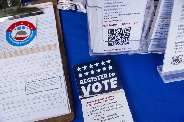
Ahead of the 2026 primaries, the North Carolina State Board of Elections rejected a plan Tuesday to open an early-voting center on the Greensboro campus of North Carolina A&T State University, according to NC Newsline.
The Republican-controlled board also voted to close the existing early-voting centers at Elon University and Western Carolina University.
After the vote, a group of N.C. A&T students who traveled to Raleigh for the board meeting gathered in the boardroom, protesting the decision. But Francis De Luca, chair of the board, threatened to call the cops if they didn’t leave, according to the news outlet.
De Luca, who voted against the early-voting sites, said he’s not in favor of them for numerous reasons. “There’s no parking,” he said. “They may set aside parking; if it’s filled, you’re going to get a ticket. We don’t put sites where there’s no parking anywhere else.”
But Siobhan Millen, a Democratic member of the board who voted for the voting centers, said the move puts “student voting is in the crosshairs.”
Without voting sites on campus, students—including many who don’t own cars—will have to travel to off-campus precincts, though some in favor of axing campus polling centers have described them as redundant. Zayveon Davis, a voter engagement leader at N.C. A&T, said the HBCU would provide shuttles to take students to the nearest polling place.
Nonetheless, he called the decision “disappointing” and reflective of broader Republican-led efforts to restrict voting access, especially for marginalized communities.
“I hope that everybody leaves here knowing that your voice does matter. Your vote does matter,” he told NC Newsline. “And if it didn’t, they wouldn’t be working this hard to take it away.”
Ok, folks, today is voting day in Newfoundland and Labrador, and so, as usual, it’s time to look at manifesto promises with respect to post-secondary education.
Newfoundland is feeling pretty good these days. Just five years ago it was living with a budget deficit of about $1 billion, and the only reason it was that low was because of a federal bailout for the Muskrat Falls dam. Now, the province *almost* has a balanced budget, it has the fastest-growing provincial economy in the country (I know, low bar, but still), and it has a new Memorandum of Understanding with Hydro-Quebec to replace the Upper Churchill contract which will – in theory at least – transform provincial finances, though not everyone is convinced. The debt load is still considerable ($47 billion) and servicing that debt takes up more money than the province spends on education. But who cares about long-term problems when there are votes to be bought…er…sought?
Let’s start with the commitments New Democratic Party, which usually wins at least one or two seats in the House of Assembly. They promise three things with respect to post-secondary education. First, they want to reverse the Liberals’ decision to let tuition rise after a 20-year freeze. Because of the deeply opaque way the NDP’s presents its costing data, it is unclear if the NDP intends to actually reimburse College of the North Atlantic (CNA) and Memorial for this or if it is simply going to tell them to eat it (a little back-of-the-envelope math suggests the rise tuition is bringing in somewhere between $20-$25 million/yr by my estimation). Second, it is going to pay CAN $10/million to increase trades training. And third, it is going to find a way to give healthcare students paid work terms.
Now, over to the Conservative Party, which does occasionally win elections (in fact it won three in a row in 2003, 2007 and 2011, and held power for 12 years). Oddly, the Conservatives have published a document called “Platform Highlights” but not an actual platform. The party seems to be running on strictly three planks made up of precisely one adjective and one noun (“Better Healthcare”, “Safer Communities” and “Lower Taxes”). Post-secondary students get in on the action, but not institutions. Like the NDP, they want to provide paid work terms for students (though in the Conservatives’ case this doesn’t seem to be limited to health care). They also want to “guarantee jobs for students training in a program where there are staff shortages” (this does seem to be limited to health care), and finally, provide a tuition refund for graduates who work in the province. This is, of course, a policy which, as I have explained on more than one occasion, is as dumb as a bag of hammers.
So, now over to the governing Liberals, whose pitch can be summed up as “we signed an MOU with Hydro-Quebec to re-up the Churchill Falls agreement and boy are we going to be rich!” Yet, perhaps because of the enormous debt, while the Liberals are making a lot of promises, a lot of them are pretty small ball. A million here, a million there – in the big scheme of things, it’s fairly restrained. (Aside: one of the more interesting provincial pledges I have seen anywhere in recent years is the Liberal pledge on the Technology and Defense sectors, which I think points to an interesting possible future where National Security actually comes to be seen as an area where provinces have some agency and some responsibility).
Anyways, back to post-secondary education, where the Liberal manifesto promises, as I say, are pretty restrained. It basically comes down to three things. First, the Liberals promise to cover all the costs of tuition associated with all practicum courses for Newfoundland and Labrador nursing students, and offer all graduating nurses full-time permanent positions in Newfoundland and Labrador. Second, they want to create a one-time moving allowance of up to $500 per student for rural students to assist with moving costs to study in St. John’s. And third, they are going to work with Memorial and CNA to expand capacity in certain fields related to new construction in Churchill Falls.
In other words, friends: today’s vote in Newfoundland is another episode in that continuing tradition of the New Canadian Post-Secondary Consensus, in which every party in every province believes that:
1) Money for students is good while money for institutions is not, and
2) To the extent post-secondary education has value, it is exclusively related to Nursing and the Construction Trades.
So, God guard thee, Newfoundland. And God help us all if, as seems increasingly likely, this is the future of Canadian post-secondary education.
As the 2026 midterm elections approach, efforts to manipulate congressional district boundaries—under the guise of redistricting—pose a serious threat to representative democracy in the United States. These efforts are not simply a matter of partisan politics; they represent a calculated attack on the principle of one person, one vote, and on the fragile trust working Americans place in democratic institutions.
Across multiple states, redistricting maps are being drawn to favor incumbents and dominant political parties, most often through a practice known as gerrymandering. While both major parties have been guilty of gerrymandering, the recent wave of redistricting efforts has intensified in key battleground states, particularly following the 2020 Census and court rulings that rolled back federal oversight.
Some of the most blatant manipulations are unfolding in Southern and Midwestern states, where legislatures have redrawn districts to dilute the voting power of Black, Latino, and low-income communities. In states like Alabama, Georgia, Louisiana, North Carolina, and Ohio, courts have intervened—only to be ignored, delayed, or overruled by higher courts, including the U.S. Supreme Court. The result: districts that favor white conservative voters while silencing diverse urban and working-class voices.
These distortions in representation aren’t merely political—they have real consequences for education policy, healthcare, labor rights, and civil rights. When working families and students find themselves in districts designed to neutralize their votes, their needs are less likely to be met by elected officials. Funding for public education, protections for contingent workers, and relief from student loan debt are often neglected in favor of corporate interests and ideological agendas.
The U.S. Supreme Court’s 2019 Rucho v. Common Cause decision paved the way for even more aggressive gerrymandering, ruling that federal courts could not adjudicate claims of partisan gerrymandering. That decision effectively gave state legislatures a green light to draw lines with political intent, even when the result undermines basic democratic principles. And with the Voting Rights Act gutted in Shelby County v. Holder (2013), many communities of color no longer have a legal shield against discriminatory maps.
In a just system, redistricting would be handled by independent commissions. In some states, this is happening—California, Michigan, Arizona, and a handful of others have taken steps toward fairer maps. But in most of the country, the party in power controls the process and uses sophisticated data tools—often developed by private firms with little transparency—to fine-tune districts down to the household level. This isn’t democracy. It’s data-driven voter suppression.
For students, low-income voters, and working-class Americans, the implications are profound. A House of Representatives that does not reflect the electorate cannot be expected to act on behalf of its needs. Adjunct professors, student debtors, gig workers, rural teachers, and public librarians already operate on the margins. When their political voices are diluted, they are pushed even further to the periphery.
These redistricting battles also have an educational cost. In states where partisan gerrymandering has secured one-party rule, legislatures have targeted curriculum content, attacked diversity and inclusion programs, cut higher education funding, and undermined faculty tenure—all without meaningful opposition. Political disempowerment leads directly to institutional decay.
The Higher Education Inquirer calls attention to these developments not only because they distort elections, but because they warp the social and economic future of the country. The 2026 House elections may be won or lost not at the ballot box but on a redistricting map drafted behind closed doors in state capitals.
The right to vote is hollow if the outcome is predetermined. The promise of representative government collapses if districts are engineered to deny equal voice. Without public awareness and pressure, these efforts to undermine democracy will go unchecked.
It’s time to speak plainly: Unless there is a national movement to restore fairness to the process, the House of Representatives in 2026 will be even less representative of the people it claims to serve.
Sources:
Brennan Center for Justice. “The Redistricting Landscape, 2023–2026.”
ProPublica. “How Politicians Use Redistricting to Lock in Power.”
NPR. “Supreme Court Ruling Lets Partisan Gerrymandering Stand.”
Southern Coalition for Social Justice. “Voting Maps and Racial Disenfranchisement.”
ACLU. “Gerrymandering: How It Works and Why It Harms Democracy.”
U.S. Census Bureau. “Apportionment and Redistricting Data.”
I’ve been fascinated for a while by the connection between political leanings and education: The correlation is so strong that I once suggested that perhaps Republicans were so anti-education because, in general, places with a higher percentage of bachelor’s degree recipients were more likely to vote for Democrats.
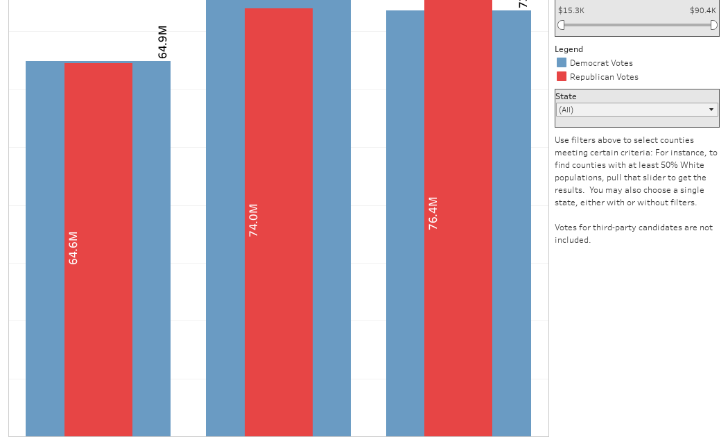
The 2024 presidential election puzzled a lot of us in higher education, and perhaps these charts will show you why: We work and probably hang around mostly people with college degrees (or higher). Our perception is limited.
With the 2024 election data just out, I thought I’d take a look at the last three elections and see if the pattern I noticed in 2016 and 2020 held. Spoiler: It did, mostly.
Before you dive into this, a couple of tips: Alaska’s data is always reported in a funky way, so just ignore it here. It’s a small state (in population, that is) and it’s very red. It doesn’t change the overall trends even if I could figure out how to connect the data to maps. Hawaii’s data is fine, but I don’t put it on the map because it takes a lot of work to get it to fit so that you can read the other states. It’s a blue state, but also small. So they balance out.
Some definitions: Bachelor’s degree attainment is the percentage of people in the county who have a Bachelor’s Degree or higher using 2020 data. If a county has 100,000 people and 27,500 have a BA, that’s an attainment rate of 27.5. Nationally, the rate is about 38%.
Median income is the Census Bureau statistic showing median earnings in the past twelve months for people who have earnings.
The statistic “Percent Democrat” is the percentage of voters who voted for Democrats, among those who voted Democrat or Republican. In other words, it excludes third-party voters. The Democrats and Republicans are the only parties with a candidate on every state’s ballot, so it’s the only fair comparison, I think. If you want to count people who throw away their vote, be my guest.
Simpson’s Diversity Index is a way to talk about diversity that’s a little different than you might think. It is not the percentage of people of color. Simpson’s Diversity essentially calculates the probability of selecting at random two different categories from a population. So, if 95% percent of a county is White, it’s not very diverse. Same as one that’s 80% Black or African-American, or 65% Hispanic. Higher numbers on Simpson’s means more diversity of the group. A group with one Hispanic person, one White person, one Black person, and one Asian person would be perfectly diverse, as you’d always pick two people from different groups in a random sample.
Final tips: It’s important to interact here by using the sliders and/or filters, and/or highlighters. You can’t break anything; you can always reset the view using the little arrow at lower right.
There are seven views here, accessible via the tabs across the top.
National View shows all the data from all the counties rolled up to a year. You can see Democrat and Republican votes on the bars. Use the sliders to only include counties with certain levels of income, diversity or educational attainment, nationally or in a single state. You’ll probably quickly see the great American divide.
Ed Attainment Splits is the same data, but divided. Each group of bars shows increasing attainment, from left to right. So at the far left is the aggregation of all counties with lower attainment, and as you move to the right within a year, you see higher levels of bachelor’s degree attainment. The three tallest blue bars tell the story of 2024 in a way no political scientist can.
The next three views show scatter plots, with Percent Voting Democrat on the y-axis (vertical). The three different views just swap out three different values: Bachelor’s degree attainment, Median Income, and Simpson’s Diversity. These three things largely covary, so the similar patterns should not surprise. The bubbles are sized by the number of voters, and you can hover over any bubble for details. Use the Highlight Tool at top to focus only on Blue, Purple, or Red counties.
The cleverly named view titled “Map” shows every county colored by its political lean. You can choose a year at top left, and only show certain counties using the various filters at top. Again, you can’t break anything by interacting, and a reset is a click away.
And finally, because there is one in every group who points to the preponderance of red on the map and thinks it’s meaningful, the final view shows Land Doesn’t Vote. Los Angeles County (in yellow) has more people by itself than all the blue states plus Hawaii combined. And it has more people than all the orange states combined, too.