Tag: FirstYear

  • First-year student diversity in American colleges and universities, 2018-2022

    First-year student diversity in American colleges and universities, 2018-2022

    I started this visualization to show how first-year classes at the highly rejective colleges had changed since COVID-19 forced them all to go to a test-optional approach for the Fall of 2021.  But it sort of took on a life of its own after that, as big, beefy data sets often do.

    The original point was to help discount the conventional wisdom, which is propped up by a limited, old study of a small set of colleges that showed test-optional policies didn’t affect diversity.  I did this post last year, after just one year of data made it fairly clear they did at the institutions that had the luxury of selecting and shaping their class. 

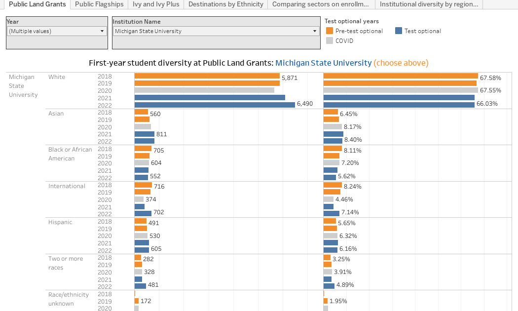
    This year I took it a little farther.  The views, using the tabs across the top, show the same trends (now going to 2022) for Public Land Grants, Public Flagships, the Ivy and Ivy+ Institutions.  In each case, choose one using the control.

    Note that I had colored the years by national trends: 2018 and 2019 are pre-test optional, gray is COVID, and blue is post-test optional.  This is not to say that any individual college selected either required tests or went test-optional in those years, but rather shows the national trend.  And remember these show enrolling students, not admitted students, which is why gray is critical; we know COVID changed a lot of plans, and thus 2020 may be an anomalous year. 

    The fourth view shows where students of any selected ethnicity enroll (again, use the dropdown box at the top to make a selection); the fifth view breaks out ethnicity by sector; and the final view allows you to look at diversity by sector and region (to avoid comparing diversity in Idaho, California, and Mississippi, for instance, three states with very different racial and ethnic makeups.)

    On all views, hovering over a data point explains what you’re seeing.

    If you work at a college or university, or for a private company that uses this data in your work, and want to support my time and effort, as well as software and web hosting costs, you can do that by buying me a coffee, here. Note that I won’t accept contributions from students, parents, or high school counselors, or from any company that wants to do business with my employer.

    And, as always, let me know what jumps out at you here. 

    Source link

  • First-year student (freshman) migration, 2022

    First-year student (freshman) migration, 2022

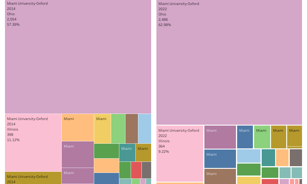
    A new approach to freshman migration, which is always a popular post on Higher Ed Data Stories.

    If you’re a regular reader, you can go right to the visualization and start interacting with it.  And I can’t stress enough: You need to use the controls and click away to get the most from these visualizations.

    If you’re new, this post focuses on one of the most interesting data elements in IPEDS: The geographic origins of first-year (freshman) students over time.  My data set includes institutions in the 50 states and DC.  It includes four-year public and four-year, private not-for-profits that participate in Title IV programs; and it includes traditional institutions using the Carnegie classification (Doctoral, Masters, Baccalaureate, and Special Focus Schools in business, engineering, and art/design.

    Data from other institutions is noisy and often unreliable, or (in the case of colleges in Puerto Rico, American Samoa, and other territories, often shows close to 100% of enrollment from that territory.)

    Instead of explaining how to interact with these views, I’ve put a text box on the view when appropriate.  You won’t break anything by clicking; I promise.

    If you use this in your business, I appreciate your support on Buy Me A Coffee to help with web hosting, software, computer, and labor costs.  If you are a parent or a high school counselor, just scroll right to the views. 

    Yes, there are some data problems in every report using IPEDS data, so don’t make any strategic decisions based on what you see here (I corrected Harvard’s 2012 glitch of not reporting anyone from California but 220 students from Arkansas instead, and I see Kenyon 2022 is funky.  I only report what’s in the data, folks.)

    Source link

  • First-year Discount rate at private colleges, 2021

    First-year Discount rate at private colleges, 2021

    This is always a popular topic, but the subject is misunderstood.  I want to talk about discount rate at private colleges.  

    IPEDS has the best data on first-year (or freshman) discount, so that’s what I visualize.  And the first part of this is going to get a bit into the weeds; if you work in a private college or university, and you use this in your work, or you send it to trustees, you can support my time, effort, software, and hosting costs by buying me a coffee.  If  you don’t want the details, and you think you understand this concept, feel free to skip down to the section that breaks down the views, below the line of asterisks.

    For those who always ask, no, I don’t do this for public universities.  It may be helpful to compare institutions within a state, but beyond that, state funding models and the mix of resident and nonresident tuition rates make comparisons across borders mostly meaningless.  And for the more knowledgeable who might wonder, I assume that all institutional aid is unfunded; that is, it’s not coming in as a revenue stream from an external source to provide funding.

    Let’s do an exercise to help you understand discount: Suppose you run an ice cream store, and you have more ice cream than you can sell.  You might offer a coupon, let’s say for 50% off a cone.

    The cone you normally sell for $4, you now sell for $2.  You just take less money for it.  There is no one there to hand you two extra dollars to make up for the gap.  The Department Store store down the street sells a very similar cone in its food court for $8, but offers a 75% off coupon.  They decide to take $2 for the cones they sell in order to be competitive with you.  

    The Gourmet Ice Cream Shop around the corner sells cones for $12, because they think their ice cream is much better, their store nicer, and their location more convenient to the subway station.  On occasion, they will tell the kids at the orphanage they’ll give them a free ice cream cone, but everyone else pays.  And finally, Mel’s Fair Deal Ice Cream store sells ice cream cones for $2.50, but never offers coupons.

    If everyone uses your coupon, your store has a discount rate of 50%, and your net revenue per cone is $2.  But of course, some people will pay $4.  If everyone uses the coupon at the Department Store, their net revenue per cone is also $2.  But their discount rate is 75%.  

    The Gourmet Store is more generous with the orphans than people realize; about half of their cones are given away.  So their discount rate is also 50%, but their net revenue per cone is $6.  And finally, Mel’s Fair Deal Ice Cream has a discount rate of 0% and a net revenue of $2.50 per cone.

    It’s important to remember that none of these stores cares where the cash comes from.  It could be from the customer’s pocket, from a parent or aunt, government food stamps, or a loan they take out from the government.  You count the cash, not the source of the cash.

    Now, guess what?  Almost all college aid is discount, much like those coupons the ice cream stores hand out.  It’s simply the college agreeing to take less cash than its published tuition rate.  If tuition is $40,000 and you offer a $20,000 discount or scholarship, you simply take $20,000 to educate the student, and write the rest off as an accounting transaction.

    The need for higher discounts in higher education are driven by tuition prices that are too high for most people to pay.  Colleges have to discount, or they’re going to have costs associated with making too much ice cream to sell that they can’t pay.

    (This is the part where someone will want to comment and extend the analogy ad infinitum: Which ice cream is better? Is one really worth six times more? Why don’t you make more flavors to attract more customers instead of discounting the vanilla to bring people in? Does your cost of ice cream production get lower if you produce a lot more?  Can’t you do research and optimization to figure out who should get the coupons when to maximize profit? And if so, couldn’t you lower price a lot and drive the others out of business?  Couldn’t you offer the coupon to fewer people and hope more pay full price? Please don’t be that person.  I’ll do a workshop for you if the price is right.)

    So, to easily calculate discount, in case it’s not clear, take the amount you have to discount and divide by the published price.  For a college, the discount rate is total institutional (unfunded) grant aid/total gross tuition. For average net revenue, take total gross revenue, subtract institutional (unfunded) grant aid, and divide that number by the number of students.

    For instance, if your sticker tuition is $40,000 and enroll ten students, your total gross tuition is 40,000 x 10, or $400,000.  If you award $100,000 in unfunded aid to make that enrollment happen, your discount rate is 100,000/400,000, or 25%.  After you take the aid away from tuition, your average net revenue is (400,000 – 100,000)/10, or $30,000 per student.  That’s how much cash you have to work with to do things like pay faculty, cut the grass, heat the buildings, and run the administration.

    ***************************

    Now, below, you can dive into college discount rates, net revenue, mixes, and the shape of the industry. This data set is very rich, and I may do another angle on this topic later.  But for now:

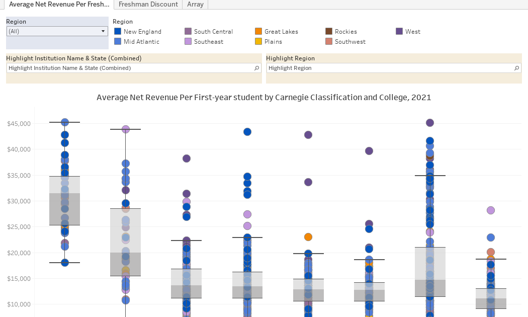
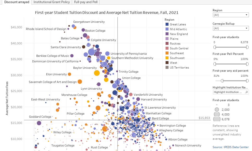
    Discount arrayed (the first view using the tabs across the top) arrays about 950 four-year, traditional, private colleges.  I’ve removed lots of religious seminaries, some very small institutions, and, frankly, some suspect data from this for the sake of clarity.  This is IPEDS data so it’s reliable, but never perfect.

    Each college is a dot, colored by region and sized by freshman enrollment relative to the set displayed. The view shows discount rate on the x-axis, and average net revenue on the y-axis.  

    You can use the filters at right to limit the set further.  You can’t break anything, and you can reset the view using the controls at the bottom.  Try this: Use the First-year students filter to look at colleges with at least 2,000 freshmen.  Then look at those colleges with fewer than 250.  Interesting, no?

    The reference lines are the unweighted average of all 950 institutions in the set.

    Institutional grant policy shows how many colleges and how many students fall into institutional grant aid categories.  Some institutions give aid to 100% of all students.  The vast majority give aid to 90% or more.

    And finally, the Full-pay and Pell shows two variables: The percentage of students who get no aid (full-pay students) and those who get Pell grants at the institution shown.  And remember, it doesn’t matter where the cash from full-pay students comes from: That group includes some students whose parents write a check, and some who might get a Pell and whose parents take out an ill-advised PLUS loan for the cost of attendance.

    The point?  Discount rate is important for similar institutions in the same region, but as thing unto itself, it’s kind of meaningless.  Net revenue is more important, for the most part, but at some institutions where undergraduate education can almost be called a sideline business, even net revenue is not important as it might seem.

    Eager to hear your thoughts.

    Source link