In August, Denise A. Battles stepped down after 10-plus years as president of the State University of New York at Geneseo to take a position with the SUNY system, which meant that my term as her presidential spouse came to an expected but abrupt end. I have since spent a great deal of time musing about my decade in that role, the joys and heartbreaks, the triumphs and the tragedies, and even the title … First Man? First Dude? It’s an odd occupation, since nationwide the job description is either nonexistent or as varied as the institutions where spouses and partners serve. My purpose here is to offer a few observations, derived from my experiences and those of my peers, and also humbly offer some advice to present and future executive spouses and partners.
Denise and I met at our new faculty orientation, which seems like a lifetime ago, and grew up together as academics. She chose administration early on, and I taught for decades before giving up faculty status to become a full-time fellowship director. As she advanced from dean to provost to president, my role as the administrative “trailing” spouse altered in both subtle and overt ways at each new institution, but the core was always rooted in our dedication to the universities we served and to each other. We were fortunate to always be employed at the same university and offered ourselves to search committees as a package deal. Many of my peers gave up careers to serve as dedicated presidential spouses and partners or have positions in business or with outside organizations. For some, their ties to the institution come down to an occasional student play or alumni meet-and-greet, a few calendar events to plan and dress for. Others appear on campus virtually every day, though doing so can be fraught with peril. What’s the old saw? Why do presidents get fired? Houses and spouses (cue laughter).
There’s a kind of isolation that comes with being a presidential spouse or partner, as virtually everyone at the institution or the surrounding community seems to either work in some way for the president or chancellor or is related to or knows someone who does. That reality leaves a distance, an unspoken space many feel from campus and community acquaintances and even those considered friends. I often discussed this condition with other board members of the spouses-and-partners group that is affiliated with the American Association of State Colleges and Universities (AASCU) and for which I served for over a decade. Many feel a sense of remoteness even with the myriad social outlets that come with the role—entertaining, dinners, social and athletic events, fine arts performances, donor visits, local clubs and organizations. The pandemic left many of us questioning the roles we played as presidential spouses and partners and what the future would bring for our ghostly campuses, overworked partners and largely absent student body. In many ways, that anxiety has not much changed.
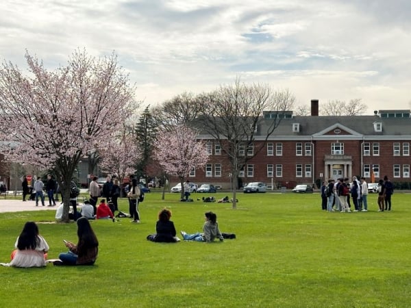
My wife and I were lucky enough to live in a stately historic presidential residence on Main Street in a quaint western New York village, mere steps from the campus. We would often sit on the front porch and greet the students and villagers, even the mayor, walking by … Pleasant as it was, we never forgot we were living in someone else’s house. I still work remotely with fellowships on a phased retirement plan for the college and recently have found myself missing the bustle of the campus and community, attending campus events, and even wearing the golden name badge signifying I was part of the campus team.
During Denise’s presidency, I would see her mostly only at the end of the day, after she had been dealing with perhaps a sticky personnel matter or one of the myriad other pressing issues on campus, and when she was still digesting the implications and finding solutions. We followed a strict code of confidentiality and professionalism about discussing these matters, which meant I was often not privy to what may have been happening. I made it a point in casual conversation with the campus and village community to refer to Denise as “the president,” to subtly suggest that I was not some kind of informational conduit and also that I knew little. After a while, folks stopped asking.
Most presidential spouses and partners ache to do more to help their loved ones but know that unconditional support is the best strategy. They are not vice presidents or back-door conduits, as there are plenty of people on campus to serve those functions. Of course, it is true that university chancellors and presidents are well compensated for their work, but the grind offers little respite and few moments for a personal life or chances to escape the endless crises. The average life of a college presidency has shrunk to a mere 5.9 years due to the strain. Faculty, staff and, yes, administrators are being asked to do more, even as they feel anxiety about what the future will bring for their families and positions. As perhaps never before, our campuses must find a unity of purpose to face the fallout from domestic politics and world events.
Presidential partners often face unexpected challenges when crises arise, as they may become targets for disgruntled and mentally unstable individuals from the campus and community, an unsettling and frightening reality that I unfortunately experienced too many times. Early on, I made the decision to eschew social media entirely, as the viciousness and ignorance were both unrelenting and entirely predictable. These potential grim truths are features of the job, but in the absence of some kind of orientation or guidebook, many partners are left to deal with these situations alone without anyone to confide in but their harried presidents, who can commiserate but may be legally and ethically barred from reciprocating.
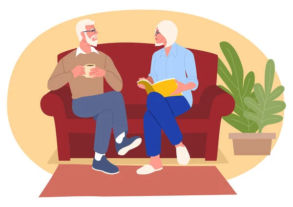
Like many presidential couples, my wife and I have been together day in and day out, pretty much continuously, since we began in academia. But “together” is a bit of a misstatement, as even though we were under the same roof, the work never ended, the email only increased and, if possible, our time together talking as a couple about the everyday things and our future was ever more brief. That reality is echoed in stories I hear from my spousal and partner colleagues across the nation—presidential relationships are being tested as never before.
So, here’s my advice to present and future presidential partners, humbly offered and born from 10 years on the job. I could list 20 more points, but these seem like the most important ones.
- Make the role your own. Since there is no template, you can choose what to be or not to be, regardless of what a predecessor may have been or done. Garden club membership is not required, and you can miss that regular season game. Take your time before committing and remember that you can always say no.
- Find supporters and confidants among your spouse and partner peers. Family and friends are often well meaning, but, as with many occupations, cannot really understand what you are going through. AASCU’s Spouse and Partner Program offers a safe and confidential circle of fellow travelers who are more than willing to lend an ear and offer their own experiences to help you through your struggles as you help them through theirs. I recommend membership highly.
- Be there for your president or chancellor. Listen, but don’t try to fix anything. Doing so can be the hardest part of the job. Sometimes they just need to vent, especially during the worst of times—and if they seem upset or a bit hostile, usually it’s not about you. You are not an administrator; no one hired you to advise, and doing so may make things worse. They are privy to information that may frankly be none of your business, until it is, and if so, they will tell you what you need to know.
In writing this piece, I don’t seek pity or sympathy for spouses and partners. I fully acknowledge the privileges that my position as a presidential spouse entailed and feel a deep sense of gratitude for having been given the opportunity to serve the university and the community. I have spent my entire working career in academia as an educator and, with this essay, seek only to inform the larger academic community as to the nature of the job and counsel those who may assume the role at some point. Presidential spouses and partners will continue to live in a strange kind of uncertainty as they struggle to support their presidents and chancellors, often while surrounded by acquaintances but still largely alone, and a bit uncertain as to what their roles truly require.