Tag: rate

  • Yes, your yield rate is STILL Falling, 2023

    Yes, your yield rate is STILL Falling, 2023

    This now-annual post is one that boggles and befuddles people, especially those who think that your yield rate is something you control by flipping switches.  In reality, yield rate is controlled by something much more powerful: Algebra.

    First, let’s review what yield rate is:  Colleges get applications, and they admit a certain percentage of them.  In aggregate colleges admit the vast majority of applicants.  Even though this visualization shows an aggregate admit rate of 58.3% in 2023 (the red line at bottom left), the set of colleges in the data only include colleges required to report to IPEDS; this excludes community colleges and any other institution that considers itself an Open Admissions institution.

    Of that 58%, some percentage enroll, and that’s called the yield rate.  As you can see, the yield rate (the purple line at bottom center) has been falling every single year since 2001.  This is a function of math.  Applications (the orange bars at top left) have risen 211%, while the total enrolled has increased by only 43%.  If you do the mental math, you can tell that more students are applying to more institutions, and getting more offers of admission.  In this scenario, yield rate goes down based on simple algebra.

    Which is not to say, of course, that some colleges haven’t shown increases in yield rates. More on that in a moment.

    There is one more calculation of interest, called the Draw Rate.  I did not invent the Draw Rate figure, and I do not know who did.  I only remember hearing it referred to sometime in the mid-1980s as I was a young admission officer.  It’s the college’s yield rate divided by the admit rate, and it is in some sense the best measure of market power and position.  It only became interesting to me when colleges started trying to pump up applications in order to appear to be more selective, believing that selectivity was what students and parents wanted.

    When you drive up applications artificially via things like Fast Apps, Smart Apps, VIP Apps, massive fee waivers, and other things, you generate applications from students who are far less likely to enroll (or yield).  And even though you might get nominally more selective, you lose that value when your yield rate goes down as a result.  Draw Rate accounts for that, in some measure, although it too, can be manipulated by taking half (or more) of your class via Early Decision or Restrictive Early Action.  Draw rate goes up when your yield rate increases and/or your admit rate falls.

    The blue line shows what has happened to our collective fascination with application increases: We’re working harder, and spinning our wheels faster, all in vain.  To be sure, you have to do this because your competitors are.  But it would be great if we never would have started down this path.

    Remember what I said about some colleges increasing yield even when collectively the rate has gone down?  Use the control at top right to put only the 12 Ivy Plus institutions into the visualization, and see what happens. Note the Draw Rate, and remember that the collective average is 0.36.

    That’s why I like that measure: It helps separate the market’s most powerful entities from all the rest. 

    Stay tuned: We’ll have the 2024 data in about a year!

    Source link

  • Indiana University Faculty Who Focus on Student Engagement Using Top Hat See 11.5% Decrease in Student Withdrawal Rate

    Indiana University Faculty Who Focus on Student Engagement Using Top Hat See 11.5% Decrease in Student Withdrawal Rate

    Course withdrawals carry significant academic and financial consequences for students and universities. Studies consistently demonstrate that withdrawing from first-year courses can greatly increase a student’s risk of discontinuing their studies, reducing their likelihood of completing a degree (Akos & James, 2020).

    TORONTO – October 22, 2024 – Top Hat, a leading provider of student engagement solutions for higher education, has released the first significant finding in an ongoing research initiative with Indiana University exploring the impact of student engagement leveraging Top Hat on retention and academic outcomes. The study, involving an analysis of hundreds of courses from the Spring, Summer, and Fall semesters of 2023, observed that the use of Top Hat by instructors resulted in an 11.5 percent decrease in the mean student withdrawal rate compared to similar course types without using the platform. In absolute numbers, this would equate to approximately 289 of the sampled Indiana University students continuing their course work during the 2023 academic year. The findings highlight the positive impact of integrating Top Hat into course delivery on student retention, particularly in introductory courses that often have higher drop-out rates.

    The Top Hat platform empowers educators to use frequent low stakes assessments to increase student engagement during lectures through interactive polls, quizzes, and discussions. The use of frequent low stakes assessments have been shown to improve student confidence, academic outcomes and retention (Meer & Chapman, 2014). The principles of active learning can also be extended outside of class through Top Hat Pages, a content editing and personalization tool that enables instructors to create or customize their own interactive learning materials. Every interaction is captured by the platform, providing students with real-time feedback, while empowering faculty with data-driven insights they can use to identify struggling students and improve the impact of their instruction.

    “Indiana University is deeply committed to the success of our students, and the findings from this research demonstrate how the thoughtful integration of instructional technologies has contributed to strengthening our undergraduate retention,” said Gina Londino-Smolar, Ed.D., Teaching Professor at IU Indianapolis. “Implementing active learning and frequent assessment, which have been shown to improve student outcomes, has been an important focus for us and our partnership with Top Hat has been instrumental in enabling us to scale these practices across our institution, ensuring a consistent, high quality learning experience for our students.”

    The study’s primary objective is to evaluate the influence of Top Hat on various student outcomes, with an initial focus on withdrawal rates—a key indicator of student success. The collaborative research project, approved by the Institutional Review Board (IRB), involved analyzing data from thousands of individual courses. From the original large dataset, similar courses based on discipline and level were identified in order to equalize the sample size and undertake a more accurate analysis. After filtering the dataset, 235 unique Top Hat courses were compared against a similar set of 235 unique courses that did not use Top Hat.

    Indiana University began working with Top Hat in 2017 and, based on high rates of faculty adoption, made the decision to offer the platform free of charge to all students by entering into an enterprise license agreement the following year. By addressing concerns around equity, student affordability and ensuring compliance with respect to data privacy and standards for web accessibility, adoption has increased substantially. For the 2023/2024 academic year 1,022 faculty and 51,679 students across more than 1,900 individual courses from all nine IU campuses used Top Hat to enhance learning.

    “This study reinforces the importance of providing faculty with tools that make evidence-based practices, like active learning, easier to adopt,” said Maggie Leen, CEO of Top Hat. “The data speaks for itself—when instructors have access to the tools to support effective teaching methods, it can lead to stronger student engagement and higher persistence. We’re proud to be part of Indiana University’s efforts to increase on-time graduation rates for their students.”

    The 2030 IU Strategic Plan has one pillar dedicated to Student Success and Opportunity with a commitment to student affordability and experience throughout their educational journey to have success in the workplace and beyond. The incorporation of Top Hat to engage students with the course content, reducing withdrawal rates, can be seen as a direct contribution to the pillar for student success.

    Since its founding in 2009, Top Hat has continued to introduce new features to make proven teaching methods more accessible to instructors. Most recently, Top Hat announced the release of Ace, an AI-powered teaching and learning assistant that enables instructors to generate assessment questions and discussion prompts based on their lecture slides and course materials. As a personalized study assistant, Ace allows students to break down challenging concepts, find guidance tackling difficult homework assignments, and create on-demand practice questions they can use to prepare for high stakes assessments. 

    The initial findings will inform both Indiana University and Top Hat’s future strategies for enhancing student outcomes. The research initiative is currently focused on identifying patterns of usage by instructors across disciplines and their impact on student engagement and academic performance. Ongoing analysis is exploring the impact of Top Hat on the academic experience of various student populations, including historically underrepresented groups with a focus on how the platform supports equitable access to learning, improves engagement, and contributes to closing achievement gaps.

    About Indiana University

    Indiana University (IU) is one of the nation’s leading public research universities, with 90,000 students across 930+ academic programs, seven campuses, two regional academic centers and nine School of Medicine campuses. Since 1820, Indiana University has helped students create brighter futures while also driving innovation, from breakthroughs in DNA technology to cancer research to trailblazing cultural programs and resources. IU is home to world-class academics with the country’s largest medical school, the world’s first school of philanthropy, the top-ranked Kelley School of Business and O’Neill School of Public and Environmental Affairs, and the Luddy School of Informatics, Computing and Engineering, the nation’s first school of informatics. The university’s campuses are united by IU 2030, an aspirational vision for a bold and ambitious future focused on student success and opportunity, transformative research and creativity, and service to the state of Indiana and beyond. Learn more at iu.edu.

    About Top Hat

    As the leader in student engagement solutions for higher education, Top Hat enables educators to employ proven student-centered teaching practices through interactive content and tools enhanced by AI, and activities in in-person, online and hybrid classroom environments. To accelerate student impact and return on investment, the company provides a range of change management services, including faculty training and instructional design support, integration and data management services, and digital content customization. Thousands of faculty at 750 leading North American colleges and universities use Top Hat to create meaningful, engaging and accessible learning experiences for students before, during, and after class.

    Contact [email protected] for media inquiries.

    Source link

  • Data Show Women and People of Color Aren’t Advancing to Higher Faculty Ranks at the Same Rate as White Men – CUPA-HR

    Data Show Women and People of Color Aren’t Advancing to Higher Faculty Ranks at the Same Rate as White Men – CUPA-HR

    by CUPA-HR | May 2, 2024

    New research from CUPA-HR on the state of the faculty workforce in higher education shows that despite some growth in representation among tenure-track women and faculty of color in new hires, advancement to higher faculty ranks remains a barrier. What’s more, these promotion gaps are found in every faculty discipline.

    CUPA-HR’s research team analyzed data from the Faculty in Higher Education Survey, a comprehensive data source that collects salary and demographic data by tenure status, rank, and faculty discipline, to evaluate representation and pay equity for women and faculty of color from 2016-17 to 2022-23.

    In addition to the finding that women and faculty of color are not being promoted to senior faculty ranks at the same rate as White men, the data also show that women, Black, and Hispanic or Latina/o faculty are better represented in non-tenure-track than in tenure-track positions, and that pay gaps in non-tenure-track positions persist for these groups. Combined with the fact that these groups are less likely to be promoted to higher ranks in tenure-track positions, the result is that a substantial segment of faculty, primarily women and people of color, are employed in positions that pay lower salaries throughout their careers.

    Other Findings

    Tenure-track faculty positions are on the decline. There has been a decline in tenure-track positions and a corresponding increase in non-tenure-track positions over the past seven years. In 2016-17, tenure-track roles accounted for 73% of faculty, but by 2022-23, this proportion fell to 66%, with a marked increase in non-tenure-track positions over the last two years. Additionally, the percentage of new tenure-track assistant professor hires dropped in recent years, indicating a trend toward more new non-tenure-track hires.

    The representation of women and people of color in tenure-track faculty positions is increasing, yet challenges remain. There was a notable increase in the representation of tenure-track (TT) women and faculty of color from 2016-17 to 2022-23. In 2022-23, more than one-fourth (26%) of TT faculty were people of color. This marks a 28% increase over the span of seven years, compared to 2016-17, when faculty of color constituted closer to one-fifth (21%) of all TT faculty. However, the growth in racial/ethnic representation still lags when compared to the demographic composition of U.S. doctoral degree holders. Further, despite strides toward pay equity for tenure-track faculty of color, White women in tenure-track positions still face persistent pay gaps in 2022-23.

    Explore the interactive graphics and read the full report, Representation and Pay Equity in Higher Education Faculty: A Review and Call to Action.


    Source link

  • The annual graduation rate post

    The annual graduation rate post

    I know I’ve been barking up the tree of “Graduation Rates are inputs, not outputs” for a long time.  And I know no one is listening.  So I do this, just to show you (without the dependent variable) just how unsurprising they are.

    Here are four views of graduation rates at America’s four-year public and private, not-for-profit colleges and universities. And I’ve put them in four views, with several different ways to look at the data.

    The first (using the tabs across the top) shows four-, five-, and six-year graduation rates on the left, and “Chance in four” on the right.  In other words, since everyone pretty much thinks they’re going to graduate from the college they enroll in as a freshman, what are the chances of graduating in four years, rather than six?  There are some surprises there, as you’ll see.

    On all the visualizations, you can apply filters to limit the colleges you’re looking at.  The scroll bar (to move up or down) is on the right but it’s sometimes hard to see.  And the size slider is set to a minimum of 1,000 students, but you can change that; just beware that small colleges often have wonky data, for several reasons.

    The second view shows six-year rates by gender.

    The third view breaks out six-year rates by ethnicity, comparing African-American, Hispanic, and Asian rates (the shapes) to the rate for White students (on the gray bars).

    And the final view breaks out six-year rates by Pell Grant status, then shows the gap between the two on the right. On the gap chart, a negative number shows colleges where Pell graduation rates are higher than non-Pell rates.

    Enjoy! 

    Source link

  • First-year Discount rate at private colleges, 2021

    First-year Discount rate at private colleges, 2021

    This is always a popular topic, but the subject is misunderstood.  I want to talk about discount rate at private colleges.  

    IPEDS has the best data on first-year (or freshman) discount, so that’s what I visualize.  And the first part of this is going to get a bit into the weeds; if you work in a private college or university, and you use this in your work, or you send it to trustees, you can support my time, effort, software, and hosting costs by buying me a coffee.  If  you don’t want the details, and you think you understand this concept, feel free to skip down to the section that breaks down the views, below the line of asterisks.

    For those who always ask, no, I don’t do this for public universities.  It may be helpful to compare institutions within a state, but beyond that, state funding models and the mix of resident and nonresident tuition rates make comparisons across borders mostly meaningless.  And for the more knowledgeable who might wonder, I assume that all institutional aid is unfunded; that is, it’s not coming in as a revenue stream from an external source to provide funding.

    Let’s do an exercise to help you understand discount: Suppose you run an ice cream store, and you have more ice cream than you can sell.  You might offer a coupon, let’s say for 50% off a cone.

    The cone you normally sell for $4, you now sell for $2.  You just take less money for it.  There is no one there to hand you two extra dollars to make up for the gap.  The Department Store store down the street sells a very similar cone in its food court for $8, but offers a 75% off coupon.  They decide to take $2 for the cones they sell in order to be competitive with you.  

    The Gourmet Ice Cream Shop around the corner sells cones for $12, because they think their ice cream is much better, their store nicer, and their location more convenient to the subway station.  On occasion, they will tell the kids at the orphanage they’ll give them a free ice cream cone, but everyone else pays.  And finally, Mel’s Fair Deal Ice Cream store sells ice cream cones for $2.50, but never offers coupons.

    If everyone uses your coupon, your store has a discount rate of 50%, and your net revenue per cone is $2.  But of course, some people will pay $4.  If everyone uses the coupon at the Department Store, their net revenue per cone is also $2.  But their discount rate is 75%.  

    The Gourmet Store is more generous with the orphans than people realize; about half of their cones are given away.  So their discount rate is also 50%, but their net revenue per cone is $6.  And finally, Mel’s Fair Deal Ice Cream has a discount rate of 0% and a net revenue of $2.50 per cone.

    It’s important to remember that none of these stores cares where the cash comes from.  It could be from the customer’s pocket, from a parent or aunt, government food stamps, or a loan they take out from the government.  You count the cash, not the source of the cash.

    Now, guess what?  Almost all college aid is discount, much like those coupons the ice cream stores hand out.  It’s simply the college agreeing to take less cash than its published tuition rate.  If tuition is $40,000 and you offer a $20,000 discount or scholarship, you simply take $20,000 to educate the student, and write the rest off as an accounting transaction.

    The need for higher discounts in higher education are driven by tuition prices that are too high for most people to pay.  Colleges have to discount, or they’re going to have costs associated with making too much ice cream to sell that they can’t pay.

    (This is the part where someone will want to comment and extend the analogy ad infinitum: Which ice cream is better? Is one really worth six times more? Why don’t you make more flavors to attract more customers instead of discounting the vanilla to bring people in? Does your cost of ice cream production get lower if you produce a lot more?  Can’t you do research and optimization to figure out who should get the coupons when to maximize profit? And if so, couldn’t you lower price a lot and drive the others out of business?  Couldn’t you offer the coupon to fewer people and hope more pay full price? Please don’t be that person.  I’ll do a workshop for you if the price is right.)

    So, to easily calculate discount, in case it’s not clear, take the amount you have to discount and divide by the published price.  For a college, the discount rate is total institutional (unfunded) grant aid/total gross tuition. For average net revenue, take total gross revenue, subtract institutional (unfunded) grant aid, and divide that number by the number of students.

    For instance, if your sticker tuition is $40,000 and enroll ten students, your total gross tuition is 40,000 x 10, or $400,000.  If you award $100,000 in unfunded aid to make that enrollment happen, your discount rate is 100,000/400,000, or 25%.  After you take the aid away from tuition, your average net revenue is (400,000 – 100,000)/10, or $30,000 per student.  That’s how much cash you have to work with to do things like pay faculty, cut the grass, heat the buildings, and run the administration.

    ***************************

    Now, below, you can dive into college discount rates, net revenue, mixes, and the shape of the industry. This data set is very rich, and I may do another angle on this topic later.  But for now:

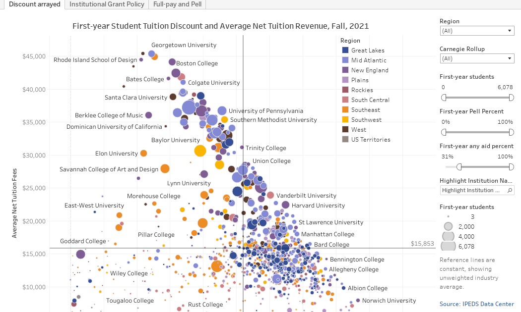
    Discount arrayed (the first view using the tabs across the top) arrays about 950 four-year, traditional, private colleges.  I’ve removed lots of religious seminaries, some very small institutions, and, frankly, some suspect data from this for the sake of clarity.  This is IPEDS data so it’s reliable, but never perfect.

    Each college is a dot, colored by region and sized by freshman enrollment relative to the set displayed. The view shows discount rate on the x-axis, and average net revenue on the y-axis.  

    You can use the filters at right to limit the set further.  You can’t break anything, and you can reset the view using the controls at the bottom.  Try this: Use the First-year students filter to look at colleges with at least 2,000 freshmen.  Then look at those colleges with fewer than 250.  Interesting, no?

    The reference lines are the unweighted average of all 950 institutions in the set.

    Institutional grant policy shows how many colleges and how many students fall into institutional grant aid categories.  Some institutions give aid to 100% of all students.  The vast majority give aid to 90% or more.

    And finally, the Full-pay and Pell shows two variables: The percentage of students who get no aid (full-pay students) and those who get Pell grants at the institution shown.  And remember, it doesn’t matter where the cash from full-pay students comes from: That group includes some students whose parents write a check, and some who might get a Pell and whose parents take out an ill-advised PLUS loan for the cost of attendance.

    The point?  Discount rate is important for similar institutions in the same region, but as thing unto itself, it’s kind of meaningless.  Net revenue is more important, for the most part, but at some institutions where undergraduate education can almost be called a sideline business, even net revenue is not important as it might seem.

    Eager to hear your thoughts.

    Source link

  • Pay Increases for Higher Ed Employees Sharply Improve, But Still Fall Short of Inflation Rate – CUPA-HR

    Pay Increases for Higher Ed Employees Sharply Improve, But Still Fall Short of Inflation Rate – CUPA-HR

    by CUPA-HR | April 3, 2023

    New research from CUPA-HR has found that although employees across the higher education workforce saw the most substantial pay raises in 2022-23 than in the past several years, they are still being paid less than they were in 2019-20 in inflation-adjusted dollars.

    Some of the key findings from an analysis of CUPA-HR’s higher ed workforce salary survey data from 2016 to 2023:

    • This academic year, raises for higher ed employees were the largest seen in the past seven years, and all position types (administrators, professionals, staff and faculty) received an increase of at least 1.11 percentage points compared to the previous year.
    • Tenure-track and non-tenure-track teaching faculty continue to receive the smallest pay increases of any higher ed employee category. In 2022-23, tenure-track faculty saw a median pay increase of 2.9 percent and non-tenure-track faculty saw an increase of 3.2 percent. Tenure-track faculty salary increases have not kept pace with inflation since at least 2015, and non-tenure-track salary increases last met or exceeded inflation in 2016-17, meaning full-time faculty in general continue to be paid less every year in inflation-adjusted dollars.
    • Staff, which is typically the lowest-paid category of higher ed employees, saw the biggest raises this academic year at 5.3 percent (up from 2.9 percent in 2021-22).

    Explore this data and more in CUPA-HR’s newest interactive graphic.

    CUPA-HR Research

    CUPA-HR is the recognized authority on compensation surveys for higher education, with its workforce surveys designed by higher ed HR professionals for higher ed HR professionals and other campus leaders. CUPA-HR has been collecting data on the higher ed workforce for more than 50 years, and we maintain one of the largest workforce databases in existence. CUPA-HR also publishes numerous research publications and interactive graphics highlighting trends and issues around higher ed workforce planning, pay equity, representation of women and racial/ethnic minorities and more. Learn more about CUPA-HR research.


    Source link