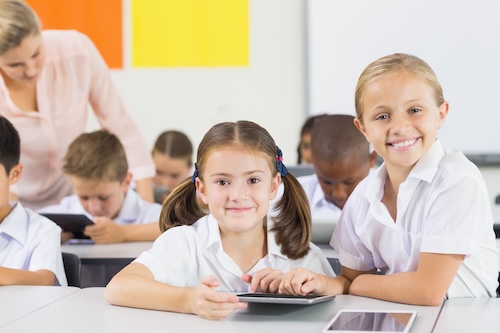
More than half of science teachers believe the most important value of science education is how it contributes to students’ curiosity, critical thinking, and creativity, according to a new report from LEGO Education. But are today’s students truly engaging with science education?
LEGO Education’s State of Classroom Engagement Report: Science Edition surveyed more than 6,000 global teachers, parents, students, and U.S. administrators to gather data that can offer insight to support educators as they strive to engage their students in science learning.
Science learning builds life skills students will use even if they do not pursue the science in college or as a career. It also increases student engagement and well-being, but here’s the catch: Students have to feel connected to the material in order to build these skills.
Just over half of global science teachers say their students are engaged in science, which points to a critical need to boost engagement in the subject, according to the report. Interestingly, students say they are more engaged in science than they are in school overall. Only one-third of teachers worldwide indicate that their students are engaged in the classroom. Schools could leverage students’ interest in science to build schoolwide engagement–a key factor tied to student well-being.
When students aren’t engaged in science, what’s behind that lack of engagement? Often, they’re intimidated before they even learn the material, and they assume the topics are too challenging. Students lose confidence before they even try. Of students who say science is their least-favorite topic, 45 percent say science is too hard and 37 percent say they are bad at science. What’s more, 77 percent of global teachers say they believe students struggle because of complex concepts and curricula, and they’re searching for for impactful resources that support every student’s success.
“If students think they’re not good at the subject or avoid it, we risk losing an entire generation of innovators and problem solvers,” said Victor Saeijs, president of LEGO Education, in the report.
How can educators reach students who struggle to engage with science? Hands-on science learning is the key to piquing student curiosity, prompting them to engage with learning material and build confidence as they explore science concepts. Sixty-two percent of science teachers say hands-on activities drive student engagement in science. Seventy-five percent of science teachers who do incorporate hands-on activities believe this approach leads to higher test scores and grades.
More students need access to hands-on science learning. Only 55 percent of students say they regularly get hands-on experiences–these experiences usually require extra time and resources to plan and execute. Eighty-two percent of science teachers say they need more ways to teach science with play and hands-on methods.
Having access to hands-on science learning experiences increases students’ confidence, giving them the boost they often need to tackle increasingly tough-to-learn concepts:
73 percent of students with access to hands-on learning opportunities report feeling confident in science
Just 52 percent of students who do not have access to hands-on learning report feeling confident in science
Hands-on experiences in science drive:
Learning outcomes: 71 percent of science teachers who incorporate hands-on, playful learning believe the methodology supports higher test scores and grades
Engagement for all learners: 84 percent of U.S. teachers and 87 percent of administrators think that hands-on experiences help all types of learners engage with science concepts
Love of science: 63 percent of students who love science credit their passion to regular hands-on experiences
Confidence: 79 percent of students who have hands-on science experiences are confident in the subject
Administrators and science teachers are short on time and need hands-on tools and resources to quickly engage students in learning:
59 percent of U.S. administrators and 54 percent of science teachers say they need more tools to engage students in science
Nearly one-third of U.S. students do not get hands-on science experiences.
Laura Ascione is the Editorial Director at eSchool Media. She is a graduate of the University of Maryland’s prestigious Philip Merrill College of Journalism.
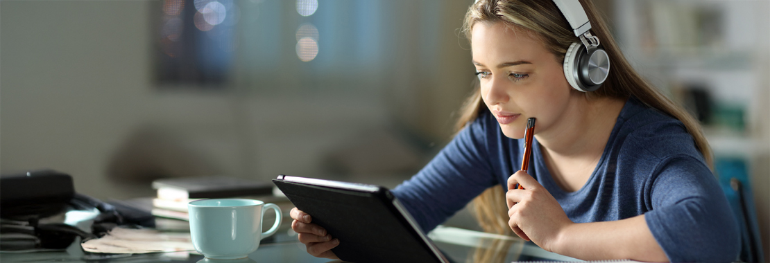
At Cengage, creating quality learning experiences is a priority. Our goal is to put the learner at the center of these experiences to help them prepare for the future, especially in much-needed fields like health care, biology and life sciences.
And so, to enhance learner engagement and deepen students’ understanding of key science concepts, we’re excited to welcome Visible Body to Cengage and our science offerings.
Introducing Visible Body
Visible Body is a leading provider of interactive apps and software used by over a million students, educators and health care/biomedical professionals around the world. Visible Body provides highly detailed 3D visuals, micro-lessons and game-like interactivity to make studying anatomy and biology easier and more engaging.
Cengage and Visible Body deepen science learning
By teaming up, we can provide expanded science offerings to more learners and educators — boosting engagement, improving problem-solving skills and strengthening students’ grasp of key science concepts.
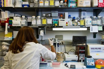
Visible Body adds to the variety of ways we can support learning. For science courses like anatomy and physiology and biology, it is vital that students gain a deep understanding of the human body and are given a hands-on way to engage with the concepts and processes.
With accurate visual representations, anatomically correct 3D models and immersive activities, learners can master the concepts quickly, while gaining access to real-world scientific experiences and practicing essential skills for the workforce. AR and mixed reality bring learning to life, enabling students to engage with scenarios typically limited to lab environments. This approach empowers institutions, especially those strained for resources, to deliver high-quality, engaging education without labs.
What’s in the future for science teaching and learning?
Visible Body will be available with Dr. Liz Co’s “Anatomy & Physiology” later this spring with plans to add it to even more Cengage higher ed and K-12 science resources soon.
Interested in learning about Liz Co’s “Anatomy & Physiology” — along with the addition of Visible Body? Fill out the form to find out more.
The new first edition of “Discovering Engineering Design in the 21st Century: An Activities-Based Approach” is a practical and applied introduction to the engineering needs of today’s world. By integrating practical activities, sustainability principles, and cross-disciplinary insights, this companion guide prepares students to think critically and creatively about the challenges they will face as engineers in the modern era.
A Hands-On Approach to Learning
Research shows that engineering students learn best when they can connect theoretical concepts to real-world applications. Written by Professor Brad Striebig of James Madison University, this curriculum-based intro engineering text bridges the gap between foundational knowledge, traditional engineering skills, and hands-on experiential learning. The author focuses on applying engineering principles to real-world design and problem analysis. It includes specific step-by-step examples and case studies for solving complex conceptual and design problems in several different engineering fields.
This textbook applies the principles of sustainable design with real-world issues in both developed and developing countries, serving as a companion guide for students as they embark on their exploration into the engineering profession. It emphasizes key steps in engineering solutions, including translating societal needs into infrastructures, products, practices, and processes. It also communicates the long-term impacts of these solutions to society and works to prepare the next generation of engineers with the breadth of skills needed to address complex environmental problems.
Through integrative analysis and sustainable design methods, students will engage with these essential concepts chapter by chapter, as they engage with the pressing issues facing this generation of engineers.
Meet the Author
Professor Brad Striebig, Professor of Engineering, James Madison University, Harrisonburg, Virginia
Dr. Striebig earned his PhD from Pennsylvania State University. He is a founding professor of the engineering program at James Madison University and previously taught engineering at Gonzaga University and Pennsylvania State University. Dr. Striebig has served as editor on major journals in environmental engineering and sustainable development. He has led major, funded, award-winning research activities focused on working with developing communities and natural treatment systems. He has published two textbooks on sustainability and engineering and has authored over 100 technical publications, including several book chapters, numerous peer-reviewed journal articles, and peer-reviewed conference proceedings.
Contributing Authors
The collaborative effort behind this text features contributions from esteemed colleagues at James Madison University. Together, these authors bring a multidisciplinary perspective, ensuring that the text addresses the diverse and interconnected challenges facing today’s engineers.
Preview Brad Striebig’s first edition intro engineering textbook, “Discovering Engineering Design in the 21st Century: An Activities-Based Approach,” in the Cengage Instructor Center.
According to The American Association of University Women(AAUW), throughout their education, girls and women are systematically tracked away from science and math. This limits their access, preparation and opportunities to enter these fields for their careers as adults. By the time students reach college, women are significantly underrepresented in STEM majors. Women make up only 34% of the workforce in science, technology, engineering and math (STEM). While this is up from 28% two years ago, it is still significantly less than the existing overall percentage of women, and men vastly outnumber women majoring in most STEM fields in college. The gender gaps are particularly high in some of the fastest-growing and highest-paid jobs of the future, like computer science and engineering.
Women in STEM Occupations Biological Scientists 46% Chemists & Materials Scientists 40.4% Computer & Mathematical Occupations 25.2% Engineers & Architects 16.5% SOURCE: U.S. Bureau of Labor Statistics, “Employed persons by detailed occupation, sex, race, and Hispanic or Latino ethnicity,” Labor Force Statistics from the Current Population Survey, Table 11, 2020.
A typical STEM worker earns two-thirds more than those employed in other fields, according to Pew Research Center. And some of the highest-earning STEM occupations, such as computer science and engineering, have the lowest percentages of women workers. Giving women equal opportunities to pursue and succeed in STEM careers helps narrow the gender pay gap, enhances women’s economic security, ensures a diverse and talented STEM workforce and prevents biases in these fields and the products and services they produce.
To help close the STEM Gap, it is important that girls and women are given the skills and confidence to succeed in math and science. There should be improvements in STEM education and support for girls starting in early education and through K-12. Every student should be exposed to engineering and computer science, and Next Generation Science Standards.Classes should be taught by connecting STEM experiences to girls’ lives, promoting active, hands-on learning and emphasizing ways STEM is collaborative and community-oriented. AAUW also suggests expanding after-school and summer STEM opportunities for girls. They suggest Increasing awareness of higher education and career opportunities, pathway opportunities, role models and mentoring programs with women in STEM for girls.
While there have been some advances, more efforts need to be made to help women close the STEM gap. Educational consultants can help encourage young women with academic aptitudes and interests in math, science, computers and engineering to explore career paths they may not have considered for their future.
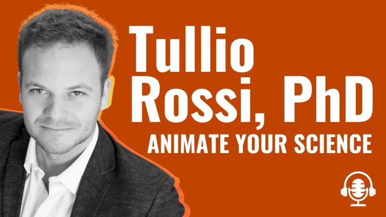
Tullio Rossi, PhD helps scientists share their research with visuals
Dr. Tullio Rossi is a marine biologist turned entrepreneur helping scientists around the world share their research. Tullio found that video animations and graphical abstracts increase the impact of your science.
And, they’re great for sharing your research with the media. Now as Director of Animate Your Science, Tullio and his team are changing the way scientists communicate with visuals.
I’m Jennifer van Alstyne. Welcome to my blog, The Social Academic. It’s all about your online presence in Higher Education. Whether you’re a graduate student, professor, scientist, researcher, or independent scholar, The Social Academic is here to help you communicate online.
In this featured interview, Tullio and I talk about
Jennifer: Hi everyone, it’s Jennifer van Alstyne here on The Social Academic blog, YouTube channel, and podcast. We’re here talking with Dr. Tullio Rossi, Director of Animate Your Science.
I’m so excited to have this conversation today because having some kind of
can make a really big difference for sharing your research.
Tullio, welcome to The Social Academic. Would you mind starting us off by introducing yourself?
Tullio: Hi, Jennifer.Thank you for having me. It’s great to be here. So I’ll give you a bit of a background about myself.
Everything’s started when I was still a teenager and I started playing around with graphic design. For years I made flyers and posters for events because my best friend organized events. So one day we thought, why don’t we make a flyer for the next event? It was a lot of fun.
I always considered [graphic design] as a bit of a plan B career, if you like. Because then I went on and pursued a career in marine biology. That was back in Italy, in my home country I did undergrad, master’s degree and then a PhD, which brought me here in Australia, where I currently live.
I was doing that PhD when I realized that actually science really needs some help from the world of graphic design and communication in general.
Because there’s so much great research published in these peer-reviewed articles, which nobody gets to hear about. Often not even the researchers themselves. So that pushed me to try things that not many others were even considering to figure out a way on how we can make sure that this research we publish is noticed. That it’s not just lost in this giant online repository of papers.
The question is how do we make sure that our research stands out?
Jennifer: That’s amazing. And I actually watched one of your early videos about your own research. Can you tell us a little bit about that?
Tullio: Sure. My research was about the effect of climate change on fish and the ocean in general. It’s a kind of research that has absolutely no commercial application whatsoever.
The only point of that research is to let the public know what we risk if we don’t address our climate change problem.
I concluded that I really needed to get these results out in some way. So I read a lot about storytelling.
I found that whiteboard animations are actually within reach to everyone. I’m not trained as an animator. I used to be a graphic designer. Yes, but I’m not an animator. But anybody can actually make a whiteboard animation. Because there are a number of fairly user-friendly software out there that have very extensive libraries of drawings and assets that you can just use.
I figured out, okay, I actually can put together an animation myself with…my budget was what? $30 [laughs], which was like a one month license to this software I used. And so I decided to try it.
What really made the difference is that I told about the research in a way that didn’t feel like lecture, but in a way that felt like the story. And that makes all the difference, really.
So I started the video, “Imagine to be a baby fish,” you know, and that really drew people in.
I had the opportunity to observe people watch my video. I could see emotions on their faces. And I was like, yes, that’s the holy grail of communication is when you make people feel something.
That video worked really well. It was seen by thousands of people around the world. It won prizes in science communication. And even got me an email from a stranger saying, “Oh, I finally understand what the problem is with this thing called ocean acidification. Thank you for making the video.”
I was like, all right, I think nobody has ever told me thank you before for doing the work I was doing. That feels good.
The world is not just made of angry planet climate change deniers. Now, also nice people out there will show signs of gratitude if us researchers do the little extra effort to break it down in a simple and accessible way for everyone. That was really a great experience.
Then, I presented this work at a scientific conference and the feedback from other researchers was really good. A lot of them came after my talk and said, “Oh, I love what you did. I wish I could do the same. I just don’t know how to do it.” Or, “I don’t have the time.” And so that turned on a light bulb in my head thinking, I should take these more seriously and perhaps I can even make a career out of this.
And so that’s started a new part of my life of my career into science communication and led to where I am today, leading Animate Your Science, a science communication agency that is privileged to help researchers and institutions from all around the world, literally all continents to communicate science using tools like
Animation videos
Graphical abstracts
Posters
Infographics
Training
So either we do it for you if you’re busy, but if you have the time we can also teach you some skills.
Jennifer: I think that’s amazing. And that really helps anyone who needs this kind of skill in their life, whether it’s having it done for you or getting help to learn how to do it yourself.
What you were talking about in terms of being able to see the emotions of people who watched your video, the very first video you created about this. I wish you would see me watching it. I was like crying by the end. And I remember going to my fiancé and being like, you know, how much we care about sustainable fishing? Let me tell you about this video that I just watched and how important it is for us to understand our oceans, understand what climate change is affecting, and what we can start to share about it.
This video affected me so much that I was already telling people about it within just a few minutes of having watched it myself. And I just think that that kind of excitement, that kind of emotional impact that that video had on me, just goes to show how important a company like yours is, how important the work that you’re doing to help other researchers and scientists communicate their work to the general public, but also to other researchers who can benefit from it. It’s amazing.
Tullio: Thank you, Jennifer, I’m very happy to hear that it touched you. That’s always the deck part of communication is reaching people not just at the brain level, but way deeper down here in the heart.
Jennifer: Yeah.
Tullio: And when that happens, which is not easy, you really hit the jackpot in communication.
Jennifer: For sure.
Free online presence workshop
Get started for in this virtual choose your own adventure workshop for professors, researchers, and graduate students.
What is a graphical abstract to share your research?
Jennifer: We’ve been talking about a little bit about video, but they’re also amazing at graphical abstracts and that’s something that you’ve helped scientists with. What is a graphical abstract?
Tullio: Sure.
When I started this new part of my career in business, I looked around or what was out there in terms of graphical abstracts. And I realized that pretty much none of what was out there was actually suitable if you wanted to communicate your research to a non-expert audience. So if you want to reach the general public with your graphical abstract, none of what was out there would work.
All the graphical abstracts we used to see are very technical. They are straight to the key process, let’s say molecule A meets molecule B, they have a reaction to create this new molecule. That’s pretty much what they look like. Some in the medical field even go as far as having p-values, which definitely will mean nothing to a non-expert.
My interests and vision was really to bring science to society, not just to other experts. I wanted to create something that will go beyond the expert sphere.
I created the new format, the graphical abstract, which is a little bit more wordy, I limit it to 80 words. But it has the advantage that it gives some context. It tells the story of that research.
In 80 words, I figured it was enough to just touch on
A little bit of background highlighting what the knowledge gap or the question that the research is asking.
Providing the key results and why that matters. Can it be done in 80 words? I’m not saying it’s easy, but it can be done.
And the rest are visuals relevant to the research.
The reality is that people process images way, way faster than the process text. That’s why we have street signs that are not worthy. Yeah, they don’t explain things with words. They explain with iconography.
Same applies to your graphical abstract. The more visual it is, the more rapidly the viewer will be able to understand it.
Jennifer: So by limiting the words you’re really able to communicate through both words and visuals, what the story is in that graphical abstract it sounds like.
Tullio: Yeah. With this balance between words and visuals, you can really reach anybody. Then you’ve got a much wider audience. Then at the end of reading [the graphical abstract], they’ll be able to decide whether they want to go and read the actual paper. Great. That might be your goal.
Or, just to understand what the key message is, and then move on.
But they can still then share it on social media with friends, which is still a very important thing. It really extends the potential impact of the research passively.
Jennifer: That’s great. So it sounds like once you have this graphical abstract, it’s something that you can share on social media. That must really help scientists to reach more people.
Tullio: Absolutely. So we’re seeing a great use case for graphical abstracts is social media. I will say Twitter above all.
The wrong approach, which I still see very often is to say, “Hey, I published a new paper.” And you pop the link to the paper and that’s it. Well, that’s a tweet that goes unnoticed because it’s not visual. It’s just a string of text.
Some researchers then screenshot one of the figures, maybe the previous figure and they pop it in there. That’s a little bit better, but still people don’t want to see charts on Twitter.
Jennifer: That’s kind of a figure out of context too. You don’t necessarily have access to that paper right away.
Tullio: Yes, it’s often out of context, so people will struggle to make sense of it.
Here is where the graphical abstract really helps. In one panel where you can flesh out that key story and attract people with visuals.
Jennifer: That’s amazing. A thing I really like about it is that it can be shared on its own and in conjunction with the paper.
It’s okay if people are only connecting with the graphical part of it, they don’t necessarily need to read the paper to be able to share it.
They compare how effective it is to tweet about your research with, or without a graphical abstracts. Still consider that these are fairly technical graphical abstracts. So not those I was describing. Even with the technical [graphical abstract], here’s what they found:
The reach (how many people will see it on Twitter) is almost 8x as high.
The number of retweets (how many times people will share it) is more than 8x as high.
Article visits (how many people click and actually read your paper) is almost 3x as high.
Jennifer: Wow.
Tullio: This is pretty amazing. Isn’t it like day and night?
Jennifer: Yeah.
Tullio: I think it should become the standard that when you publish your paper and you want to share it on Twitter or any other social media it needs to have a graphical abstract.
It will be a massive lost opportunity if you don’t. It might be.
Jennifer: Yeah, it sounds like if we’re seeing those kinds of numbers with the kind of really technical graphical abstract, having something from you or something that really just communicates more effectively to the general public can even increase that potential reach even more.
That potential for retreating, if you don’t understand what is going on in the abstract, it’s going to go down. Once you have that connection, that connection that helps you not only understand, but know why it might be helpful for other people to see it too. That’s what increases that potential for sharing. So I just love that.
Jennifer: Now what’s the difference between a graphical abstract and a scientific poster? In the humanities. I think I’ve done one poster about my research and it wasn’t very good.
What is a scientific poster versus a graphical abstract?
Tullio: Sure. In my view, they are actually very similar. The key difference is the size.
Jennifer: Okay.
Tullio: Graphical abstract is typically something that needs to fit in a tweet on social media.
As I said, I would not write more than 80 words and have one or two key visuals.
On a poster, you have much more real estate. Typically it’s printed on an eight zero format, which is very large. Yeah, plenty more real estate.
But having all that real estate often leads these researchers to make the most common mistake, which is to dump everything they’ve got on it. So they dump a couple thousand words. They dump not one chart, maybe eight. And then a couple of tables too.
Then the whole thing becomes this wall of text and chart that is just overwhelming for the audience. That’s the key problem of posters.
One of my battles is to change that. Because if we designed posters this way, we’re creating a disservice to ourselves and our audience.
These posters are ineffective because they put people off. Literally. If something looks overwhelming, you don’t want to look at it.
Think about the typical poster session, pre-corona. You know, it’s the end of the day, you get your first glass of wine. You’re starting to relax. And you go around and look at posters.
Do you really want to read for half an hour 2,000 words and processes, and eight complicated charts? I don’t think so.
What you want is to have a conversation with the person presenting that poster. Right?
The poster should, first thing, attract attention. Because, you know, it’s a room full of posters. There’s probably maybe some conferences, hundreds of posters.
Jennifer: Right.
Tullio: The first thing is that you need to stand out. The way you achieve that is by having one key large visual that is related to your research. Let’s say if your research is on let’s say the bone structure chemistry, have a large bone. Something that is recognizable from that other side of the room.
Jennifer: Ahh, so a big visual.
Tullio: One key, big visual that will make your poster stand out from the other side of the room. People will notice it, get curious, walk towards you and then start the conversation.
The goal is not to watch people read your poster. The goal is to quickly walk them through the story in a one minute spiel. And then ask a question and start conversation which is supposed to go two ways. Right? And that’s how good networking is supposed to be.
Bottom line is that a poster is an eye-catcher first, and a conversation-starter second. That’s what it’s supposed to be.
To achieve that we need to slash the amount of content we put on our posters. That’s the key thing that will dramatically improve. Even without getting into graphic design principles. If you just cut the content in half, you improve your poster massively.
Because everyone is making the same mistake, having way too much on it.
Jennifer: I definitely made that mistake. Yeah.
Tullio: Yeah, look, we are all guilty, but in a way, we’re not because we don’t know any better. Researchers don’t get any training on this. And that’s why I want to change this.
Jennifer: That’s great!
Tullio: That’s why I am providing training on scientific posters in the form of workshops and online courses. Because literally I couldn’t find any training on this. I was lucky to have this background in graphic design. But 99.9% of researchers, don’t.
Jennifer: Right.
Tullio: We need to at least spend a couple of hours learning how we should design an effective poster before we go to the first conference and then get disappointed because,
Oh, nobody came to talk to me.
People were not really interested in my poster.
Nobody really noticed it.
I don’t have any contacts from this conference.
I think it was a waste of time and money.
That’s not the kind of experience you want. It should be the opposite!
You should be full of people that want to talk to you, having lots of new contacts. To thrive in your career. That’s the whole goal of a poster session.
Jennifer: I guess that’s why your course is called How To Design An Award Winning Poster. So this isn’t just a poster that’s going to do well for your research. It’s a poster. That’s going to capture that attention so you can really meet people who are interested in it, interested in what you’re doing. I just love that.
Tullio: Yes. And ideally your poster should work for a broad audience, not just technical audience, you know? It depends on where you set the bar, but let’s say for most scientific conferences, it’s a technical audience and that’s fine.
When designing a research poster for a general audience
Jennifer: We were talking about different uses for posters. What is a good poster that you could make for a general audience?
Tullio: For a general audience, the key thing is keeping jargon in check. Because if you’re not an expert and you’re not familiar with the jargon on something.
One jargony word. Okay. Two? On the third one, you’re like, this is not for me. I feel stupid. And you switch off. And you stopped reading.
And you lost the person. It’s just how it goes.
If you want to reach a broader audience with your poster, definitely keep the drive in and check. It’s better to have a few extra words, but to explain a concept, rather than just relying on jargon.
Other than that, you cannot assume people will be able to understand complex charts. Like 3D plots? Forget about it. Like, bar charts? Fine. Most people can understand a bar chart, but forget about all the more complex things like 3D plots, which is very common in some disciplines. Or, some crazy charts like in evolutionary biology or genetics which look so complicated.
If those are your visuals, you should really rethink how you present your data visually for a broader audience.
But if you go to a genetics conference and there’s just hundreds of geneticists around you, then go for it and that’s fine.
Jennifer: [Laughs.] Then the jargon will make sense to them.
Tullio: Then the jargon will make sense. Then the complex genetics chart will make sense too. And then it’s fine.
The first thing is always to ask yourself
Who am I talking to?
Who am I presenting to?
Once we’ve got clarity on that, then that sets the bar for your communication.
Jennifer: I think that’s wonderful. I really enjoy talking to you about this because I think that visuals are so important for researchers in all fields, not just scientists, but everyone who’s working on something that maybe a limited audience is going to be able to read that kind of final product.
It can really help to talk about it online, whether you’re embedding a video on your website or sharing it on social media. There’s potential to reach way more people than most researchers expect with that kind of visual. So I just have enjoyed this conversation so much.
Is there anything else you’d like to add before we wrap up?
Tullio: Oh, look I could talk about this stuff for hours.
Resources on the Animate Your Science website
Tullio: Something I wanted to add is that yes, we have this online course on our website called How To Design An Award Winning Scientific Poster. But we also have plenty of free resources on our blog including some poster templates, which many researchers find really handy. So feel free to visit our website. If you can dig into the resources section on the blog. There’s plenty of very well-written valuable materials for free.
But then if you’re interested in really going deep, I recommend our online course. That would be the right way to go.
Jennifer: [Laughs]. Well I am so excited to share your course with people. I hope that if you’re working on a scientific poster you check it out. Having that ability to reach more people can really affect how you feel about your research.
Dr. Tullio Rossi is an award-winning science communicator, marine biologist and graphic designer.
As founder of the science communication agency Animate Your Science, he helps researchers tell their story to the world.
His engaging video animations and eye-catching graphics make science understandable for everyone, reaching millions of people around the world, thereby creating a real-life impact.