Tag: Tuition

  • Families Use a Variety of Options to Keep Pace with Increasing College Tuition

    Families Use a Variety of Options to Keep Pace with Increasing College Tuition

    Title: Covering the Tuition Bill: How Do Families Pay the Rising Price of College?

    Author: Phillip Levine

    Source: The Brookings Institution

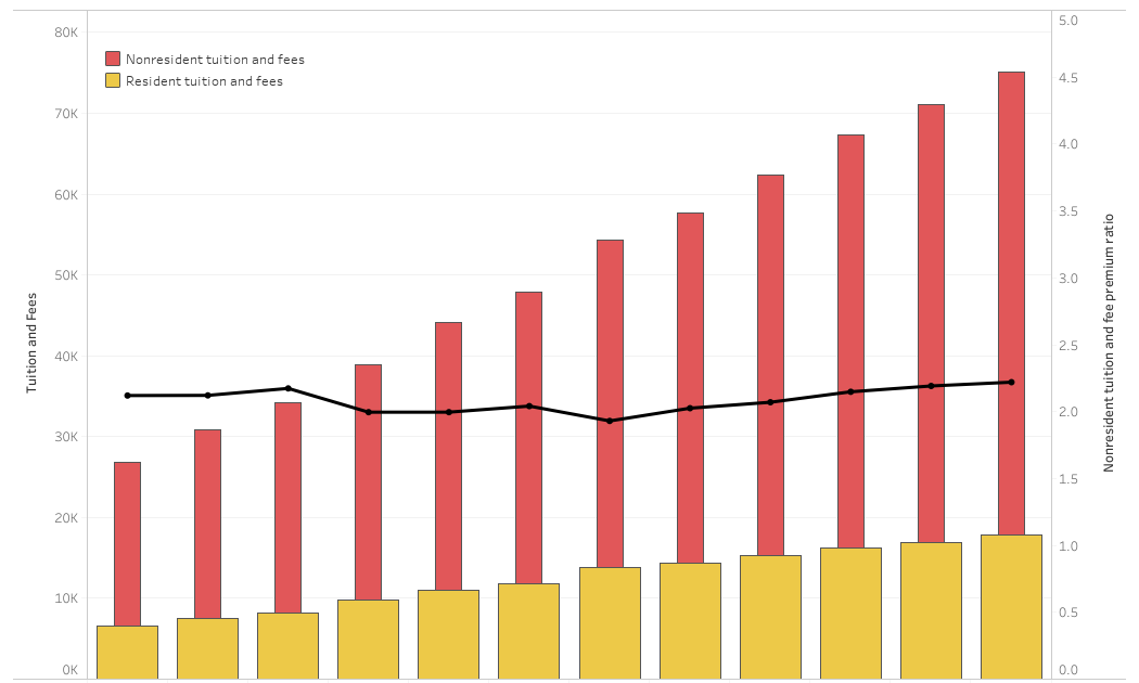
    The increasing costs of attendance at colleges and universities, especially higher “sticker prices,” have attracted attention from both families and policymakers. Although many families are not paying the full sticker prices due to financial aid, today’s families are still facing higher bills for postsecondary education.

    A new analysis from the Brookings Institution examines the different funding sources that families use to pay for four-year nonprofit colleges and how these differ depending on family income. While the findings reflect the different limitations families face based on their incomes, they also suggest that rising net prices mean all households face additional hardships when their children enroll in college.

    Key findings include:

    Middle- and higher-income parents increasingly used their own income and savings.

    • Between 1996 and 2008, payments to colleges from parents’ income and savings jumped by $1,500 to $4,600, depending on the family income and type of institution. These values likely increased again by several thousand from 2008-2020, but specific figures are not available.

    Middle- and higher-income parents have borrowed more.

    • Families with incomes below $50,000 and students attending private institutions saw the highest increases, an average of $1,200, in parents taking out loans from 2008 to 2020.
    • Families with incomes between $50,000 and $100,000 borrowed, on average, $800 more in parent loans for students attending public institutions between 2008 and 2020.
    • Parents were more likely than students to take out education loans, especially between 1996 and 2008 and among middle- and higher-income families.

    Students from lower-income backgrounds worked more.

    • Payments to colleges with funds from student earnings increased among families with incomes under $50,000 from 1996-2008. Student earnings likely also covered the bulk of net price increases for lower-income families between 2008 and 2020.
    • Students from families earning less than $50,000 enrolled at public institutions were six percentage points more likely to work in 2008 compared to in 1996.

    These findings provide reassurance that increased student borrowing is not the primary resource for students to cover increased net prices at four-year colleges. Although the student debt crisis continues to gain attention as overall student loan debt has grown broadly, that increase is largely not occurring at four-year nonprofit institutions.

    However, increased borrowing by parents, especially in middle- and higher-income families, is a trend worthy of more attention. Given that lower-income families may be unable to take on parental loans due to creditworthiness, parental borrowing can contribute to increased inequality as cost may prevent lower-income students from selecting the best school for them or from attending college at all. Middle- and higher-income families can face other significant consequences: If parents deplete their assets or save less, they may not be able to retire until they are older or have decreased retirement income.

    To read the full report, click here.

    —Austin Freeman


    If you have any questions or comments about this blog post, please contact us.

    Source link

  • Tuition and Fees at Flagship and Land Grant Universities over time

    Tuition and Fees at Flagship and Land Grant Universities over time

    If you believe you can extract strategy from prior activities, I have something for you to try to make sense of here.  This is a long compilation of tuition and fees at America’s Flagship and Land Grant institutions.  If you are not quite sure about the distinction between those two types of institutions, you might want to read this first.  TLDR: Land Grants were created by an act of congress, and for this purpose, flagships are whoever I say they are.  There doesn’t seem to be a clear definition.  

    Further, for this visualization, I’ve only selected the first group of Land Grants, funded by the Morrill Act of 1862.  They tend to be the arch rival of the Flagship, unless, of course, they’re the same institution.

    Anyway, today I’m looking at tuition, something you’d think would be pretty simple.  But there are at least four ways to measure this: Tuition, of course, but also tuition and required fees, and both are different for residents and nonresidents.  Additionally, you can use those variables to create all sorts of interesting variables, like the gap between residents and nonresidents, the ratio of that gap to resident tuition, or even several ways to look at the role “required fees” change the tuition equation.  All would be–in a perfect world–driven by strategy.  I’m not sure I’d agree that such is the case.

    Take a look and see if you agree.

    There are five views here, each getting a little more complex.  I know people are afraid to interact with these visualizations, but I promise you can’t break anything.  So click away.

    The first view (using the tabs across the top) compares state resident full-time, first-time, undergraduate tuition and required fees (yellow) to those for nonresidents (red bar). The black line shows the gap ratio.  For instance, if resident tuition is $10,000 and nonresident tuition is $30,000, the gap is $20,000, and that is 2x the resident rate.  The view defaults to the University of Michigan, but don’t cheat yourself: Us the filter at top left to pick any other school. If you’ve read this blog before, you know why Penn State is showing strange data.  It’s not you, it’s IPEDS, so don’t ask.)

    The second tab shows four data points explicitly, and more implicitly.  This view starts with the University of Montana, but the control lets you change that.  On top is resident tuition (purple) and resident tuition and fees (yellow). Notice how the gap between the two varies, suggesting the role of fees in the total cost of attendance.  The bottom shows those figures for nonresidents.

    The third view looks a little crazy. Choose a value to display at top left, and the visualization will rank all 77 institutions from highest to lowest.  Use the control at top right to highlight an institution to put it in a national context.  Hover over the dots for details in a popup box.  If you want to look at a smaller set of institutions, you can do that, too, using the filters right above the chart.  The fourth view is the exact same, but shows the actual values, rather than the rank.  As always, hover for details.

    Finally, the fifth view is a custom scatter plot: Choose the variable you want on the x-axis and the variable to plot it against on the y-axis.  Then use the filters to limit the included institutions. As always, let me know what you find that’s interesting.

    Source link